maulrat
TPF Noob!
- Joined
- Jul 23, 2008
- Messages
- 652
- Reaction score
- 0
- Location
- San Diego, CA
- Can others edit my Photos
- Photos NOT OK to edit
Well, I finally had a chance to take some pics out of my apartment. I've had my first DSLR now for about 1 week but haven't had much time to play with my new toy. I'm starting out straight in manual mode. Although I am making a lot of mistakes, I am getting a better feel for manipulating exposure. I tend to take my photos metered a little on the dark side so that I do blow them out when I post process.
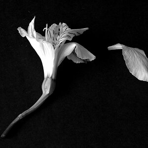
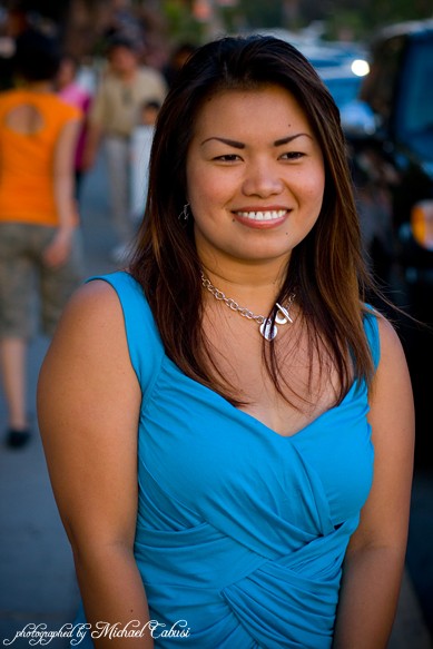
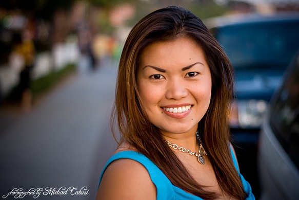
I didn't have much time but out of about 10 shots of my model, these are the 4 that came out alright. Like I said, I didn't have much time behind the glass or else I would have taken more. Before I give them to her, can you please let me know what I could do to post process them better? If you have any ideas how I could have taken better shots, I would greatly appreciate that too.
Isa

Dalawa
Tatlo
Apat

Thank you,
-maulrat
I didn't have much time but out of about 10 shots of my model, these are the 4 that came out alright. Like I said, I didn't have much time behind the glass or else I would have taken more. Before I give them to her, can you please let me know what I could do to post process them better? If you have any ideas how I could have taken better shots, I would greatly appreciate that too.
Isa
Dalawa
Tatlo
Apat
Thank you,
-maulrat
 She should relax her arms some and look more toward the camera or completely away (profile, back/profile, etc.). Other than that it's a good pic.

![[No title]](/data/xfmg/thumbnail/36/36394-700ff78d7b45c663863e641a9bcf1fe1.jpg?1619737548)
![[No title]](/data/xfmg/thumbnail/36/36398-33d875428a7eefdf5b31188ec0f555a5.jpg?1619737551)
![[No title]](/data/xfmg/thumbnail/30/30889-6a35eb14fac2d7d837d49a6a1757d874.jpg?1619734500)