_jessicalynn_
TPF Noob!
- Joined
- Jul 26, 2012
- Messages
- 117
- Reaction score
- 31
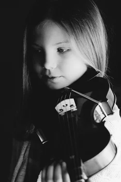
I think number 1 is the strongest. I see where you were going with the heavy darkness, however I personally think they are still too dark.
I would love number one with more detail on the violin.
See what some other people say though.
cgipson1 said:Where do you think she was going with this .. please enlighten me! I don't see anything well thought out, or artistic.. just bad lighting...
And your the authority of all things artistic?
#1 reasonable framing.. but lost so much detail in the instrument... subject right side of face too dark. Need better lighting....
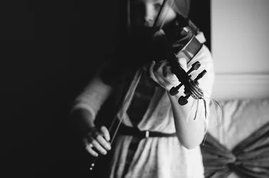
#2.. cut her off just above the eyes?? Are you kidding?
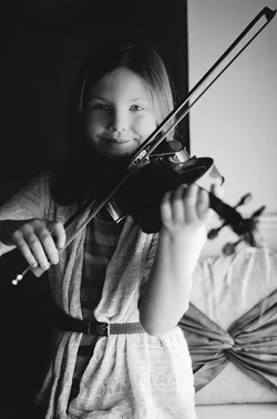
#3 better framing.. but her right elbow is gone.. and since that adds to what she doing (playing), the loss of elbow is not appropriate. The DOF should have been deeper to get the end of the instrument sharp, and the girls hand sharp, IMO... and lighting on her fact, shadows are much too deep. There is also very little definition in her blurry forearm, and the upper arm behind it.. they blend together and make the arm look odd. Open up the frame a bit, and get better lighting....
This isn't low key... and that is good, because low key, and little girls seldom work together.
cgipson1 said:Where do you think she was going with this .. please enlighten me! I don't see anything well thought out, or artistic.. just bad lighting...
And your the authority of all things artistic?
cgipson1 said:I didn't go into great depth on how to fix them, because I know you are supposedly a "pro" (or at least you charge for sessions)... and should know how to fix them on your own, with what I suggested. If not, let us know....
I actually do appreciate the cc and the advice, very much so! I just don't think one person can discredit someone else's work as having any artistic value, when that is subjective.
cgipson1 said:I didn't go into great depth on how to fix them, because I know you are supposedly a "pro" (or at least you charge for sessions)... and should know how to fix them on your own, with what I suggested. If not, let us know....
I never called my self a "pro". I am a working photographer but I'm alway trying to learn more and improve!
The lighting as an idea is fine here. It's a very traditional look for classical musicians and their instruments. As a side note, when I view the images larger than the thumbnails the backgrounds are rendered as a dark grey and should, I feel, instead be very very close to flat black.
#1 is fine, but not very interesting.
#2 is a photograph of the instrument, not the musician. You threw the musician out of focus, but that's not enough, we're going to be interested in her because she's a person, and we find the out of focus and cropping puzzling. Lose more or her in the darkness. You don't want a floating viola, but you DO want to signal strongly that the girl is NOT what we should be looking at.
#3 is framed in a very nifty fashion, the bow lies in the frame so perfectly that this is obviously what you were interested in. This has the same problem as #2, which is compounded by the fact that she's SMILING! Disaster! Now we know we're supposed to look at her, which is wrong! Again, lose her (and that bow-thingy in the background, and whatnot) in more darkness or something. For that one I would have placed her against a black background all the way across, hit the bow with a snooted strobe, and let her be barely visible in whatever leaked light there was. But then, I shoot everything with a snooted strobe, so
In short, you have some really interesting visual ideas which are not quite pulled together here.