What's new

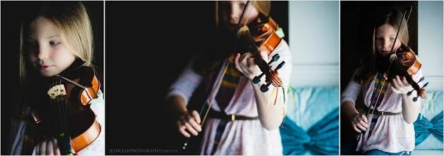
Girl with her viola

I like the visual appeal of #1, but these deep shadows/contract set a somber tone for me and don't work for little kids like this. E.g., the exact same shot would've worked great IMO if the person was old.
 
_jessicalynn_ said:
I actually do appreciate the cc and the advice, very much so! I just don't think one person can discredit someone else's work as having any artistic value, when that is subjective.

I don't think Charley claimed your shots didn't have any artistic merit. I think he just bristled a bit at your reaction and sharpened his responses a bit. I am still seeing you interpreting things defensively... Not that I suppose I should blame you, but it's going to color everything for you.

For what it's worth I think the first shot had great potential and probably would work if the violin wasn't outright black as we see it here. I think the others have too many issues to be truly salvageable, but I do like the general idea and I'm someone who quite likes stark black and white images of kids. I am, however, kind of unique there. Most people react pretty strongly in the negative to them.
 
$image-4181469840.webp

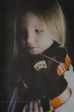
I made some adjustments where I could taking all the cc into consideration. I like!
 
If you could use curves to bring up the viola in the first one just a bit, I think you'd have a winner. If you have an original you can put up somewhere that I can futz with I can show you.
 
I still think you should completely bin those other two, btw. Give up on them. Background and composition issues that you're simply not going to get around.
 
Gotta agree with Manaheim... First one could be a keeper... even the third one maybe... but the second one is definitely a binner!

And yes.. they are improved!
 
I like the first one too.

Very fun!
 
1 has a lot of potential

For me the light and shadows contain much to much contrast you have lost high lights on her face and blocked up darks in the violin

I thing when you were shooting this a reflector to the left side could have made a world of difference

Jeff
 
Here is where I've gone with 1. Very interested in what you guys will think, this is my first time working with texture, but I think it works with this image. $cassie textures.webp
 
Here is where I've gone with 1. Very interested in what you guys will think, this is my first time working with texture, but I think it works with this image. View attachment 34848

I don't! I think if you want it to be a good image, then just make a a good image.. no gimmicks, no actions, just a good sharp image of a young musician. But it is your call...

Texture and other things like instagram, selective color, etc.. will sometimes work with a good image. But most of the time they make the image worse. And with an image that already has problems.. they don't hide the problems, they just add to the "bad"!
 
Last edited:
I really like #1. (the first edit of #1) The dramatic lighting with the strong contrast of the b/w really works for me. It seems like the other two are throwing me off because of the composition, and lack of a main focused point. My eye is really not being drawn into anything in the last two.
 
Here is where I've gone with 1. Very interested in what you guys will think, this is my first time working with texture, but I think it works with this image. View attachment 34848

I don't! I think if you want it to be a good image, then just make a a good image.. no gimmicks, no actions, just a good sharp image of a young musician. But it is your call...

Texture and other things like instagram, selective color, etc.. will sometimes work with a good image. But most of the time they make the image worse. And with an image that already has problems.. they don't hide the problems, they just add to the "bad"!

Agree with Charlie. People often take a marginal image and poor effects on top to try to make it better. It doesn't. There are cases when an effect that you can add enhance a photo, but those are really only when the photo was a good photo to begin with and adding the effect made it complete... not when it was an afterthought.

BTW, I think these were all better as b/w. Not sure why you switched to color.
 
Jessica, I love your photos! I will agree that number 3 is the weakest, but you are definitely receiving some overly harsh criticism from people that don't like your style.
 
davidzacek said:
Jessica, I love your photos! I will agree that number 3 is the weakest, but you are definitely receiving some overly harsh criticism from people that don't like your style.

Thanks David! It really doesn't bother me, the things I tend to share are usually photos that are a little bit different for me, but that I like, and am interested in others opinions. I'm not sensitive and try to take something out of it. Glad you like them!
 

Create an account or login to comment

You must be a member in order to leave a comment

Create account

Create an account on our community. It's easy!

Log in

Already have an account? Log in here.

New Topics

Back
Top Bottom