What's new

Give it too me - I asked for it!!!!

LisaCadwell

TPF Noob!
Joined
Oct 7, 2012
Messages
138
Reaction score
7
Location
Yakima, WA
Can others edit my Photos
Photos OK to edit
C&C- let it rip. I'll tell you a few of the things I don't like about them....

1) water fountain - playing with the exposure as it was under exposed, I find that the water is too... hmmm white??? It blends into the background too much. I also think that you will tell me that it is too centered. Canon EOS XS 55-250mm lens, F/5.6, 1/320, ISO 320

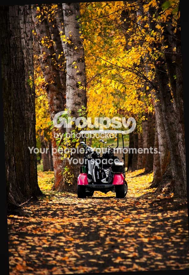
2) Golf Golf Cart - I actually like this one. But still too centered? Canon EOS XS 55-250mm lens, F/5.6, 1/200, ISO 800

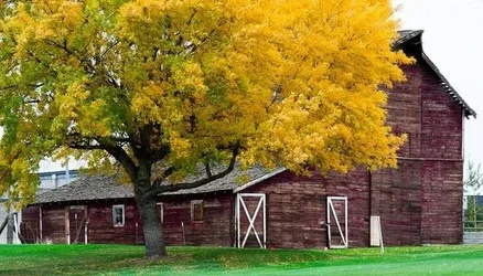
3) Barn - in the attempt to get the old barn more red, I think I over played the colors in the editing? There are power lines in the upper right hand corner that will need to come out as soon as I'm better at that in LR4. But overall, I like the color contrasts. The weather was changing and it had just started to rain when I took this one. Canon EOS XS 55-250mm lens, F/5.6, 1/125, ISO 500


#1: C+

#2: A-

#3: C+
 
I like that barn. I may have walked up closer, tilted up slightly and got less grass more tree/barn. And if you like it composed such as you did, perhaps remove the power lines, tree and rails on right, and fix the funky green tint of the grass?
 
I agree with 2WP on everything he said, but I'd go one step further and clean up the newer building showing through the tree on the left. Very nice photo.
 
What Derrel said, except that #1 is a C- not a C+ ;)

The fountain is basically a picture of nothing. What am I even supposed to be looking at, here? Without the fountain it might make a good abstract, maybe, but with it, it's definitely a picture of a Thing, just not an interesting thing.

The golf cart is pretty awesome. Fantastic use of color here (imagine how pointless this would be in b&w!). The slight tilt of the cart really makes it. Great "seeing" as they say.

I like the barn quite a bit better than the fountain, but it's still not great. The framing is uncomfortable, the tree wants more space, I think, and the wires coming into the frame on the right are unfortunate. I would be loathe to edit them out because I am odd that way, but they aren't very good. This is an interesting Thing, and you have a concept here, but it's not very well realized, to my eye. The color of the grass looks really quite odd to me, as well.
 
The fountain just bores me. there isn't enough there to keep my attention. I really like the golf cart one. helps that I golf. being cenered in that shot doesnt bother me, i find my eyes following the path to the cart. The last one isn't bad, im just not big on barns.
 
What Derrel said, except that #1 is a C- not a C+ ;)

The fountain is basically a picture of nothing. What am I even supposed to be looking at, here? Without the fountain it might make a good abstract, maybe, but with it, it's definitely a picture of a Thing, just not an interesting thing.

The golf cart is pretty awesome. Fantastic use of color here (imagine how pointless this would be in b&w!). The slight tilt of the cart really makes it. Great "seeing" as they say.

I like the barn quite a bit better than the fountain, but it's still not great. The framing is uncomfortable, the tree wants more space, I think, and the wires coming into the frame on the right are unfortunate. I would be loathe to edit them out because I am odd that way, but they aren't very good. This is an interesting Thing, and you have a concept here, but it's not very well realized, to my eye. The color of the grass looks really quite odd to me, as well.

I agonized over the C+ versus C- grade myself...buuuut...I gave it a C+ for the vertical camera orientation, instead of the average student's probable,likely horizontal camera orientation! (only half-joking here). I agree with amolitor's insights on the second and third shots. The golf cart and path and fall foliage shot...CLEARLY the best of the bunch, and well-done. The barn is as amolitor said, "uncomfortable".
 
Agree with everyone on the first and third, but I'm not that fond of the second either, at least as it is. There is way too much out-of-focus foreground for it to be a pleasing shot. Cropping most of it out would make this a much better shot, imo. I'd rather have seen the camera tilted up a little to include more of the trees and leaves, but the crop would still be a very nice image.
 
#1: To me, the main failing on the fountain is perspective. Had you been closer to the water and lower down, you could have set the fountain against a backdrop of grass which would have allowed it to stand out. The grassy foreground doesn't add that much.

#2: Nice. I'd chop a bit off the bottom, just below where the tree trunks are.

#3: It's hard to get rid of power lines in LR. Nice colors. Not sure how I feel about the composition. My eye wants to see more of the tree. But, alternatively, a much tighter crop showing the trunk, lower branches and the barn doors might also work nice.
 
Last edited:
I think #2 is nicely seen but unfinished.
Everything is bright and thus competes with the cart for my eye.
I would lower the brightness and increase the saturation of everything but the cart (but decrease the red saturation in the foreground.)
Decrease the brightness of the canopy of the cart.
Upright it a bit and add a vignette to keep the eye in - and viola :wink:

appletree_TU-74_683x1024_lllll.jpg
 
First and 3rd no real interest at all especially 1, burnt out highlights and poor comp.

Golf cart and Colours, GOOD, but, WHY do people not post process, eg crop

And same for the barn, and those terrible cables top right, took 25 seconds to remove and crop
 

Attachments

  • $Image1.webp
    $Image1.webp
    87.9 KB · Views: 138
  • $Image1.webp
    $Image1.webp
    77.7 KB · Views: 114

Create an account or login to comment

You must be a member in order to leave a comment

Create account

Create an account on our community. It's easy!

Log in

Already have an account? Log in here.

Back
Top Bottom