What's new

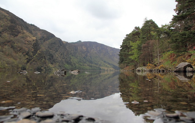
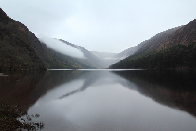
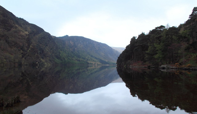
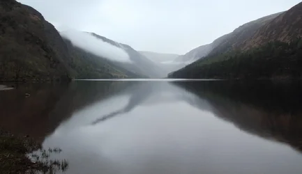
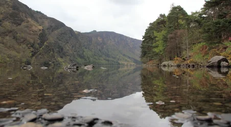
Glendalough

I like the reflection on the second one, makes me feel there is a dragon flying over hehe
They all have the same composition, is that intentional?
 
Nice 3 picture set.

picture 1 would be that much stronger if you cropped it so that the top of the the 2nd tree on the right. That would help to control the amount of sky which is basically grey and have us focus on the river, especially the foreground.

Picture 2 I would also crop to where the mountain ridge on the right is the corner of the photo.

Picture 3 also would benefit from the same amount of crop.
 
i like them, they would be even stronger if you had maintained a bit more detail in the sky and clouds.
 
One thing to watch - the shoreline, which acts in images like these as a pseudo-horizon, is almost right in the centre of each of the images and thus it tends to cut the image in half and this sort of thing is not usually helpful with the overall composition - rule of thirds is the general norm for the placement of features like this in these sorts of images. The other thing that "bothers" me is that I think the colours look flat, almost as if the white balance (WB) was off - did you use auto WB in these images? Not sure what "post-processing" package you are using, but I would like to see the colours "pop" a bit more, so the other question is are you using a calibrated monitor? The other thing that sometimes makes for flat colours is the colour space that is being used to process the images and then post them on the web. Are you shooting raw or jpeg, as this may affect the final outcome as well. Anyway, I could go one, but enough for now - my 0.02¢ FWIW.
____________________
WesternGuy
 
I like the reflection on the second one, makes me feel there is a dragon flying over hehe
They all have the same composition, is that intentional?
#2 and #3 are pretty much from the exact same spot, taken only minutes apart,3 was actually first then 2 after it started raining and some mist appeared. The first one was taken later the same day from a slightly different location, but close. Because reflections were involved I kind of went for the same half and half ignoring rule of thirds composition
 
Nice 3 picture set. <br>
<br>
picture 1 would be that much stronger if you cropped it so that the top of the the 2nd tree on the right. That would help to control the amount of sky which is basically grey and have us focus on the river, especially the foreground. <br>
<br>
Picture 2 I would also crop to where the mountain ridge on the right is the corner of the photo.<br>
<br>
Picture 3 also would benefit from the same amount of crop.

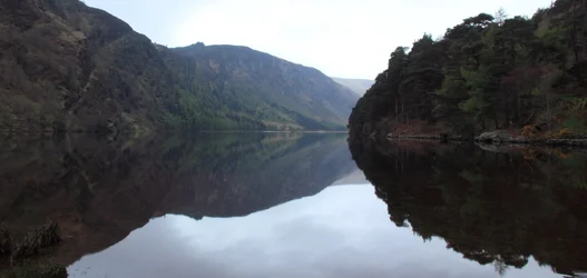
Is this what you mean?
$Glendalough early mormning2.webp$Glendalough early morning2.webp$glendalough7.webp
 
i like them, they would be even stronger if you had maintained a bit more detail in the sky and clouds.

Thanks, I should have brought filters but didn't that day
 
One thing to watch - the shoreline, which acts in images like these as a pseudo-horizon, is almost right in the centre of each of the images and thus it tends to cut the image in half and this sort of thing is not usually helpful with the overall composition - rule of thirds is the general norm for the placement of features like this in these sorts of images. The other thing that "bothers" me is that I think the colours look flat, almost as if the white balance (WB) was off - did you use auto WB in these images? Not sure what "post-processing" package you are using, but I would like to see the colours "pop" a bit more, so the other question is are you using a calibrated monitor? The other thing that sometimes makes for flat colours is the colour space that is being used to process the images and then post them on the web. Are you shooting raw or jpeg, as this may affect the final outcome as well. Anyway, I could go one, but enough for now - my 0.02¢ FWIW.
____________________
WesternGuy

I usually use rule of thirds but thought with reflections half and half would work, but I will keep it in mind. I used auto wb and shot raw,and increased the temp in pp after as it was a fairly hazy morning. I use photoshop and dpp but my laptop isn't calibrated. I intend my next purchase to be a proper monitor
 
Thanks all for the input
 
Just saw your 3 re-edits. Huge difference. All are much stronger compositions. I hope you agree.
 
I would have cropped out the grass or whatever that is in the lower left of 2 and 3. I find that distracting. Also, 2 and 3 are a little dark for me, not enough details in the sides. Otherwise, I like the compositions.
 

Create an account or login to comment

You must be a member in order to leave a comment

Create account

Create an account on our community. It's easy!

Log in

Already have an account? Log in here.

Back
Top Bottom