This shot was taken while I was in San Francisco. I was using a polarizer filter and did some minimal photoshop, levels hue etc. Any advice, comments will be greatly appreciated :]
I'm not too much of a fan of the almost centered support (for lack of a better word). It needs to go to one side or the other IMHO. I like the blue. Your polarizer did a great job of bring about the color. I would like it to be a little bit sharper. It seems to be a little soft.
Something about this picture bothers me, and I think its because the golden gate bridge is known for its color, so to have it silhouetted just seems backwards to my mind.
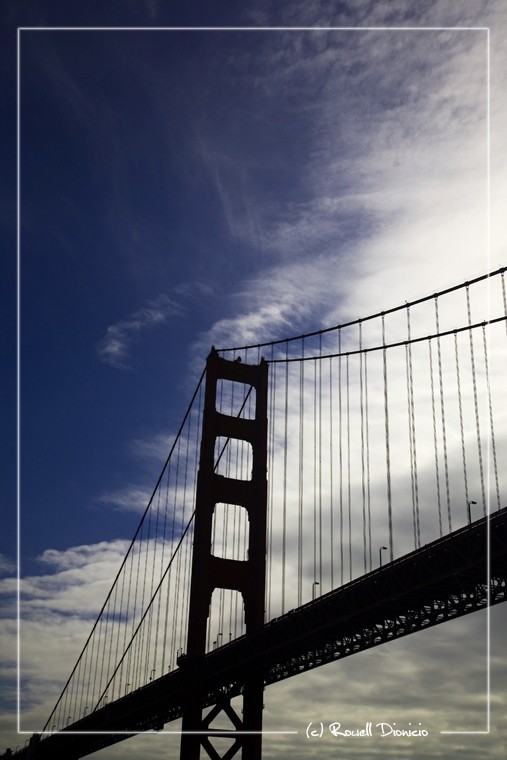
Wow, I think its an excellent photo. I love the composition, however I would have maybe moved so the tall deal was to the right a bit more. I love the blue and silhouette, as I said in another thread, theres not much I love more than a good silhouette! Excellent work!
In Photoshop I just took the selection tool and created that box and then applied a stroke. Erased a section of the square where I wanted my sig to go. Thats it!
Thanks for your replies guys. I am a big fan of the rule of thirds but I was on a boat and it was ridiculously cold and I did not want to get other people (who are part of the tour) in the shot. I think it is okay for being centered because you can see other parts of the bridge but I know what you guys are talking about :]