DGMPhotography
Been spending a lot of time on here!
- Joined
- Mar 23, 2012
- Messages
- 3,160
- Reaction score
- 718
- Can others edit my Photos
- Photos OK to edit
Hey there,
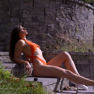
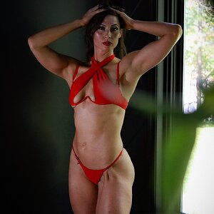
So I would love some thoughts on my image here! Also wondering if you think I should clean up her hair a little bit in post, or leave it as is?

Thanks!
So I would love some thoughts on my image here! Also wondering if you think I should clean up her hair a little bit in post, or leave it as is?
Thanks!
")