Gotcha

goooner

Been spending a lot of time on here!
Joined
Oct 4, 2014
Messages
2,376
Reaction score
1,074
Location
Germany
Can others edit my Photos
Photos OK to edit
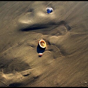
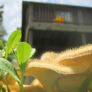
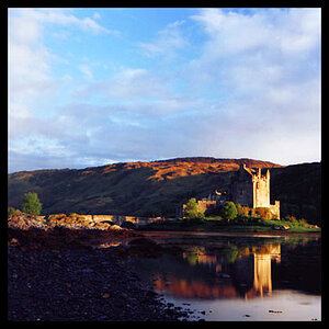
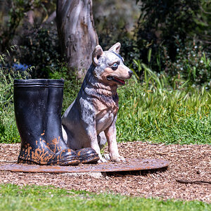
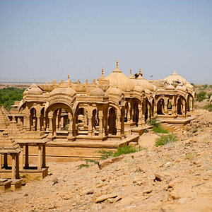
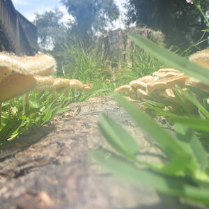
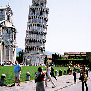
Still trying my hand at this B&W 'thing'. I need some guidance in this 'field' of photography, so C&C is more than welcome.

#1
_DR13412-Edit.jpg

#2
_DR13410-Edit.jpg
 
Last edited:
Guess its back to the drawing board.
 
Those are great! I'm not an expert but they seem to have nice tonal range. Good clarity and sharpness. I see white, black, and gray. Well done and good subject to use it on.
 
Those are great! I'm not an expert but they seem to have nice tonal range. Good clarity and sharpness. I see white, black, and gray. Well done and good subject to use it on.
Thanks, now that you mention it, I'm not sure I can see white on my (uncalibrated) monitor. I just play around with the file in Nik collection until I like it :allteeth:
That's how I do it, whether it's right or not. I use GIMP but Fujifilm Acros makes things way easier. The one advantage to shooting in color, then converting in post is adjusting the color sliders for greater tonal control, this is key with a two or three colored flower. An example would be a white flower with a yellow cup, by adjusting the yellow slider gives you creative leverage to turn that cup from white to black and increase dimension and overall dynamic appearance. However, Acros simulation is pretty effective generally speaking, other than 2 or three colored flowers.
 
These have good tonal range. But they are a slight bit harsh/contrasty. In most B&W images you want a black somewhere, (unlike gray, there are no shades of black or white). The black sets the stage, a benchmark for the grays. White draws your eye away from all else, sorta like an eye-magnet. (If there are details in the black and the white, then it's a gray.)
 
These have good tonal range. But they are a slight bit harsh/contrasty. In most B&W images you want a black somewhere, (unlike gray, there are no shades of black or white). The black sets the stage, a benchmark for the grays. White draws your eye away from all else, sorta like an eye-magnet. (If there are details in the black and the white, then it's a gray.)
Thank you Gary, I will keep that in mind when I play around with my next attempt.
 
Strong image !
 

Most reactions

Back
Top