You are using an out of date browser. It may not display this or other websites correctly.
You should upgrade or use an alternative browser.
You should upgrade or use an alternative browser.
jcdeboever
Been spending a lot of time on here!
- Joined
- Sep 5, 2015
- Messages
- 19,868
- Reaction score
- 16,084
- Location
- Michigan
- Can others edit my Photos
- Photos OK to edit
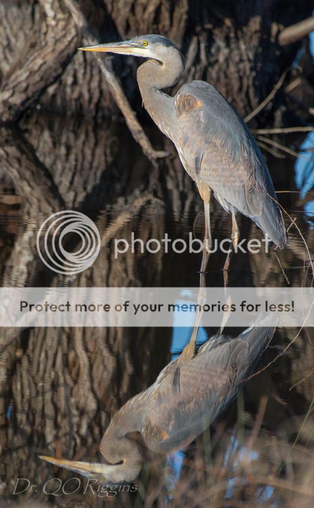
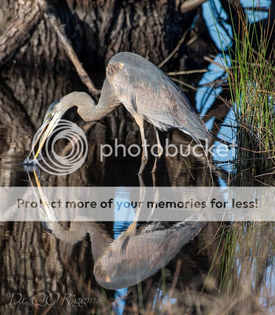
Those are excellent @quinte.#5 is off the charts. Well done. #5 nominated Mar POTM.
I digress, it is not up yet. Will do when available.
Sent from my XT1254 using Tapatalk
I digress, it is not up yet. Will do when available.
Sent from my XT1254 using Tapatalk
quinte
No longer a newbie, moving up!
- Joined
- Sep 23, 2010
- Messages
- 231
- Reaction score
- 63
- Location
- Arkansas
- Can others edit my Photos
- Photos NOT OK to edit
- Thread Starter 🔹
- #3
Those are excellent @quinte.#5 is off the charts. Well done. #5 nominated Mar POTM.
I digress, it is not up yet. Will do when available.
Sent from my XT1254 using Tapatalk
Why, thank you. So very kind.
jcdeboever
Been spending a lot of time on here!
- Joined
- Sep 5, 2015
- Messages
- 19,868
- Reaction score
- 16,084
- Location
- Michigan
- Can others edit my Photos
- Photos OK to edit
Your welcome. Thank you for providing me a goal to work towards.Those are excellent @quinte.#5 is off the charts. Well done. #5 nominated Mar POTM.
I digress, it is not up yet. Will do when available.
Sent from my XT1254 using Tapatalk
Why, thank you. So very kind.
Sent from my XT1254 using Tapatalk
- Joined
- Jun 23, 2015
- Messages
- 8,705
- Reaction score
- 6,830
- Location
- Petawawa, Ontario
- Can others edit my Photos
- Photos NOT OK to edit
- Moderator 🛠️
- #6
Great set.
- Joined
- Oct 2, 2008
- Messages
- 7,218
- Reaction score
- 3,078
- Location
- Vancouver Island
- Can others edit my Photos
- Photos OK to edit
What they^ said!
annamaria
Been spending a lot of time on here!
- Joined
- Sep 18, 2013
- Messages
- 3,595
- Reaction score
- 978
- Location
- Milledgeville, GA
- Can others edit my Photos
- Photos OK to edit
Number five is my vote.
LarryLomona
Been spending a lot of time on here!
- Joined
- Jun 12, 2013
- Messages
- 1,815
- Reaction score
- 655
- Location
- Plano,Texas
- Can others edit my Photos
- Photos OK to edit
really cool images.
Didereaux
Been spending a lot of time on here!
- Joined
- Oct 29, 2013
- Messages
- 2,372
- Reaction score
- 1,587
- Location
- swamps of texas
- Can others edit my Photos
- Photos OK to edit
Yep, #5 it is!  Love Big Blues, they will spend an afternoon inventing new poses for you.
WesternGuy
Been spending a lot of time on here!
- Joined
- Dec 23, 2010
- Messages
- 5,281
- Reaction score
- 1,219
- Location
- Calgary, Alberta, Canada
- Can others edit my Photos
- Photos NOT OK to edit
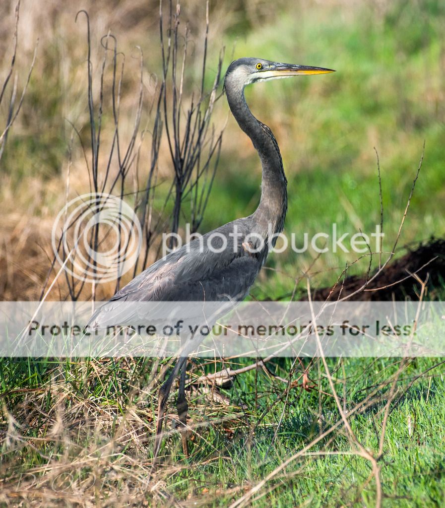
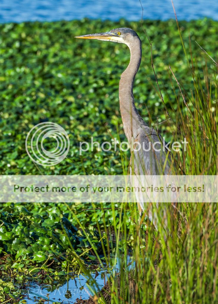
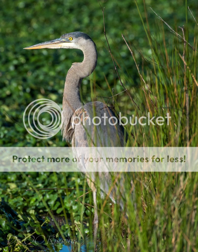
This is a very nice set of images. #4 and #5 with the reflection are my favourites, although I am not a fan of the close crops. For example, if it was mine, I would have a bit more space on the right side of the image. This gives the appearance of the bird having some space to move into, otherwise it is a very static portrait. I would say the same for #2 and #3, except in reverse. In fact, in #1 and #3, the bird is very centered in the image, and this is not always the best place for the subject. Rule of thirds is relevant here, in my opinion.
WesternGuy
WesternGuy
Last edited:
Most reactions
-
 219
219 -
 123
123 -
 80
80 -
 79
79 -
 77
77 -
 76
76 -
 69
69 -
 68
68 -
M
59
-
 54
54 -
 53
53 -
 52
52 -
 51
51 -
 48
48 -
 44
44



![[No title]](/data/xfmg/thumbnail/34/34140-74799834a513b0cbf28dfda9aeae291b.jpg?1734164703)


![[No title]](/data/xfmg/thumbnail/39/39429-cfa441056f1e6a1995539dc87c794876.jpg?1734173523)
