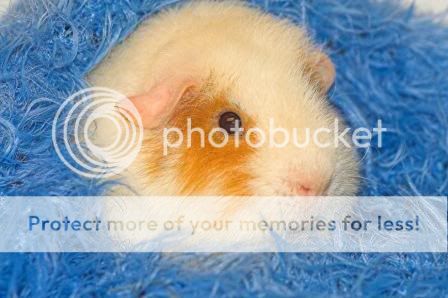
Does this portrait look cold to you? Is there anyway to warm up the colours in PS? Is the lighting ok? Does it capture the guinea pig ok? sorry for so many questions.
- Image > Adjustments > Auto Contrast
- Selected the eye using the magic wand tool (you may need to add/remove parts from the selection)
- Image > Adjustments > Hue/Saturation: reduced saturation by about half, then reduced lightness very slightly
- Select > Deselect
- Image > Adjustments > Shadow/Highlight: Bumped the highlights up slightly (about 10% I think) using a reasonably small Radius
- Filter > Sharpen > Smart Sharpen: Sharpened by 40% using a Radius of 1px, set to Remove Lens Blur and with More Accurate ticked.
These were all very quick adjustments and you could probably improve on my attempt substantially by playing with the controls a bit more until you're completely satisfied (also using the full-sized image would help ).
What do you think?
Hope that helps, if you don't like it feel free to say so!
WOW! thank you so much, it looks so much better :hail: your a star! I'll have a go with the full size version and then post my attempt here, would you have a look over it for me? I really must learn how to photoshop :hug::
I'm by no means an expert (only been using PS for about a year, and very intermittently) but of course, I'd be glad to see what you turn out!
Photoshop looks really daunting at first but it's actually not that hard to use once you figure out where the basic tools are and what they do. The best way to learn is to have a play (on an image you've got a spare copy of!) and find out what happens - I sometimes find it helpful to undo/redo a couple of times (particularly when making subtle changes) so you can really get a feel for what you've done and whether you like it.
When I'm working seriously on an image, my rule of thumb tends to be to keep things gentle - there's a temptation to go all out with crazy effects but (at least IMHumbleO) the best images are the balanced ones that make you believe you're looking at the real thing.
Enjoy playing, and let me see how you get on
Ooh, by the way - I should have said in the first place that I think your piggy pics are super! Keep up the good work! :hug::
Well, the colors remain the same, and blue is a "cool" color - not much you can do to warm it up. The edited version is nicely sharpened, but the colors are the same.
Overall, the image works because these are complementary colors on the color wheel. Blue and orange look great together! Cool colors recede and the warmer color, orange, advances - so, by having the warm color in the center of your shot, it's an effective composition in its own right. :thumbup:
Plus, he's a cute little guy. It's a well done portrait! All this image really needed was a bit of sharpening.
Don't be. That's what this Critique Gallery is here for.
I would, however, like to remind members of the OTE Rule in the Guidelines. http://www.thephotoforum.com/forum/showthread.php?t=23315
If you don't mind people editing your images then just put OTE alongside them.
And people who edit other members' work must make themselves aware of the limitations and restrictions they have agreed to.
Sorry if I went about this the wrong way - I probably should have asked first and then had a go in PS. On the other hand I didn't want to offer assistance and then find I couldn't do anything with it
Everything is fine and no-one has done anything wrong.
Just wanted to raise people's awareness by drawing attention to the revised OTE Rules. We've had a major 'misunderstanding' recently so I just thought people should know where they stand and be aware of what is and isn't allowed.
You've made a great improvement to that shot already, nice one
The colours and contrast are looking much better and you've done a good job on the eye :thumbup:
The only other thing I would do to it is just to play a little more with the sharpness. When you sharpen an image at full size, the strength of the sharpening effect is reduced (sharpening is based on a pixel radius, so obviously if you have more pixels then proportionally fewer of them are affected by the filter of the same radius).
Be careful not to overdo it though, as you can end up bringing out the noise more than the detail in the subject. The sharpen window itself can be handy for this because you can check for oversharpening in the preview window at 100%, while increasing the radius until you get the level of detail you're looking for in the main image at the sort of size you want (you'll need 'Preview' ticked).
On a second (and third, and fourth) look, I'm not entirely sure whether you should leave it as it is!
I can't decide whether a little softness adds to the image, given the subject (and it really is only a little bit - if you were going to sharpen any more it'd need to be pretty subtle).
At the end of the day it's your pic, so just do what you like the best!


![[No title]](/data/xfmg/thumbnail/32/32635-be18e952e67667cbb1525b4b057b6423.jpg?1619735554)