Guitar Hero Ad

alannahrose

TPF Noob!
Joined
Dec 2, 2009
Messages
69
Reaction score
0
Location
Oklahoma
Can others edit my Photos
Photos NOT OK to edit
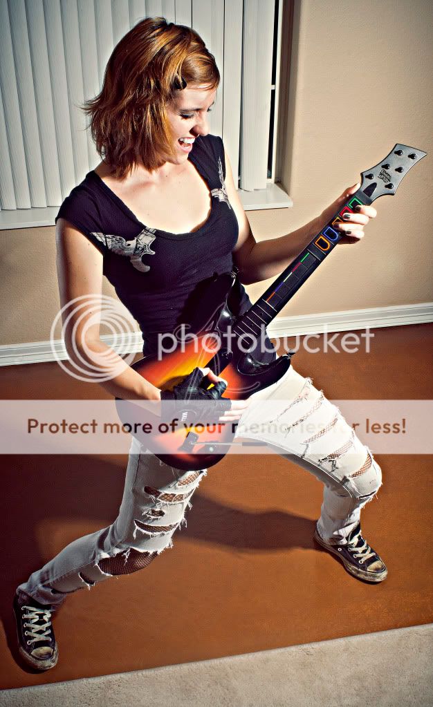
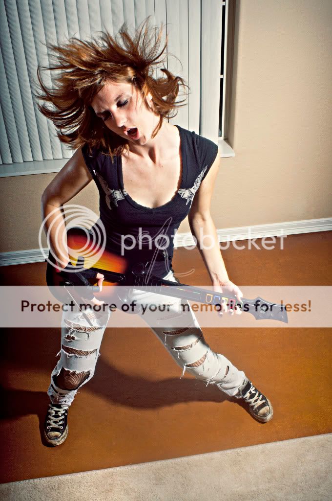
I shot these for my advertising class. I wanted it to look like it was shot in a house and I just wanted it to look like the girl playing is having fun. I used my Nikon D300s and a Nikkor 24mm and two Dynalites. Any thoughts on how I can improve them and which one is better as an ad. Thanks!

BGH5.jpg


BGH4.jpg
 
I like both of them. I prefer the first one though. It looks so cool! They both do! What kind of PP did you use?
 
I did most of it in camera raw. Then I applied a vintage action to it and sharpened it to give it that almost surreal look. Thanks!
 
I agree, the first one looks good as is. maybe edit it to make it look more unreal. that's just me, kind of like the cover of guitar hero. or maybe make a cover and instead of the rockstars on there replace it with yourself? idk... don't listen to me lol
 
I like the second one better. The way she was caught in that one makes it look more surreal to me. I can't wait to get my flashes so I can do this. One of my favorite kind of shots.
 
"Yeah, Baby, yeah!" Nice work. Like 'em both, prefer the second one a slight bit though. The head-banging hair in #2 sells me on it.
 
Same here, I love em both, but I'm sold on the 2nd one! She looks like she's rockin out and having a good time doing it. The shot is freakin awesome! Lots of action and she is still in focus, no motion blur or anything and the effects are great!
 
Thanks everyone! I also prefer the second one, I just didn't know which would work better as an ad.
 
Did you use the unsharp mask? Or a different filter? If you used unsharp mask, what settings?
 
Definitely some good aspects here, but I see room for improvement.

I'm not digging the lighting. It's hard, and that usually makes an image more dramatic...but I'm not getting that here. It's also a bit hot/bright on parts of her skin and the ratio is fairly steep.
Maybe it's that the light doesn't jive with the background/setting...I'm not sure.
On that topic, I see where you are going, wanting it to look like she's playing it in a livingroom...but I think it's too plain as it is. If you are going to set the scene for an ad...then take it farther. Show the TV with the game playing...show some other people having a great time etc.
I'm almost thinking that if the background is just going to be a window & wall, then you might as well cut her right out and put in a psychedelic background etc.
 
#2, but I would have shot it on a green screen and added a more hip background in post. The editing and lighting of the subject should be a little less harsh IMHO. Good work though!
 
As-shot it has a fairly "real" look and feel to it. The heavy shadow anchors her to the floor...it looks like an apartment living room...I assume many guitar hero players will find this look believable and realistic...adding in a wild background in post would change the feel of the shot quite a bit, and take it from realistic to the fantastic or whimsical...both ways could work.
 

Most reactions

Back
Top