I don't ascribe to any standard or theory; I look at a picture and try to figure out what my subconscious response is to the various elements, what makes the picture either work or not work for me.
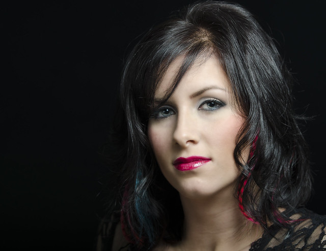
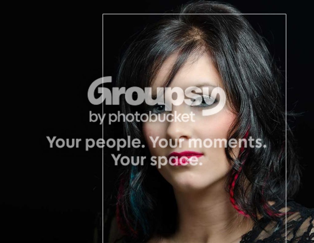
To some one who looks at only content and superficial impact, this is a great shot - great color, great sharpness, damn nice PPing.
What does bother me is the placement in the frame.
I look at the picture and my subconscious person, who believes that everything in an image is left there for a purpose. tries to parse where you've put her and to figure out what message you are giving with the placement.
Her head touches the top, she's almost cut off at the neck at the bottom, with that little piece of dress pointing down.
Yet there is room behind her and lots of room at the left. It isn't balancing anything, why is it there?
And she's merging into that dark background - why?
I'm not saying there are answers to these questions, just that you did this and my inner person is trying to figure out why.
If she was pretty close to the edge all around, then the clipping at top and bottom would make sense to me; those empty spaces would be gone mostly and the merge into the background wouldn't be as important. I wouldn't care about little things being clipped off; it makes sense and doesn't cost any real info.
So I would be happier with something like this below.
IMO, everything in the frame is put there or left there on purpose and should have an artistic reason.








![[No title]](/data/xfmg/thumbnail/39/39509-3c2c5856429b4b8ff3cf44cd3b2afa8c.jpg?1734173650)