It's not "rules" I am talking aboout, it's just basic compositional concepts like the elements and principles of design that have been around for a couple thousand years. Things like using the frame's space effectively, line of gaze, short side of frame, balance,contrast, harmony, dominance, unity/dissonance, and like line,shape,mass,texture,hue,value, repetition, dissonance, harmony, and so on...
It's good to experiment, but the elements and principles of design never "go away" and we can not re-invent new concepts to replace them. I get what you're saying.
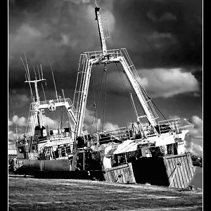
When you said that #1's landscape orientation did not work, what issues do you think prevented it from working?
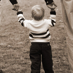
This entire issue is fraught with the chance for hurt feelings, and misunderstandings. I spent years in group C&C sessions where a fine art professor and 20 to 25 students would all evaluate the photos each of us shot in group C&C sessions. Much more brutal than anything I've ever seen here on TPF. I hate to bring up the idea of the elements and principles of design, but some of the experiments you mention have been done before by tens of thousands of people who are working mostly off of the idea that a rule of thirds placement can create exciting images, but when in reality what it sometimes leads to is extremely un-balanced compositions, with a high degree of tension, such as when the eyes are placed off to the outer thirds of an image, and the line of gaze goes to the short side of the frame, and then the subject is off-balance, causing dissonance, tension, and an unpleasant feeling in the human brain. If the desired goal is dissonance and a feeling of imbalance, then that is a GOOD result!
I see this idea being explored in shots #1 and #5 most especially. In both, the eye direction/line of gaze is present with short-side tension, and imbalanced placement of the subject within the total frame area.




![[No title]](/data/xfmg/thumbnail/40/40307-b3813381d3c1ef8282c72905405b50fe.jpg?1734174715)
![[No title]](/data/xfmg/thumbnail/33/33496-cbbeddf3051451b7c3d3db2cd5ed1dc0.jpg?1734163608)
![[No title]](/data/xfmg/thumbnail/35/35955-01e9c8140cdcaac10d227d68e42ac0d4.jpg?1734167771)



![[No title]](/data/xfmg/thumbnail/40/40310-01bec1b9b7918522bf21a09cf75c5266.jpg?1734174717)
![[No title]](/data/xfmg/thumbnail/34/34042-f37784c4a5db3d0cf34059cad22b288c.jpg?1734164453)