Navigation
Install the app
How to install the app on iOS
Follow along with the video below to see how to install our site as a web app on your home screen.

Note: This feature currently requires accessing the site using the built-in Safari browser.
More options
You are using an out of date browser. It may not display this or other websites correctly.
You should upgrade or use an alternative browser.
You should upgrade or use an alternative browser.
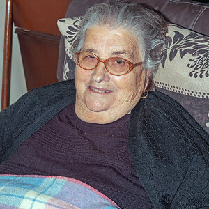
Heather at the Park
- Thread starter chuasam
- Start date
- Joined
- Apr 25, 2016
- Messages
- 11,573
- Reaction score
- 8,747
- Location
- Northeastern Pennsylvania
- Can others edit my Photos
- Photos NOT OK to edit
Number 2 is my personal choice for lighting effects.
- Joined
- Jun 23, 2015
- Messages
- 8,524
- Reaction score
- 6,427
- Location
- Petawawa, Ontario
- Website
- www.trevorbaldwin.space
- Can others edit my Photos
- Photos NOT OK to edit
Agree. Love #2
Granddad
Been spending a lot of time on here!
- Joined
- Jun 22, 2011
- Messages
- 2,271
- Reaction score
- 1,333
- Location
- Lincoln, England
- Can others edit my Photos
- Photos OK to edit
I like 2 but I like 3, too. However, the problem with mirrored sunglasses is brought to the fore - there's this bloke with a camera very obviously reflected and once seen I can't unsee him.
The only time I shot my wife in mirrored sunglasses I was able to photoshop myself out.")
The only time I shot my wife in mirrored sunglasses I was able to photoshop myself out.
OP
OP
chuasam
Been spending a lot of time on here!
- Joined
- Feb 9, 2012
- Messages
- 3,588
- Reaction score
- 928
- Can others edit my Photos
- Photos NOT OK to edit
It's the damn natural leaves reflectors *lol*The greenish tint on her face in the first picture is very interesting, but it makes her teeth a little bit yellow.
FITBMX
Been spending a lot of time on here!
- Joined
- May 11, 2014
- Messages
- 3,860
- Reaction score
- 1,423
- Location
- Burns, KS, USA
- Can others edit my Photos
- Photos OK to edit
I like #1, but it is lacking fill light and catch light in her eyes would make it really great!
The second one is the best of the set as they are.
The second one is the best of the set as they are.
Trever1t
Been spending a lot of time on here!
- Joined
- Dec 30, 2010
- Messages
- 9,331
- Reaction score
- 2,722
- Location
- San Jose, CA
- Website
- wsgphotography.com
- Can others edit my Photos
- Photos NOT OK to edit
Well my thoughts;
Why shoot landscape orientation for these? It's the first thing that hits me, she's cropped awkwardly, centered in LS. Try using "portrait" orientation for a portrait UNLESS there's some story in the surroundings you want to tell, and then place your prime subject to one side (rule of thirds).
She's lovely and I can tell very comfortable with you, so that's a huge advantage, use it. The reflector helped but the background did too, look at that and take note!
I kinda like the B&W except for the crop. Go back and shoot with her again, Portrait for portrait, choose your BG carefully, leave roomin your frame to allow for post crop if necessary.
Derrel
Mr. Rain Cloud
- Joined
- Jul 23, 2009
- Messages
- 48,225
- Reaction score
- 18,941
- Location
- USA
- Website
- www.pbase.com
- Can others edit my Photos
- Photos OK to edit
Well my thoughts;
Why shoot landscape orientation for these? It's the first thing that hits me, she's cropped awkwardly, centered in LS. Try using "portrait" orientation for a portrait UNLESS there's some story in the surroundings you want to tell, and then place your prime subject to one side (rule of thirds).
She's lovely and I can tell very comfortable with you, so that's a huge advantage, use it. The reflector helped but the background did too, look at that and take note!
I kinda like the B&W except for the crop. Go back and shoot with her again, Portrait for portrait, choose your BG carefully, leave roomin your frame to allow for post crop if necessary.
Speaking of horizontal framing--what the heck happened with shot number one? She is riding soooooo low in the frame, it makes absolutely no sense whatsoever...just a simply awful framing decision...the top space above her head is as much as the distance from her eyebrows to the bottom of her chin,and the bottom of the chin is very low. The top of the head to bottom of the eye is 3 inches, from the same eye to the eye to the bottom of the frame is 2 and 15/16 inches...this is just...awful framing and composing The green skin could also use a major dose of color correction thrown at it.
As Trevor1t asked, "Why shoot landscape orientation for these?" This 30% person, 70% out of focus dead space background just looks very snapshot-like, but the long lens and blown-out background doesn't fit in to that at all.
OP
OP
chuasam
Been spending a lot of time on here!
- Joined
- Feb 9, 2012
- Messages
- 3,588
- Reaction score
- 928
- Can others edit my Photos
- Photos NOT OK to edit
artistic decision, I'm trying to make the landscape orientation work.Well my thoughts;
Why shoot landscape orientation for these? It's the first thing that hits me, she's cropped awkwardly, centered in LS. Try using "portrait" orientation for a portrait UNLESS there's some story in the surroundings you want to tell, and then place your prime subject to one side (rule of thirds).
She's lovely and I can tell very comfortable with you, so that's a huge advantage, use it. The reflector helped but the background did too, look at that and take note!
I kinda like the B&W except for the crop. Go back and shoot with her again, Portrait for portrait, choose your BG carefully, leave roomin your frame to allow for post crop if necessary.
Speaking of horizontal framing--what the heck happened with shot number one? She is riding soooooo low in the frame, it makes absolutely no sense whatsoever...just a simply awful framing decision...the top space above her head is as much as the distance from her eyebrows to the bottom of her chin,and the bottom of the chin is very low. The top of the head to bottom of the eye is 3 inches, from the same eye to the eye to the bottom of the frame is 2 and 15/16 inches...this is just...awful framing and composing The green skin could also use a major dose of color correction thrown at it.
As Trevor1t asked, "Why shoot landscape orientation for these?" This 30% person, 70% out of focus dead space background just looks very snapshot-like, but the long lens and blown-out background doesn't fit in to that at all.
I do admit that it didn't work to well for the first image.
I did an earlier shoot with her entirely in portrait orientation and I wanted to try something different.
I hate the boredom of following rules and making sure images are all sharp and blah blah
Derrel
Mr. Rain Cloud
- Joined
- Jul 23, 2009
- Messages
- 48,225
- Reaction score
- 18,941
- Location
- USA
- Website
- www.pbase.com
- Can others edit my Photos
- Photos OK to edit
It's not "rules" I am talking aboout, it's just basic compositional concepts like the elements and principles of design that have been around for a couple thousand years. Things like using the frame's space effectively, line of gaze, short side of frame, balance,contrast, harmony, dominance, unity/dissonance, and like line,shape,mass,texture,hue,value, repetition, dissonance, harmony, and so on...
It's good to experiment, but the elements and principles of design never "go away" and we can not re-invent new concepts to replace them. I get what you're saying.
When you said that #1's landscape orientation did not work, what issues do you think prevented it from working?
This entire issue is fraught with the chance for hurt feelings, and misunderstandings. I spent years in group C&C sessions where a fine art professor and 20 to 25 students would all evaluate the photos each of us shot in group C&C sessions. Much more brutal than anything I've ever seen here on TPF. I hate to bring up the idea of the elements and principles of design, but some of the experiments you mention have been done before by tens of thousands of people who are working mostly off of the idea that a rule of thirds placement can create exciting images, but when in reality what it sometimes leads to is extremely un-balanced compositions, with a high degree of tension, such as when the eyes are placed off to the outer thirds of an image, and the line of gaze goes to the short side of the frame, and then the subject is off-balance, causing dissonance, tension, and an unpleasant feeling in the human brain. If the desired goal is dissonance and a feeling of imbalance, then that is a GOOD result!
I see this idea being explored in shots #1 and #5 most especially. In both, the eye direction/line of gaze is present with short-side tension, and imbalanced placement of the subject within the total frame area.
Last edited:
Most reactions
-
 472
472 -
 328
328 -
 325
325 -
 296
296 -
 287
287 -
 233
233 -
 219
219 -
 192
192 -
 176
176 -
 171
171 -
 146
146 -
 144
144 -
 139
139 -
 120
120 -
 110
110


![[No title]](/data/xfmg/thumbnail/37/37628-b854997825aadb4eedaa3247baf8069f.jpg?1619738155)