What's new

Helen - Maternity 5/5/13 - Part 1

jowensphoto

Been spending a lot of time on here!
Joined
Feb 28, 2011
Messages
2,983
Reaction score
906
Location
Northern Viriginia, US
Can others edit my Photos
Photos NOT OK to edit
So as not to completely photobomb/overwhelm you all, I'm breaking this into two parts. The second set will be much different, so that isalso part of the reason for separating the two. I'm kind of in love with these, though I know the processing is pretty heavy and not for everyone.

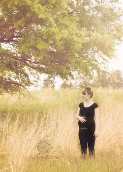
1. $_MG_6069 copy.webp
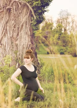

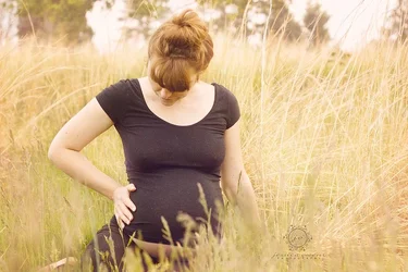
2. $_MG_6085 copy.webp


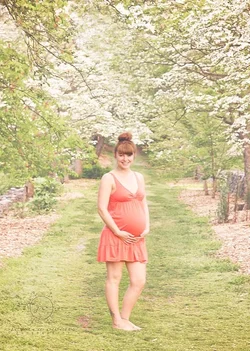
3. $_MG_6099 copy.webp


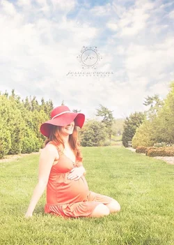
4. $_MG_6115 copy.webp


5. $_MG_6144 copy.webp


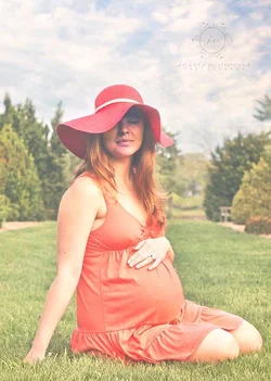
6. $_MG_6148 copy.webp <-- my FAVORITE :heart:. I absolutely love this shot, but can't figure out the best way to remove/lessen the red color cast on her face (damn that cute hat!). Any advice on this is much appreciated.


Probably too much for in depth C&C, but general feedback is always appreciated :)
 
I quite like these.. 1 and 5 are my favs! I don't mind the processing so much.. but in the last I feel like it does strange things to her face under the hat and it just doesn't work on that image IMO. And I'd fix her nipples in 3.. lol
 
General remarks: Not everyone loves the out of focus foreground grass. I am on the record as loving it, but even I find it tends to give a slightly voyeuristic feel. Also, nipples all over the place. Very appropriate and real, if you're that sort. It's very motherhood, organic, good stuff. I personally find it perfectly ok, but again, mileage may vary.

I am not personally in love with the misty look, but it's a thing and it's obviously deliberate, so I will shut up about that now.

#2, most especially small, makes it blindingly obvious that you've applied some sort of selective mistiness effect. She really POPS OUT to the extent that she looks composited in. I would revisit this one and blend a little more carefully. Consult #3 which, to my eye, hit it just about perfectly.

#6 is excellent. Getting those ecstatic meditative looks is pretty much the point of maternity, to my way of thinking. The red cast doesn't bother me much, but I see what you're worried about. I'd fool about with layers with masks to get a slight color adjustment on her face, blended out with the rest. I do this a lot:

- duplicate layer
- adjust the duplicate to "at least far enough, maybe more" (in this case, adjust colors until the face is right, let the rest go where it may)
- draw a mask as best I can (so only the face, or even the forehead, is taken from the adjusted layer)
- gaussian blur the MASK for good blending
- adjust transparency of the duplicate layer to taste, until it looks convincing

Set it aside and look at it again tomorrow. Re-adjust transparency.
 
It was very cold that morning, so yeah... Lots of nipplage. And pregnancy... You know.

I totally agree about the voyeuristic nature of that use of DOF. It can come off as creepy, but I think it works in this one. She has her head turned like she heard something, and I kind of dig it in this one. Glad you're a fan as well!

animolitor- in all the photos with the black outfit, the processing did weird things to the black. I attempted to correct by burning, and I can see (even on my iPhone) that I over did it in that one. I didn't read the part of correcting the cast, but I will once I'm back at the computer and can put your suggestion into action. The misty-ness is a bit heavy, I may revisit the method of creating the effect and change it up.

appreciate the feedback!
 
Last edited:
I quite like these.. 1 and 5 are my favs! I don't mind the processing so much.. but in the last I feel like it does strange things to her face under the hat and it just doesn't work on that image IMO. And I'd fix her nipples in 3.. lol

Thank you! I'm going to work on the color cast, using the method suggested on a layer above the original background layer. I don't think the processing caused the weird cast, only exaserbated what was already there.

glad you like them! I really like 1 and 5 too. The only one I'm on the fence about love/only like is 4. It's cute, but idk if it fits. Although! I just started using PASS and the way it organized the photos in the gallery makes it fit somehow. If you aren't familiar with the site, here's a link to the gallery: jessowensphotography.pass.us/helensmaternitygallery
 
Okay Jess, I just got to point out that in the first one, she has this HUGH tree growing out of her head and back. Is that a counter balance to the baby weight in front??

(please take this as the joke it's intended.)

Good set.
 
I have a hell of a time with the blacks whenever I am going for a "light, airy" look or whatever too. Either it's just plain hard, or we're both disabled in the same way!
 
Yay! So glad you used the words light and airy! That is EXACTLY what I wanted. That was what I told her in our consultation so that's what she is expecting (no pun intended).
 
Ron- my one gripe with that photo is that she isn't on the other side of the tree. It's heavy the way it is, not because of the belly, lol but because of the overall composition.

Thanks!
 
Ron- my one gripe with that photo is that she isn't on the other side of the tree. It's heavy the way it is, not because of the belly, lol but because of the overall composition.

Thanks!

Are you meaning where there is more of the tree than the field behind her? Not sure how I feel about that, I like the field back there. Although with her looking in the opposite direction, it is a little tight to wonder what she is looking at.
 
Overall, I find that she isn't enough of a presence in the images; they're a nice set (I'm not overly fond of the processing in the orange top ones, but that's a personal feeling, and I understand it's the fashion). I would like to see her be made more the centre in at least some of them. #6 looks like it could have been cut out of a 1978 Eaton's catalogue.
 
Black clothing does not go well with light and airy...it is the very antithesis of "light", and it's claustrophobic (tombs, caves, tunnels), and not airy...and, when gaussian blurs or under-enlarger diffusion is used, the black tones and colors look...weird.

Anyway, overall I like the faded/vintage look on the majority of these. Except the one that does stand out kind of oddly. These have a look, a feel, that I think she ought to like.
 
I quite like these.. 1 and 5 are my favs! I don't mind the processing so much.. but in the last I feel like it does strange things to her face under the hat and it just doesn't work on that image IMO. And I'd fix her nipples in 3.. lol

Thank you! I'm going to work on the color cast, using the method suggested on a layer above the original background layer. I don't think the processing caused the weird cast, only exaserbated what was already there.

glad you like them! I really like 1 and 5 too. The only one I'm on the fence about love/only like is 4. It's cute, but idk if it fits. Although! I just started using PASS and the way it organized the photos in the gallery makes it fit somehow. If you aren't familiar with the site, here's a link to the gallery: jessowensphotography.pass.us/helensmaternitygallery

Ok, so sold on PASS. TY for sharing!! Too cool.
 
I like the exposure/processing on the first three better than the second three. 4, 5 and 6 look washed out, maybe even a little "hot" as far as lighting goes. (especially #5) more-so than appeals to my tastes anyway. (i realize that's a style) im also not a fan of the hat covering her face. she is too pretty to cover up.

I like #1, though i might have liked it more if she were a foot or so to the right of the tree. her hand placements DO look a bit "off" to me though, and her left hand is blurred. she kinda looks like she was distracted by something off camera when you took the picture.
the black in #2 looks much more "black" than in 1 and 3. almost looks like she was layered in. I don't think she fills enough of the frame.
I like the foreground grass better in #3 than in #1. i think it works better for this photo. you can tell it was cold though. I think for this shot i would have liked it a little better if she had both hands on her belly since she is looking down at it.

my personal picks for this set are #4 and #6. (the pose is great on #6, as is her expression)
 
My favorites are 4 & 6. I don't mind the processing too much. It does seem that #6 has more than 4 and I prefer 4's processing. #6 captured a beautiful expression.
 

Create an account or login to comment

You must be a member in order to leave a comment

Create account

Create an account on our community. It's easy!

Log in

Already have an account? Log in here.

Back
Top Bottom