What's new

Help, I suck at nature.

manaheim

Jedi Bunnywabbit
Staff member
Supporting Member 📸
Joined
Sep 2, 2005
Messages
14,457
Reaction score
3,329
Can others edit my Photos
Photos OK to edit
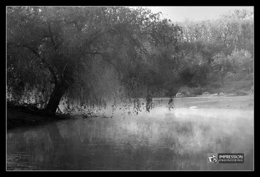
I see stuff like this and I'm always entranced by it, but I can never seem to make it work in a picture. Help! :lol:

==1==
Steamy%20Pond%20in%20Littleton%20-%20002.jpg


==2==
Steamy%20Pond%20in%20Littleton%20-%20006.jpg
 
Mists imply mystery. In the second image, the bright sky just kills it for me. If you want to emphasize the mist, you need to deepen the shadows, while still keeping the mist in the upper range of tonality.
 
Interesting B&W. Personally, I wouldn't mind seeing a colour shot as well. The problem with the first one, as I see it, is that the mid-ground tree, to the left, blends in with the background, suggesting that there isn't enough contrast to make the image "pop". It also suggests to me that this may be one of those shots that just doesn't make a good conversion to B&W - not every image does. My 0.02¢ FWIW.
__________________
WesternGuy

 
Compositionally they look good, I agree darkening the sky, shadows will enhance the 'glow' of the fog.
 
It also suggests to me that this may be one of those shots that just doesn't make a good conversion to B&W - not every image does. My 0.02¢ FWIW.

I agree. Looking at the first photo I find the composition rather pleasing but am not real thrilled with the B&W.
 
Just a thought:

$Edited_1.webp

Mark
 
Oops. Double post.

But, the above is simply a levels adjustment.

Mark
 
I think they are a little light in the contrast department...
 
Do you have a color version? I think this is mostly a b/w conversion issue.
 
The first thing I noticed, was that it was rather grey. Whilst grey and low key might have been what you were going for, I think that enhancing the mist more would help. See markw's edit, that's a huge improvement, right there :)
 
Im going to agree with the contrast. Nice scene though mana.
 
  • Thread Starter 🔹
  • Moderator 🛠️
  • #14
ooo, you guys nailed it. Mark, nice job on the levels. WAY better. There's still something about it that bothers me, though... I think it's something scrubby about the tree itself. It's just not a really nice tree... it's kinda "ok".

I suppose I could swing it the other way and try to go for a mega creepy shot later at night or something.

I did a quick edit and put up a color version... but actually... I kinda don't like this edit either. Something with this image is really throwing me off. I think it's because it doesn't have any people or buildings in it. All that green stuff. Sheesh. :lol:

Steamy%20Pond%20in%20Littleton%20-%20002%20color.jpg
 
I looked at this before, and at first thought that it was crooked - if you look at the back of the pond, there isn't much visual separation between the water and the grassed slope behind. That throws me off, it's unsettling.

Other than that, the B&W version is very pleasing, I love the mood of it.
 

Create an account or login to comment

You must be a member in order to leave a comment

Create account

Create an account on our community. It's easy!

Log in

Already have an account? Log in here.

Back
Top Bottom