You are using an out of date browser. It may not display this or other websites correctly.
You should upgrade or use an alternative browser.
You should upgrade or use an alternative browser.
Help settle a disagreement!
- Thread Starter Cheex
- Start date
WesternGuy
Been spending a lot of time on here!
- Joined
- Dec 23, 2010
- Messages
- 5,281
- Reaction score
- 1,219
- Location
- Calgary, Alberta, Canada
- Can others edit my Photos
- Photos NOT OK to edit
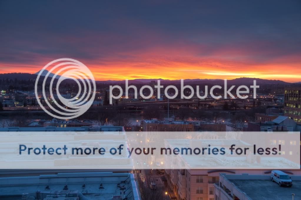
Hard to say, I tend to like number 2 better for the colour in the sky, but the foreground is so cluttered.
Cheers,
WesternGuy
Cheers,
WesternGuy
davesnothere11
TPF Noob!
- Joined
- Dec 21, 2011
- Messages
- 289
- Reaction score
- 46
- Location
- Alaska
- Can others edit my Photos
- Photos OK to edit
#1 is better IMO but overall way to much clutter my eyes bounce around the roof tops with no where to rest.
hydkaran420
TPF Noob!
- Joined
- Aug 24, 2011
- Messages
- 91
- Reaction score
- 4
- Location
- Hyderabad, India.
- Can others edit my Photos
- Photos OK to edit
I go with #2 but don't know why.
Netskimmer
No longer a newbie, moving up!
- Joined
- Jul 23, 2009
- Messages
- 1,392
- Reaction score
- 229
- Location
- North Carolina
- Can others edit my Photos
- Photos OK to edit
I like #1. The colors in the sky are much deeper and richer and the sunset isn't competing as much with the cluttered cityscape below.
EchoingWhisper
TPF Noob!
- Joined
- Aug 12, 2011
- Messages
- 1,553
- Reaction score
- 54
- Location
- Malaysia
- Can others edit my Photos
- Photos OK to edit
I prefer 2 but add a bit vibrance/saturation.
Austin Greene
Been spending a lot of time on here!
- Joined
- Jan 6, 2012
- Messages
- 1,472
- Reaction score
- 855
- Location
- Mountain View, California
- Can others edit my Photos
- Photos NOT OK to edit
Number one for sure. The sky has better colors for a sunset, and the underexposed foreground helps get rid of some of the clutter. Number two just has way too much going on and feels washed out a bit.
naptime
TPF Noob!
- Joined
- Dec 2, 2011
- Messages
- 785
- Reaction score
- 319
- Location
- Toledo, Ohio
- Can others edit my Photos
- Photos OK to edit
i like 1 better, if you chop out all the useless building in the foreground.
they take away the attention from the sunset.
they take away the attention from the sunset.
- Joined
- Dec 11, 2006
- Messages
- 18,743
- Reaction score
- 8,048
- Location
- Mid-Atlantic US
- Can others edit my Photos
- Photos NOT OK to edit
- Banned
- #10
In #2 there are two centers of interest, the street and the sunset and they are separated by a dark band. They aren't connected or related so there isn't much clue what is the real thing you want the viewer to look at.
- Joined
- Oct 4, 2011
- Messages
- 10,726
- Reaction score
- 5,468
- Can others edit my Photos
- Photos OK to edit
- Moderator 🛠️
- #11
I agree that the buildings in the foreground create such clutter in BOTH shots that it's highly distracting.
I prefer the colors of the sunset/sunrise in the first, but if it were my photo, I'd crop out those buildings in the foreground, and make the whole photo a longer, narrower ratio.
I prefer the colors of the sunset/sunrise in the first, but if it were my photo, I'd crop out those buildings in the foreground, and make the whole photo a longer, narrower ratio.
Joey_Ricard
TPF Noob!
- Joined
- Dec 22, 2011
- Messages
- 672
- Reaction score
- 69
- Location
- West Virginia
- Can others edit my Photos
- Photos NOT OK to edit
i like 1 better, if you chop out all the useless building in the foreground.
they take away the attention from the sunset.
Agreed, that processing (shadow & highlight tool, HDR or whatever) does not look good.
Remember, in photography you have to have highlights and shadows, lights and darks to bring out emotion or character in a scene.
Not everything has to be overdone to convey an emotion or scene.
xj0hnx
No longer a newbie, moving up!
- Joined
- Jan 12, 2012
- Messages
- 345
- Reaction score
- 74
- Location
- Corpus Christi, TX
- Can others edit my Photos
- Photos OK to edit
#1 Hands down. The color in the sky is beautiful, #2 the colors in the sky too weak, and the lower half is cluttered.
Sonoma
No longer a newbie, moving up!
- Joined
- Aug 9, 2010
- Messages
- 350
- Reaction score
- 36
- Location
- NW Indiana
- Can others edit my Photos
- Photos OK to edit
I'll go with #1 also. It could have been even a little darker to obscure the buildings in the foreground. Fewer distractions.
Similar threads
- Replies
- 1
- Views
- 101
- Replies
- 10
- Views
- 459


![[No title]](/data/xfmg/thumbnail/34/34693-68d7ff80dc154cec1604c718d5434ecd.jpg?1734165700)


![[No title]](/data/xfmg/thumbnail/31/31979-ea92aca54ae865842d998c9cec534991.jpg?1734160756)


![[No title]](/data/xfmg/thumbnail/42/42492-60144191c917c21139f8acd72f6ba090.jpg?1734177011)