What's new

Help w/ new show opportunity!!

mishele

Moderator
Staff member
Supporting Member 📸
Joined
Jun 19, 2009
Messages
13,661
Reaction score
4,898
Location
In your dreams!
Can others edit my Photos
Photos OK to edit
I have a exciting Juried Art Show opporunity in my area. The show is all about Fashion. One of the jurors was a designer on Project Runway. She designs her clothes from the inspiration she gets from art......=)
I kinda have narrowed down my shots a little but I am still struggling on the 3 shots to submit. So if you can put on your thinking caps and think fashion/art for me........which could you see working in this type of show. Any feed back about why you would think it would work or wouldn't work would be interesting also.

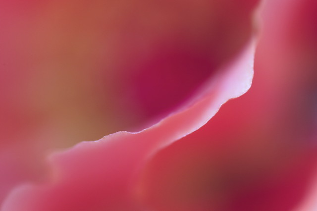
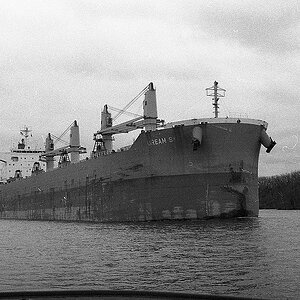
1.
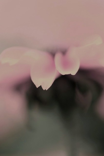
4745153907_411c890989_z.jpg

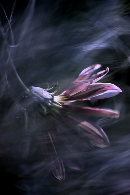
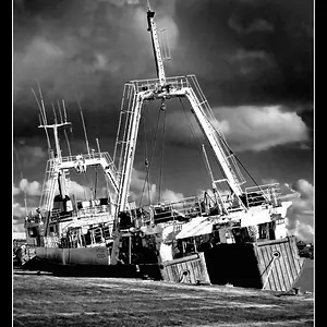
2.
4745153975_04906d4de7_z.jpg

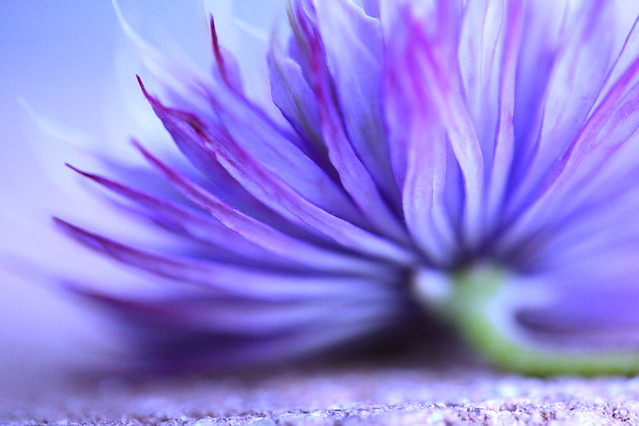
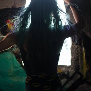
3.
5822774382_175f7c6597_z.jpg

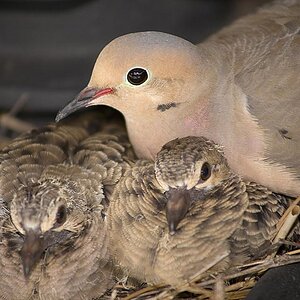
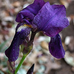
4.
4684118156_7af4a330e1_z.jpg


<Disclaimer.....I know I am the artist and I will be the one picking what I want entered =).....just thought this would be neat to open up for dialog>
 
Mish,

My vote is 2, 3 and 4. The first one doesn't do anything for me. Btw still haven't forgotten about the order :D

Hope you get your kick @ss photos on their designs!
 
In order of their strength (IMO): 3 (Outstanding!), 1, and 2. #4 would be a winner I think, but the green stem coming out into the foreground really kills it for me. Good luck!
 
Yeah amongst the set, 3 is probably the conversational piece.
 
1 feels muddy to me. LOVE some of your abstract flower stuff! Good luck!

For ART I really love #2, The movement through the image is beautiful, the crisp edges against the soft blur gives you a great contrast... It's a beautiful image.
 
#1 doesn't work for me either. #2 is almost a little too busy to be minimalist - good shot, but I can't help wondering if it could be better. #'s 3 & 4 are terrific, although in #4 I might crop or blur the in-focus foreground along the bottom of the frame.
 
  • Thread Starter 🔹
  • Moderator 🛠️
  • #8
#1 doesn't work for me either. #2 is almost a little too busy to be minimalist - good shot, but I can't help wondering if it could be better. #'s 3 & 4 are terrific, although in #4 I might crop or blur the in-focus foreground along the bottom of the frame.
I do have a edited version of shot #4 w/ the foreground blurred. I just haven't updated the shot on flickr yet.
 
Composition in #1 and 2 is not quiet strong enough for a juried show. And #1 is a bit muddy. Personally, 3 is a little over edited but that depends on what kind of show you're entering it into. It would be perfect for some shows, but not all. #4 is the strongest in my opinion in terms of technique, but it might not be the most creative. #3 translates well into fashion, and is a lot more unique than others. So perhaps you would have the most success with that one.
 
OMG! I love #3!!!!

...after that I can only say #4

Good luck, toots!
 
  • Thread Starter 🔹
  • Moderator 🛠️
  • #11
OMG! I love #3!!!!

...after that I can only say #4

Good luck, toots!

Bitter you know my work......are there any of my shots that you think would work better in this type of show? I have other shots that are also in the running......just didn't want to post 10 shots...lol
Camz....same w/ you. =)
It's very interesting to see people's reactions on some of the shots.....=)
 
Is there a website online that gives an overview about the contest? i would really need to see this to give the best feed back regarding possible submissions.
 
1, 2 and 3. 4 is boring to me.
 

Create an account or login to comment

You must be a member in order to leave a comment

Create account

Create an account on our community. It's easy!

Log in

Already have an account? Log in here.

Back
Top Bottom