Just a sidenote for future reference: spaces in between the photos, and numbered photos when the count gets above three is VERY helpful for others when trying to refer to photos and C&C!
That being said, here's my two cents:
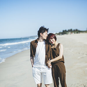
1. Nice experimentation with the long exposures, but the water and top center contains quite a few highlights. I would have used portrait instead of landscape, though.
2. Interesting composition, and nice exposure, in my opinion. Also, nice use of bokeh.
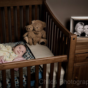
3. Once again, way too many highlights here, but nice idea with the baby. I would have probably composed it differently so that the baby wasn't dead centre, though.
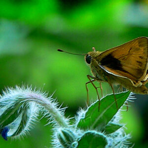
4. Subject, again, is dead centre, but nice capture with the detail of the web. I would have gotten closer and left out the leaves at the bottom. Also, if you wait until it's misty or early morning, web shots can become stunning!
i think with the creek, the tilt doesn't work at that angle. .. Agree .. thank you never actually noticed that ..hrmm
the flower shot is good, but feels a little out of focus, even though its not. That is my favorite thing about that pic .. your eyes keep trying to bring it into focus lol
the baby shot is my favorite. My wife is all smiles now
a closer shot on the spider would have made it stronger. I do have the pic in HUGE format so you can zoom in and see the hairs on his back .. the forum asks for smaller pix and I wanted to show the "whole" shot so to speak ..
#1 - I agree with the tilt, doesn't really work
#2 - Nice shot but composition is uninspiring
#3 - Agree with blown highlights and it scares the crap out of me. I've seen too many people flip and fall out of those things. Also would have gone tighter - surroundings don't add to the picture.
#4 - Doesn't excite me, but very sharp with buttery bokeh. That's some nice glass, whatever it is.


")
![[No title]](/data/xfmg/thumbnail/39/39290-dfb3e819bd94a7f30797638ae1ae27cf.jpg?1619738958)

![[No title]](/data/xfmg/thumbnail/34/34148-864c8cb333c478b2dfb9e369908dc329.jpg?1619736320)