Hi

o_milk

TPF Noob!
Joined
Oct 14, 2007
Messages
35
Reaction score
0
Can others edit my Photos
Photos NOT OK to edit
I'm Federico, 29years old, from Italy.
I began last year takin' photos.
I'm here to show my photos and to learn something about this kind of expression.

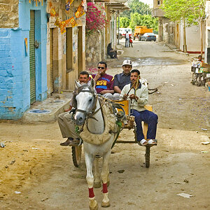
I love street photo in b/w ... so, lets start

466414552_0f0cec1a9a_o.jpg

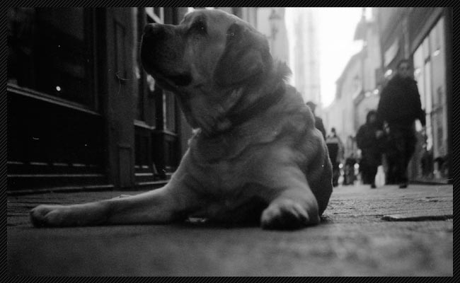
i've placed the camera on the floor ... clic!
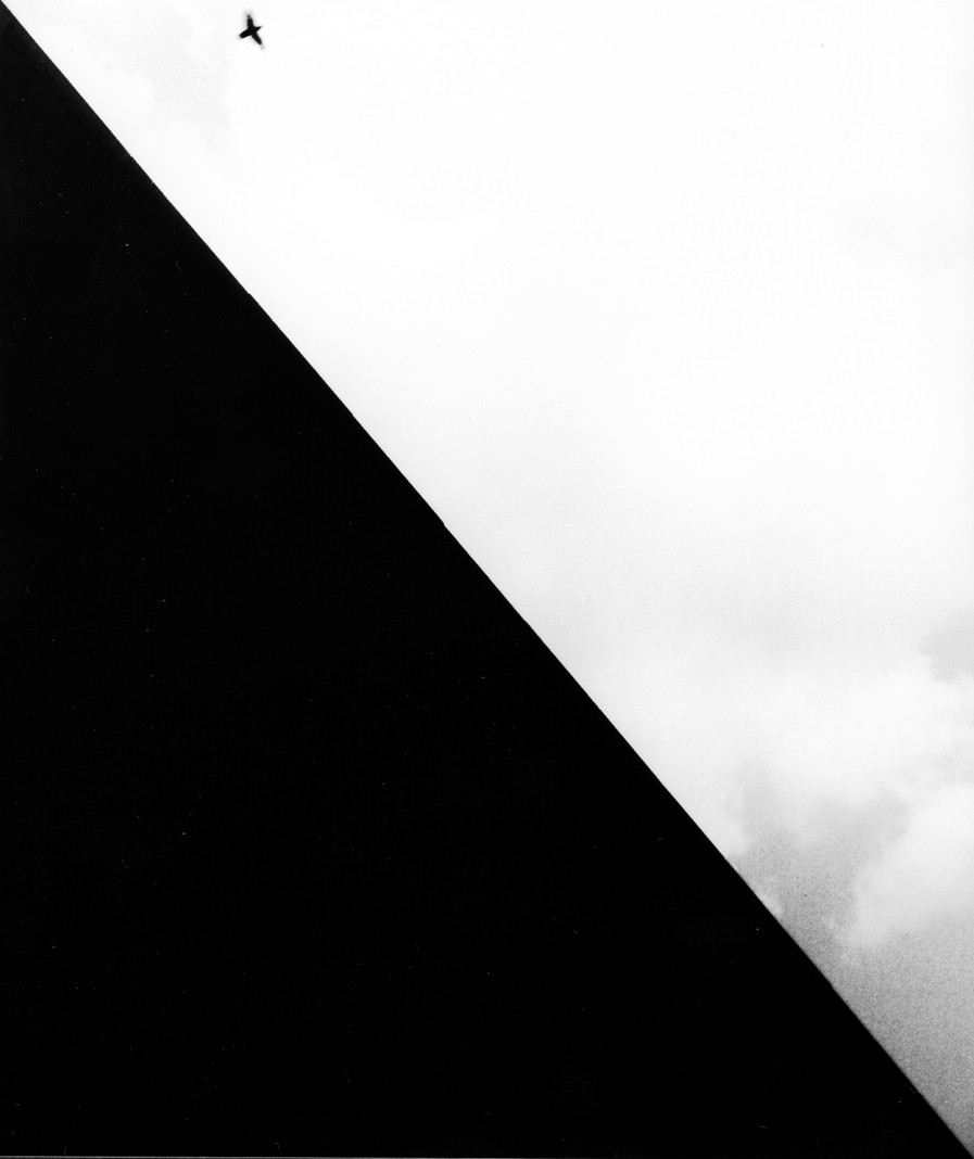
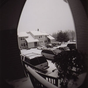
845747254_42019bea7a_o.jpg

behind a wall

So, what do you think about them?
Federico
 
very grainy/noisy...not my type of thing...
The first one is decent, but the second one lacks...well...anything...
 
thanx,
and ... what about the scene?

Federico
 
I like the graininess of the pictures!
 
Hello, and welcome to the forum!!

I like that first one!! I don't mind the "graininess" at all! One thing I'd prefer is to be able to sharpen up the face on the dog....his face is too dark?? Also, the little white spot beside his face is distracting.

Another thing would be that the dog is "floating" too high in the pic.....if you leave some space above him it will lead us to wonder what it is he is looking up at!!!

With those changes I think it would be an awesome pic!!! ;O)

I don't care for the second one....not much to it....

Just my opinions! :O)
 
First one:

Tilt the angle of the lens up. There (IMHO) is way too much ground which is useless space in the photo. There isnt enough going on there to allow it to take up such a large percentage of the active space. Also, could be a touch brighter. You hit black, but the sky doesnt quite hit true white. As we all say: a good b&w has all ranges from black to white.

Second one:

My first reaction was "huh"? There really, really is too much of that black wall in it. I thought it was just white and black triangles at first, when I realized there was a small black bird in there too. Honestly, way too much of that whatever-it-is wall in there, and not enough going on. I would toss that one if I were you.

I hope my comments help. Sometimes people take my comments to heart in a negative way, I hope youre not one of those people. We all start somewhere!
 
Agreed about more space above the dog's head on number one. Great expression on the dog's face.

Personally, I love number 2. I love the abstraction and high contrast. One thing that would make this photo more appealing for me was if there was more space around the bird-- like putting space over the dog's head, to give him space to "look," space around the bird would give it somewhere to "fly," in the viewer's imagination.
 
My only complaint some with the second one, unlike the general consensus I like the idea and composition of it. The corner to corner deadness in the image is not something you see everyday and it struck me more than the first. The only thing I would have liked to see different would have been more birds, the solitary bird is really kind of lacking in anything.


But then again one can't really summon a flock of pigeons with a snap of the finger so...
 
i personally like the 2nd one.
First one is cool, but the second does it for me. so simple
 
thanks to everyone,
i hope to take care your comments and to grow up with them.

Federico
 

Most reactions

New Topics

Back
Top