What's new

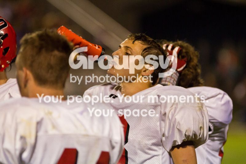
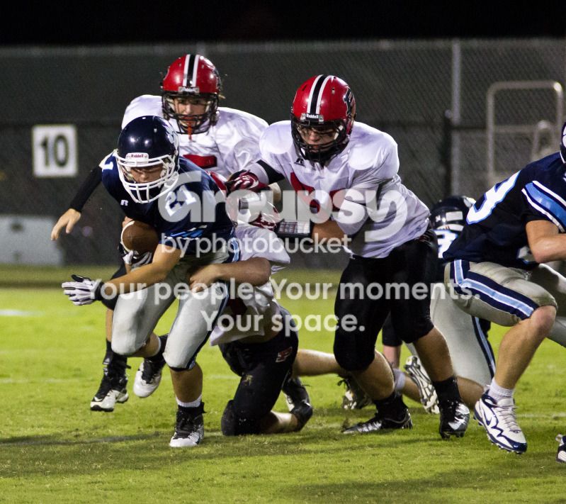
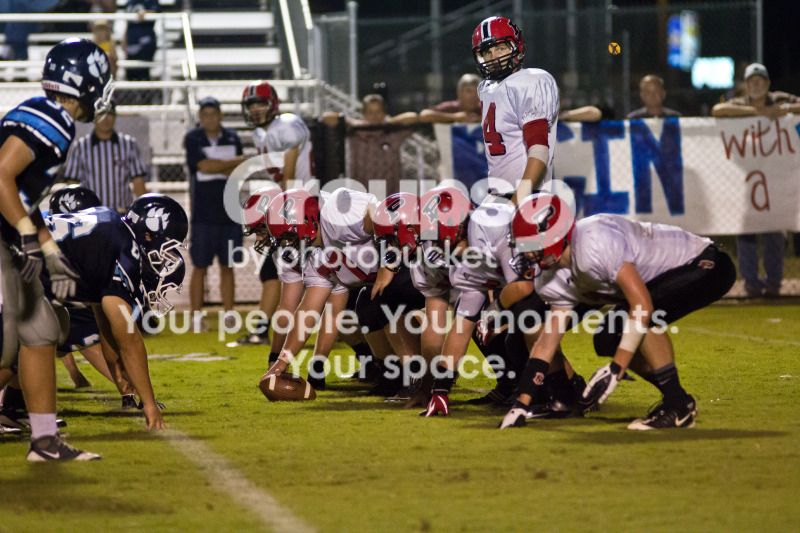
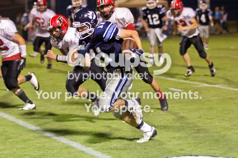
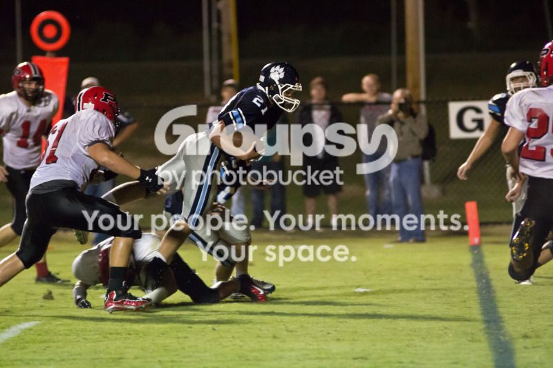
High School Football - 9/14

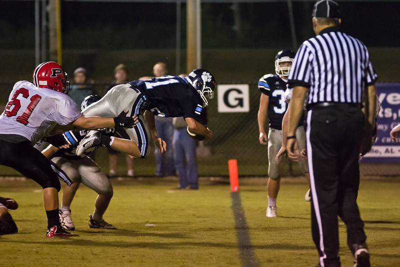
Nice shot, though your white balance is a bit yellow.

Is that Camden County GA? If so, they're so good it's absurd.
 
Not GA. This is Plainview Bears in Rainsville, AL, vs. the Pisgah Eagles. Does this one look a little better?


IMG_88282991 by rob4bama, on Flickr
 
White balance looks better, but the picture is a bit crooked.
 
I'd probably crop everything just to the right of the 'G' out. Would make your subject your prominent and cut out the clutter of the ref and lineman not doing anything.
 
I'd probably crop everything just to the right of the 'G' out. Would make your subject your prominent and cut out the clutter of the ref and lineman not doing anything.

I disagree here. Both the ref and linemen are looking at the subject. So when you look at them, their line of sight leads you back to the subject.
 
I agree with Ballistics ! I have always been told that when you shoot something in motion, from the side, it's usually best leave it some space in the direction of travel so it has "somewhere to go". Always makes my airshow pics look better. And this shot is one heck of an airshow.

EDUB

 
I would crop it to the goal line partly due to the ref's third arm. It bugs me.
 
I agree with Ballistics ! I have always been told that when you shoot something in motion, from the side, it's usually best leave it some space in the direction of travel so it has "somewhere to go". Always makes my airshow pics look better. And this shot is one heck of an airshow.

EDUB

I think in is case you don't need to give the player too much lead because the goal line is a finish point. All the really matters for that player is if he is going to break the plane. The ref and extra players in the frame detract from that struggle.
 
I like it! Sell it as is, and give each buyer a free pair of scissors. Then they can make any 'edit' they feel appropriate. :)
 
The official and the other player are a distraction. They really don't need to be in the photo, it would have much more impact without them.
 
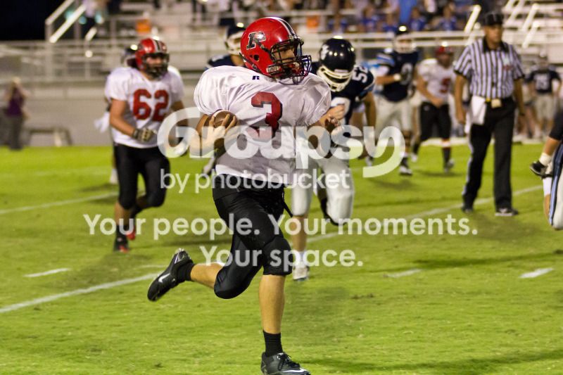
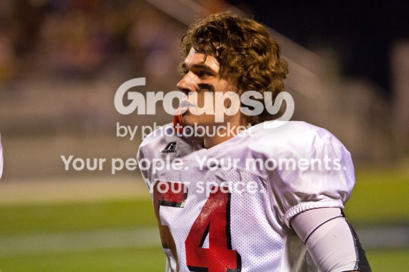
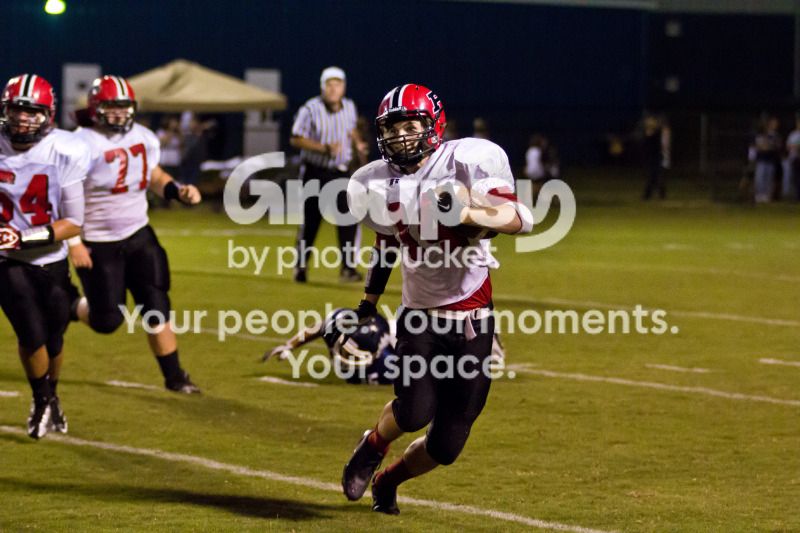
A few images. Feedback, positive or negative, is welcome. I want to get better.

1.
IMG_85552985.jpg


2.
IMG_85312981.jpg


3.
IMG_85892992.jpg


4.
IMG_86172998.jpg


5.
IMG_86533031.jpg


6.
IMG_87103027.jpg


7.
IMG_87783008.jpg


8.
IMG_88273011.jpg
 
white balance on all but 5,7 and 8 seems too yellow
 

Create an account or login to comment

You must be a member in order to leave a comment

Create account

Create an account on our community. It's easy!

Log in

Already have an account? Log in here.

New Topics

Back
Top Bottom