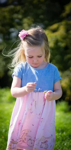
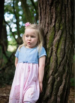
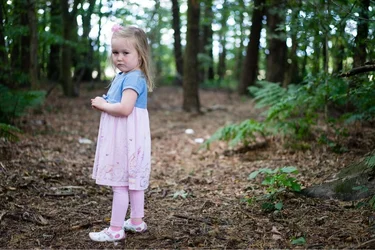
The first one would be much better, from a compositional perspective, if the young lady had been placed at the right third's position (check rule of thirds for placing things in pictures) looking back into the "negative" space on the left side of the image. As it is, all the space on the right side of the image doesn't really contribute to the image. Similar comment on the second image. I would have placed the subject a bit more to the right side of the picture. The third one for me is too closely cropped and I always like to see the subject's eyes. Hope this helps. WesternGuy





![[No title]](/data/xfmg/thumbnail/30/30862-d177ccfc3a82369b1005863cfe5fd13d.jpg?1734158821)





![[No title]](/data/xfmg/thumbnail/30/30861-fee88082ba36d0c3b443492fe3f3f1cd.jpg?1734158818)

![[No title]](/data/xfmg/thumbnail/36/36966-71220579619c9a335442302fce0e57aa.jpg?1734169703)