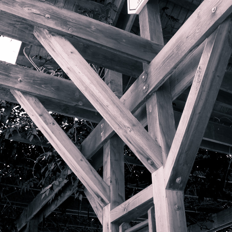
Good idea. Structural components of buildings can have great lines. I think that this image could be improved by abstracting the lines more. Here, I can tell what they are and I see them in context, which makes the image somewhat mundane for me. If you got closer, it would be more abstract, and I think it would work better. For a good example of abstracting something that is fairly mundane, check out Compaq's thread
http://www.thephotoforum.com/forum/...-black-white-set-six-abstract-ish-photos.html.





![[No title]](/data/xfmg/thumbnail/41/41798-aacfc8368463d919cba743fe318706b6.jpg?1734176109)


![[No title]](/data/xfmg/thumbnail/41/41817-4a0d3ed5be8eccb25845bd566e5cd1cb.jpg?1734176131)

![[No title]](/data/xfmg/thumbnail/40/40292-bee9ec3dc0cd7f6c47df7466ae1fa3d2.jpg?1734174705)