Home studio C&C please: Part 2, single OCF.

Desi

No longer a newbie, moving up!
Joined
Sep 28, 2011
Messages
832
Reaction score
378
Location
Los Angeles
Can others edit my Photos
Photos OK to edit
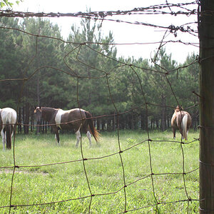
More shots for C&C from the home studio. These are with a single shoot-through at about 4 ft and 45 degrees using a speedlight, and a speedlight +/- gel for the seamless white background.

I'm mainly looking for C&C on the lighting, but will take any I can get.

Thanks,

Desi

1.

DSC_0964.jpg by Javier Descalzi, on Flickr
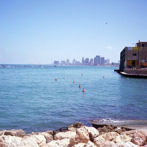
2.

DSC_0916.jpg by Javier Descalzi, on Flickr
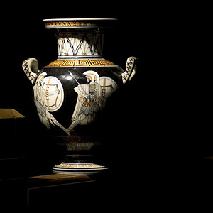
3.

DSC_0832.jpg by Javier Descalzi, on Flickr


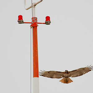
4. (actually, this one has 2 flashes, should have included this in part 1).

DSC_0948.jpg by Javier Descalzi, on Flickr
 
Do you have and use a gray card, or color checker card? Your white balance looks a bit inconsistent.

Everyone's eye sockets seem kind of dark in #4.
 
I think the lighting is nice. It's hard to mess up a shoot thru umbrella.

Number 2 some fill from camera left would help with the shadows. Also getting the umbrella as close as possible will help the light "wrap" around their faces and make shadows less pronounced.
 
Thanks KmH. No, I don't use a gray card. I've been on auto WB, which I believe just defaults to flash when the pop-up is used in commander mode. I've been thinking about the color inconsistencies and figured it was due to the enclosed space that I am working in causing a lot of bounce-back from the background gels.

I guess a gray card is next on my list of things to get.
 
Disclaimer* I am a bit of a noob to lighting. So feel free to disregard anything.

For the first shot. I am not crazy about the positioning of the two subjects. As for the lighting I think a different angle should have been used. It looks like its bringing out undesirable texture in some areas of the subjects. The laugh lines are just slightly exaggerated by the light.

The second photo is my favorite of the bunch. For me the subjects are positioned much better than the first. They also have more emotion and overall is more interesting to me. The lighting looks pretty good. One thing that slightly distracts me is there is a highlight on the woman's laugh line on the left side. The angle doesn't really match up with the angle on the other side which gives me the impression that her face isn't symmetrical. I like the way that the light falls off on the left side of both of their faces. It adds a bit of drama.

The third photo I think has the best lighting. However I am not sure I would shoot a boy on a pink background. It's accentuating the pink tones in his lips and cheeks. Almost like he is wearing makeup. I personally would have done grey to compliment his eyes.

The fourth is pretty good but the boy's head is casting a shadow onto the father's face. Same thing with the woman except I think the shadow is being cast from her hair. I would also dodge the shadows on her laugh lines. They are so dark they almost look like a mustache.

Again I am no expert with lighting. So by all means disregard what I am saying.
 
+1 on the Gray card. I seriously don't know how I ever shot without one. Whether you set custom WB in camera using the gray card, or use it in post (what I prefer, seems more accurate), you pretty much can't mess up! (Also, look into calibrating your monitor if you haven't. You don't HAVE to use expensive tools, though they will be more accurate. You can ballpark it and be better off than not doing anything).

My prefered method is to have the subject hold my gray card in front of their face for the start of each 'set' of shots with the same lighting. Then shoot after that. Then use my editing tool of choice's white balance selector tool, select the gray card in the first photo, and apply the edits to all the photos in the set. Gorgeous color, and consistent color across the board!

I mean who knew a couple bucks could affect your image quality so much?
 
Rhoads238, thanks for the detailed critique. I will pay more attention to the laugh lines in the future. I agree with you on the pink background on the boy. I'm very knew with gels/colored backgrounds.

John27 and KmH: do you use shoot the gray card with each change of background color or just with a change in your main lights.

Thanks for pointing out the white balance issues!!
 
Last edited:
Desi; These are very good!

#1 light is too flat, light appears to be coming from just above the camera position. pose is excellent, however the lady has less light on her face than does the man. Should be the other way around if unequal lighting is chosen.

#2 Pose is fantastic! Lighting is much better, although this shot could benefit from just a little fill flash to ease the shadows.

#3 Very good choices for a young male. lighting, pose, and frame are all very good.

#4 I think the only thing this shot needs is a little fill flash from a second source.

Good job on the gelled background!
 
Designer, thanks for the C&C.

The fella is actually very pale compared to the lady. Definitely a challenge. I didn't think to change the lighting direction to account for this.

I've gotten a lot of good comments on these two threads and I sure appreciate everyone lending a critical eye to my images to see the things I don't see yet.

Thanks everyone.

Desi
 

Most reactions

Back
Top