Desi
No longer a newbie, moving up!
- Joined
- Sep 28, 2011
- Messages
- 832
- Reaction score
- 378
- Location
- Los Angeles
- Can others edit my Photos
- Photos OK to edit
Hi TPF,
I've been off the forum and obsessing over lighting recently. I wonder if you would be kind enough to give me some critique on my lighting (though I'l take any critique).
I've been trying to get the settings down for high-key photos. I'm using two speedlights on a shoot-through about 4 feet from the subject at 45 degrees and one speedlight for the background. White seamless with gel for color.
I'm going to be doing a "breakfast with Santa" shoot for our local twins club. The previous photographer's kids have outgrown the club. The club members know my photography and I am not charging. I've been practicing a lot with my lighting and giving direction on posing. I've had a few friends bring their families over for portrait's to practice with.
I'm planning on sticking with a white background for the Santa shoot, but I am receptive to suggestions if you feel otherwise.
I'll start another thread with shots using a single shoot through.
Desi
1. Riley

DSC_0858.jpg by Javier Descalzi, on Flickr
2. Dawn

DSC_0884.jpg by Javier Descalzi, on Flickr
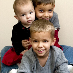
3. Tim's family

DSC_0782.jpg by Javier Descalzi, on Flickr
I've been off the forum and obsessing over lighting recently. I wonder if you would be kind enough to give me some critique on my lighting (though I'l take any critique).
I've been trying to get the settings down for high-key photos. I'm using two speedlights on a shoot-through about 4 feet from the subject at 45 degrees and one speedlight for the background. White seamless with gel for color.
I'm going to be doing a "breakfast with Santa" shoot for our local twins club. The previous photographer's kids have outgrown the club. The club members know my photography and I am not charging. I've been practicing a lot with my lighting and giving direction on posing. I've had a few friends bring their families over for portrait's to practice with.
I'm planning on sticking with a white background for the Santa shoot, but I am receptive to suggestions if you feel otherwise.
I'll start another thread with shots using a single shoot through.
Desi
1. Riley
DSC_0858.jpg by Javier Descalzi, on Flickr
2. Dawn
DSC_0884.jpg by Javier Descalzi, on Flickr
3. Tim's family
DSC_0782.jpg by Javier Descalzi, on Flickr