Guys, thank you all for your comments. That was pretty quick, didn't take long after posting that I got some great comments already! Rather than reply to each of you I'll just add a single reply to several comments here.
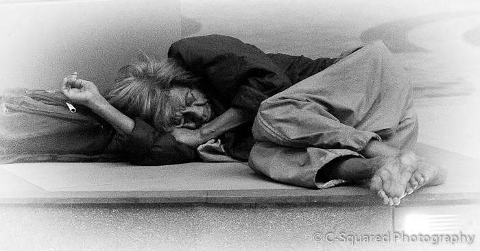
I had to crop the image, and felt it needed some framing. I actually did try a dark vignette first. In fact I started by just barely darkening the corners and outside edges, the way true vignetting actually happens with light falloff on some lenses. So I initially agreed with that sentiment myself, but to my eye it made the whole scene too dark. It seems to lose detail with that perspective, so I went the other way.
Not only is there a little grain, but I also sharpened it more than I would normally for a portrait, to emphasize the harshness of street life. But what I found with the white vignette when I made it larger was that it created a more traditional portrait perspective, with a touch of softness and a surprising sense of beauty that wasn't there without it. The contrast between a soft, even beautiful portrait and the harshness of street life is a real irony to me, and for me its what makes the photo.
But that is just the way I look at, and was taken surprise by what I saw. If others chime in and provide the same feedback that darker would be better, I'll go back and rework it so you can make the comparison for yourself.
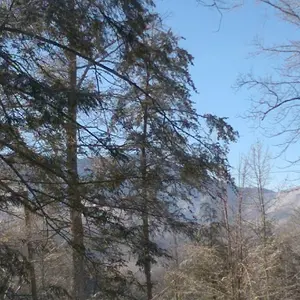
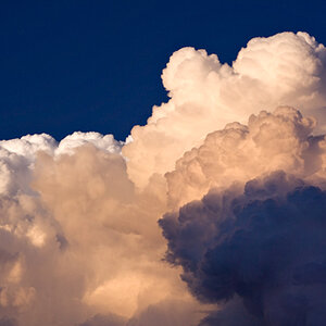
I guess I am making a series of these, its something I've been thinking about. Here's a few more that do have a darker vignette, but I think it works better on these.
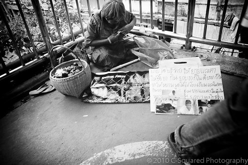 Mark My Space
 by
triangular, on Flickr
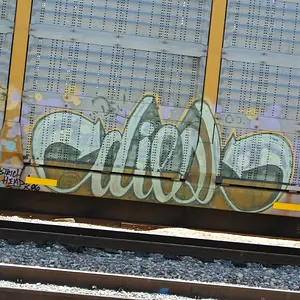
I hope its ok to post a color shot here in the b/w forum since its related:
 Do Not Disturb
 by
triangular, on Flickr
By the way I don't consider these last two to be nearly as striking as the first I posted, they are just examples of where I thought the darker tones really did work better, as a comparison.