Horeseshoe bend and antelope canyon.

cletusjermal

TPF Noob!
Joined
Feb 12, 2010
Messages
296
Reaction score
10
Location
Bossier City La
Can others edit my Photos
Photos OK to edit
C&C

#1
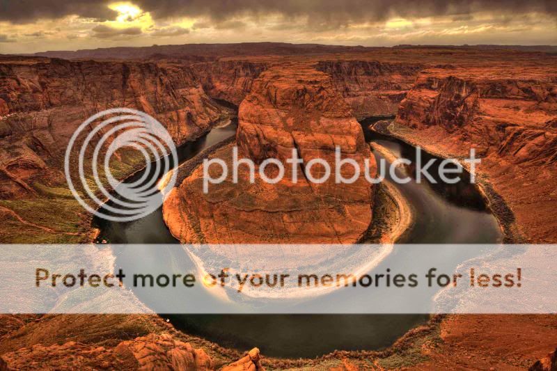
Horseshoebend.jpg


#2
_MG_2841_2_3_4_tonemapped.jpg


#3

_MG_2834_5_6_7_tonemapped.jpg
 
Last edited:
Very nice set. Picture #1 is just outstanding. Of course Mother Nature had a lot to do with it.
 
WB is way off in these.

1 is nice, but again WB
2. really soft focus, did you use HDR?
3. also soft focus

How busy was the antelope? That place really has become a tourist trap over the years.
 
Deliberate orange tone? I've shot at both locations so I know what it really is like. I think it's over done. You are lucky that there's clouds, which adds a lot more interest to the photo. I think you took the shot at the exact same spot as I did! It was quite scary having to stick the camera out of the cliff to get a clear shot.

Antelope canyon wise, I think even as an abstract photo it lacks a "theme". For an example, no.3 is simply too chaotic and doesn't show any rational. No.2 looks a little out of focus. Not sure if that's due to hand shake or mis-focus, or that you forgot to pass it through unsharpen mask.
 
McNugget801 said:
WB is way off in these.

1 is nice, but again WB
2. really soft focus, did you use HDR?
3. also soft focus

How busy was the antelope? That place really has become a tourist trap over the years.

It was pretty busy. There were a bunch of Asian tourist there it was in the middle of the week too. All of them are HDR.
 
molested_cow said:
Deliberate orange tone? I've shot at both locations so I know what it really is like. I think it's over done. You are lucky that there's clouds, which adds a lot more interest to the photo. I think you took the shot at the exact same spot as I did! It was quite scary having to stick the camera out of the cliff to get a clear shot.

Antelope canyon wise, I think even as an abstract photo it lacks a "theme". For an example, no.3 is simply too chaotic and doesn't show any rational. No.2 looks a little out of focus. Not sure if that's due to hand shake or mis-focus, or that you forgot to pass it through unsharpen mask.


I think my screen may be a tad off. On my screen it is more of a red earthy tone then orange. I'll have to check it when I get back home. It is nerve racking getting the shot. I'm fine with heights if there is something to stop me from going over the edge but if there isn't anything kinda gets the nerves going.
 
I like #1 the best but I think it would be better a little lighter. Cool location though!
 

Most reactions

New Topics

Back
Top