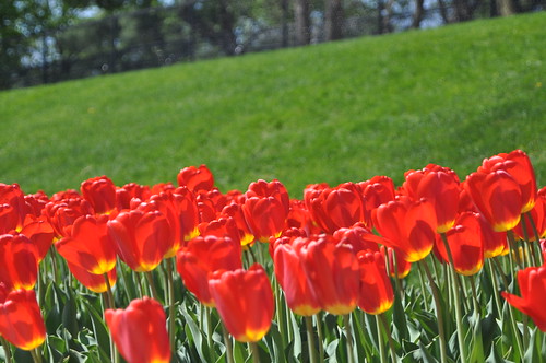
I classify this under the "desktop" category. This came with my computer. It looks so clear, crisp and vibrant. There has to be a multitude of PP put into this photo? Thoughts? It just almost looks fake to me.
It's not my pic so I linked it. I know how people are lol
http://i71.photobucket.com/albums/i125/eric-holmes/Tulips.jpg
Vibrant I can agree with, but not clear and crisp
The very low angle and filled frame totally eliminates background distractions and frames the in-focus subject against a background color (blue) that is the complementary color to yellow, which promotes your feeling of crisp.
The red swoosh provides just the right amount of tension and I would not at all be surprised to discover it was not natural and gently added with a red Sharpie.
Get the book,
The Photographers Eye. Composition and Design For Better Digital Photo's, by Micheal Freeman
He devotes an entire chapter to composing with light and color. A lighting element he discusses that was used to a degree in the image you linked to is called Chiaroscuro, and has been used in art since the the Renaissance, the 14th century or so.
If you think there is much new visual art wise, in photography, study the history of the visual arts some. The vast majority of it has been done before.
Another great book for that and a super valuable investment in your visual arts knowledge is:
[ame="http://www.amazon.com/Living-Art-Mark-Getlein/dp/0073379204/ref=sr_1_2?ie=UTF8&s=books&qid=1271906665&sr=8-2"]Amazon.com: Living with Art (9780073379203): Mark Getlein: Books[/ame]
I highly recommend the new edition, older used editions can be picked up on Amazon for about $10 including shipping.





![[No title]](/data/xfmg/thumbnail/40/40312-7470c3c8f9e3a40e6b44c423096f188d.jpg?1734174718)
![[No title]](/data/xfmg/thumbnail/40/40310-01bec1b9b7918522bf21a09cf75c5266.jpg?1734174717)


![[No title]](/data/xfmg/thumbnail/40/40311-715dda8167abb793178d6abf7e8136fe.jpg?1734174718)

![[No title]](/data/xfmg/thumbnail/35/35870-e324e80cd11d99176357e12cd2ba3b8a.jpg?1734167596)