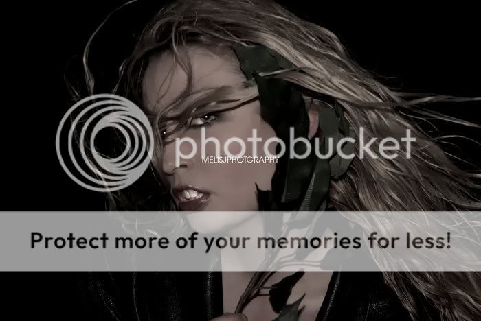
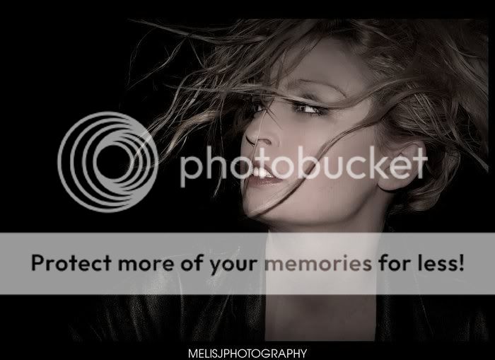
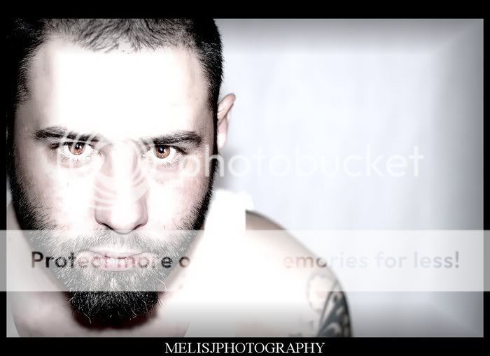
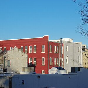
I'm not sure I like the feel of the first three... the first is prolly the one I prefer out of them. I like the pose in that one. #4 is a nice portrait... just try not to blow out the lighter areas. Nice work overall
They look fab - ony thing thats putting me off is the over processed skin - particually in # 2 and 3. Also the teeth seem to be glowing a little in #2.....
i found your label really distracting, but i did enjoy your style. out of the first three i liked the first the best. the last portrait was done well except for a little washout from the brightness
I find one and four to be very well done, but as someone else said, you need to draw the attention away from her teeth, they just are far to distracting, love the poses and pics.