What's new

I will c&c your work for you. Beginners welcomed

Here is one for you.. This is the original (resized obviously).. wanted to see what you can come up with and compare it to what i did to it. This place closed back in the 50's and hasnt seen a broom since. Very dark inside this place as there are only like 4 small windows to allow light. I swear I had been there before but I am not sure.

beforeedit.jpg

good

-interesting room
-great light once the shadows are reduced
-good comp that works well here

nit

-heavy noise from being underexposed (to much for NR software to
remove)

-not very much pixel data left to do any pp because of the underexposure

tweak

-used the midtone slider in (levels) to lighten the photo

-added a blue tint (duotone) to add mood and artistic flare to the photo
(personal choice) most editing software programs have a tint or a hue tool

-lighten (dodge) various areas around the room to add some drama
to the photo

-added a tad of selective USM (sharpening) to just the rocks in the FG as
any more will amplify the noise in the photo

-healed out the bright light coming from the doorway in the far
left as it was a distraction

Hope this helps and thanks for posting.

Take care,
Dwayne Oakes

p862740033-3.jpg
 
Last edited:
Leaning_by_lonewolf025.jpg


Here's one for ya. Appreciate any advice you'd have to offer.

good

-great off center comp
-very good colors
-good DOF
-exposure is right on
-good contrast

nit

-the knot in the center of tree is a bit of a distraction
-photo is tad soft

tweak

-desaturated the colors (global) for artistic flare (personal choice)
-added a tad of selecitve color saturation to just the green shirt
for artistic flare (personal choice)

-lighten (dodge) some of the shadows in the logs

-added a tad of global contrast boost
-added a tad of global USM (sharpening) to get over the AA filter

-healed out the knot in the center of the log and the logo on
the shirt

Hope this helps and thanks for posting.

Take care,
Dwayne Oakes

p571680221-3.jpg

Interesting interpretation. Thanks for the edit and the pointers.
 
I would love to see what you could do with this. This is an awesome and very informative thread.


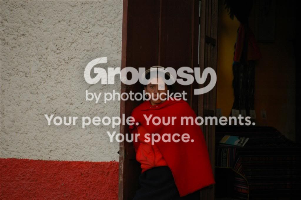
DSC_3926Large.jpg

Wow awesome photo ! Almost looks National Geographic like ! Because
of the documentative nature of this photo I will not add any artistic
flare to the photo and will keep the pp to a minimum (not even heal out)
and will just make the photo technically sound.

good

-great documentative style photo
-great color beside color, red (rare)
-photo tells a story (culture and clothing)

nit

-photo is underexposed by 2/3 Ev (still room left in the histogram)
-subject is placed on center
-photo has a tilt to the right when placed on a grid
-photo is a tad soft (face)

tweak

-straightened the photo

-cropped the photo and placed the subject close to the 1/3 rule

-used the whitepoint slider in (levels) to lighten the photo, which will set
the correct exposure and take up the room still left in the histogram

-added a tad of global contrast
-desaturated the colors a tad (global)

-lighten (dodge) the face a tad
-added a tad of selective USM (sharpennig) to just the face

Hope this helps and thanks for posting.

Take care,
Dwayne Oakes

p263643785-3.jpg
 
Last edited:
If it's not too late to get in on this... appreciate any suggestions.

Waterfront_Wallpaper.jpg


Thanks.

A technically flawless photo ! No additional pp required. Great job !
Has any work been done on this photo ? If not the setup on that
Nikon D90 is awesome, don't change a thing.

Take care,
Dwayne Oakes
 
Dwayne, do you have any recommendations on photoshop books?

Hi mm,

Thanks for the question. Not off the top of my head but what ever book
you choose make sure is has a good detail section on these topics:

1-photography fundamentals and camera controls
2-histogram and clipping
3-dodge and burn
4-composition, rule of thirds

This will give you a strong foundation to build from. Also don't worry
about finding your style, it will find you. Just keep shooting as it will show
up in your work naturally over a good amount of time.

Take care,
Dwayne Oakes
 
If it's not too late to get in on this... appreciate any suggestions.

Waterfront_Wallpaper.jpg


Thanks.

A technically flawless photo ! No additional pp required. Great job !
Has any work been done on this photo ? If not the setup on that
Nikon D90 is awesome, don't change a thing.

Take care,
Dwayne Oakes

Thank you Sir. Some pp done in ACDSee.

Look forward to your threads - they are always a wonderful learning experience.
 
Dwayne,
This is such a great way to learn. I wanted to just say how much this is appreciated. This is the way the entire Beginners section should be. :hug::
 
Dwayne,
This is such a great way to learn. I wanted to just say how much this is appreciated. This is the way the entire Beginners section should be. :hug::

Well thank you very much for the kind words ! I appreciate it !

Take care,
Dwayne Oakes
 
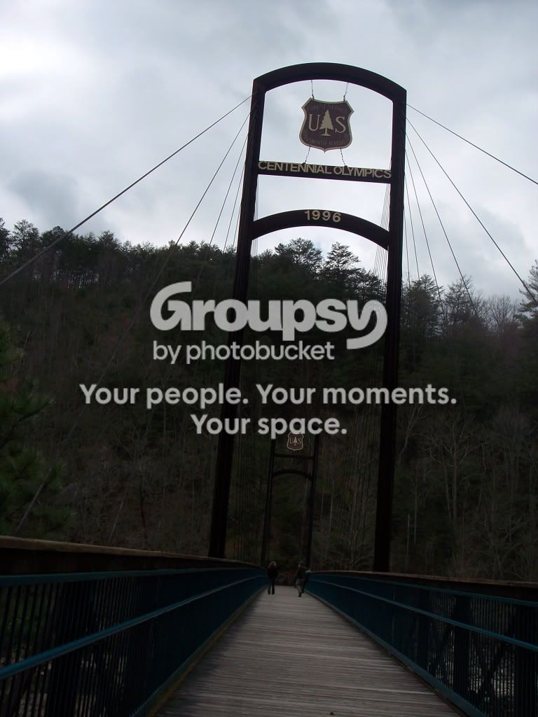
100_4227.jpg

Here's one I'd really like to see done. I've tried but nothing turns out how I like it.

good

-cool bridge
-good comp (good choice for vertical)
-great light coming off the bridge (thats what you want to enhance)
-good DOF
-the people add to the photo

nit

-FG and MG are to dark (camera's meter is being tricked and
metering off the sky) this is actually a good thing because the sky
does not get clipped and you can always lighten the FG and MG by
using the midtone slider in (levels) or lighten (dodge) the dark areas

Note: In the field it is better to slightly underexpose your photos and
then lighten them back up in pp rather than overexpose them and try to
tone the photo down in pp.

Most of my own work I underexpose in the field as the dodge
and burn effect will have more impact if you are starting with
a darker photo in pp.

-photo has a tilt to the right

tweak

-straightened the photo

-darken (burn) the dark areas in the sky
-lighten (dodge) the light areas in the sky

-darken (burn) the bridge's walkway in the FG

-lighten (dodge) midway down the bridge where the people are
-lighten (dodge) some of the areas of the forest in the MG
-lighten (dodge) the farthest US park sign
-lighten (dodge) the railing if the FG

-added a tad of selective color saturation to just the railing in the FG
-added a tad of selecitve contrast to just the railing in the FG

-added a tad of global contrast
-added a tad of global USM (sharpening)

-used the midtone slider in (levels) to set the final exposure

Hope this helps and thanks for posting.

Take care,
Dwayne Oakes

p447632602-4.jpg
 
Last edited:
100_4227.jpg

Here's one I'd really like to see done. I've tried but nothing turns out how I like it.

good

-cool bridge
-good comp (good choice for vertical)
-great light coming off the bridge (thats what you want to enhance)
-good DOF
-the people add to the photo

nit

-FG and MG are to dark (camera's meter is being tricked and
metering off the sky) this is actually a good thing because the sky
does not get clipped and you can always lighten the FG and MG by
using the midtone slider in (levels) or lighten (dodge) the dark areas

Note: In the field it is better to slightly underexpose your photos and
then lighten them back up in pp rather than overexpose them and try to
tone the photo down in pp.

Most of my own work I underexpose in the field as the dodge
and burn effect will have more impact if you are starting with
a darker photo in pp.

-photo has a tilt to the right

tweak

-straightened the photo

-darken (burn) the dark areas in the sky
-lighten (dodge) the light areas in the sky

-darken (burn) the bridge's walkway in the FG

-lighten (dodge) midway down the bridge where the people are
-lighten (dodge) some of the areas of the forest in the MG
-lighten (dodge) the farthest US park sign
-lighten (dodge) the railing if the FG

-added a tad of selective color saturation to just the railing in the FG
-added a tad of selecitve contrast to just the railing in the FG

-added a tad of global contrast
-added a tad of global USM (sharpening)

-used the midtone slider in (levels) to set the final exposure

Hope this helps and thanks for posting.

Take care,
Dwayne Oakes

p447632602-4.jpg

Great work. I under exposed on purpose but had trouble with the PP. You burn and dodge alot more than I've ever thought of doing and it really works well.

Thanks for taking the time on my shot.
 
Hi Dwayne,
I'm new with all this so thought it would be interesting to see what you could do with a photo of mine. I look forward to seeing what you can do. Thanks, Amy

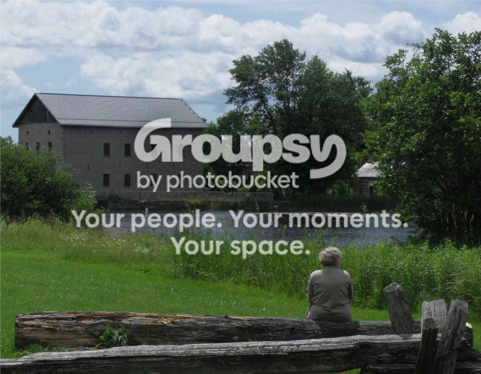
PicsfromAmysCamera146-1.jpg
 
Hi Dwayne,
I'm new with all this so thought it would be interesting to see what you could do with a photo of mine. I look forward to seeing what you can do. Thanks, Amy

PicsfromAmysCamera146-1.jpg

good

-great comp (great spacing and subject placed off center)
-great little nature area
-nice natural colors (greens)
-good DOF
-good contrast
-nice reflected light coming off the pond (this is what you want to enhance)


nit

-photo is a tad dark by 1/3 Ev (still room left in the histogram)
-photo is a tad soft

tweak

-moved the whitepoint slider in (levels) to take up the space still left
in the histogram which will lighten the photo and set the correct exposure

-lighten (dodge) the shadows in the trees (lighten just enough to see some detail)
-lighten (dodge) the reflected light coming off the pond
-lighten (dodge) the tin roof on the building
-lighten (dodge) the left side wall of the building

-darken (burn) the main side (shadow) of the building

-added a tad of global USM (sharpening)

-healed out the sign and post in the pond and the bright wood spot
beside the subject on the right

Hope this helps and thanks for posting.

Take care,
Dwayne Oakes

p636294727-3.jpg
 
Last edited:
If the C and C is still available, I'd like some feedback on this one. I've tried straightening it but it never seems to look right when I do.

IMG_8105.jpg


Thanks.
 
Here is one from me.. Has had some PP already.
img7397newweb.jpg

good

-beautiful model
-good skin tones
-good comp that works well here
-nice old ruins backdrop
-exposure is right on
-very good contrast
-great DOF effect

nit

-the pose is good but the stare does not seem natural, I think
the model looking at the lens would have been a better choice (subjective)

-there are some distractions

1-the stray hair
2-the bright light spot in the top right corner
3-the graffiti on the pillar in the bottom left corner

tweak

-healed out the 3 distractions

-lighten (dodge) the face to add a fill flash effect
-lighten (dodge) the shirt to add a fill flash effect
-lighten (dodge) the jeans to add a fill flash effect

-darken (burn) the stone area in the far right

-lighten (dodge) the ring
-added a tad of selective contrast to the ring

-using the LCH tool in Nikon Capture NX2 I set a (chroma point) on the
pink color on the shirt, this tool will allow to you increase the color
saturation to just the pink color without affecting the other colors in
the photo

-put the photo through NR software not for noise but for a soft-focus
effect

-used the sliders in (levels) to set the final exposure

-no selective USM (sharpening) needed

Hope this helps and thanks for posting.

Take care,
Dwayne Oakes

p472723654-4.jpg
 
Last edited:

Create an account or login to comment

You must be a member in order to leave a comment

Create account

Create an account on our community. It's easy!

Log in

Already have an account? Log in here.

Back
Top Bottom