I will c&c your work for you. Beginners welcomed

Here's a doozy...it's original, no PP (I posted a similar photo in the beginner thread the other day)
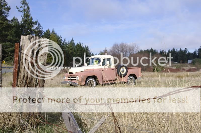
_IGP2013.jpg

good

-cool old truck
-good placement of the fence in the FG, it adds depth to the photo
-very nice natrual colors
-good contrast and detail
-good DOF
-exposure is right on

nit

-subject is placed on center

tweak

(added sepia tone/Orton-effect for artistic flare) personal choice

-cropped the photo a tad tighter and placed the subject to 1/3 rule

-switched the photo to sepia tone (most software programs and cameras
have this feature, sepia tone excels at showing things that are antique
and that has some white in the photo, snow, wedding gown etc)

Note: The Orton-effect is optional and you can leave it out and just go
with the sepia tone (color) to keep things simple if you want and the
photo will still have a nice antique look to it.

Orton-effect

1-move the midtone slider in (levels) so the photo goes very light
2-using the (gaussian blur) tool move the radius slider so the photo goes
very blurry
3-go into (blending mode) and select multiply
4-readjust the sliders in (levels) to set the final exposure

-lighten (dodge) some the trees along the road where the light is
falling on them

-lighten (dodge) the "for sale" sign

-added a tad of global contrast
-added a tad of global USM (sharpening)

-healed out some of the stray grass in the far right and some wire
around the post

Hope this helps and thanks for posting.

Take care,
Dwayne Oakes

p304347290-3.jpg
 
Last edited:
I love when you do these images Mr. Oakes. Let me find a oldie but goody. Thanks in advance.

Church.jpg

good

-great textures
-great sky and clouds
-exposure is right on
-nice light coming off the door
-the comp is a tad tight but works here

nit

-black film border is a bit of a distraction
-photo lacks drama or interest
-dust on the photo
-photo is a tad soft

tweak

-cropped out the black film border
-switched the photo to black and white as it excels at showing textures

Some dodge and burn will add some drama and interest to the photo.

-lighten (dodge) the clouds
-darken (burn) the sky

-lighten (dodge) where the light is falling on the door and the brick work
around the door

-lighten (dodge) where the light is falling on the bottom of the railing
-lighten (dodge) the top of the building

-added a tad of global contrast
-added a tad of global USM (sharpening)

-used the midtone and whitepoint sliders in (levels) to set the final exposure

-healed out the dust in the photo and the spot on the door

Hope this helps and thanks for posting.

Take care,
Dwayne Oakes

p172808393-3.jpg
 
Last edited:
Thank you Mr.Oakes...:hug::
 
Here is one for you.. This is the original (resized obviously).. wanted to see what you can come up with and compare it to what i did to it. This place closed back in the 50's and hasnt seen a broom since. Very dark inside this place as there are only like 4 small windows to allow light. I swear I had been there before but I am not sure.

beforeedit.jpg
 
I would love to see what you could do with this. This is an awesome and very informative thread.


DSC_3926Large.jpg
 
Leaning_by_lonewolf025.jpg


Here's one for ya. Appreciate any advice you'd have to offer.

good

-great off center comp
-very good colors
-good DOF
-exposure is right on
-good contrast

nit

-the knot in the center of tree is a bit of a distraction
-photo is tad soft

tweak

-desaturated the colors (global) for artistic flare (personal choice)
-added a tad of selecitve color saturation to just the green shirt
for artistic flare (personal choice)

-lighten (dodge) some of the shadows in the logs

-added a tad of global contrast boost
-added a tad of global USM (sharpening) to get over the AA filter

-healed out the knot in the center of the log and the logo on
the shirt

Hope this helps and thanks for posting.

Take care,
Dwayne Oakes

p571680221-3.jpg
 
I've love all of the others. You do great work!

DSC_25961.jpg

Thank you very much for the comments ! I appreciate it !

good

-good comp that works well here
-nice low POV (point of view)
-exposure is right on in the lit areas but would benefit from fill flash
-good DOF
-good colors and contrast

nit

-to many shadows in the FG (foreground)
-photo has slight noise
-sidewalk has a tilt to the left when its shadows are removed

tweak

-straightened the photo

-lighten (dodge) the 3 street signs, the 2 main palm trees and the side
walk in the FG to create a fill flash effect to reduce the shadows

-draken (burn) the dark area in the sky

-lighten (dodge) the grass on the right where light is falling on it
-lighten (dodge) the buildings on the left where the light is falling on them
-lighten (dodge) the bright window lights coming from buildings on
left and the one on the right

-put the photo through NR software to reduce the slight noise

-added a tad of global contrast
-added a tad of global USM (sharpening) to get over the NR software

-healed out the two stray branches in the tree on the far right

Hope this helps and thanks for posting.

Take care,
Dwayne Oakes

p1032783131-4.jpg
 
Last edited:
good

-good comp and works well here (good choice for vertical)
-good textures
-good contrast and detail
-good DOF
-exposure is right on in the FG

nit

-the sky is clipped (blown out highlights)
-dark shadows in the trees

tweak

-switched the photo to black and white as it excels at showing textures
(personal choice)

-a cool trick to fix small to medium clipped areas is to just heal or clone
them out then lighten (dodge) a new light area in and since you can
control the (dodge) or brightness you can control the clipping like
I did in the sky here (histogram shows no clipping in the sky now) this
trick also works great when you have parts of clouds that are clipped

-lighten (dodge) some of the shadows in the trees

-added a tad of seletive USM (sharpening) to just the FG and MG
(foreground and midground)

Hope this helps and thanks for posting.

Take care,
Dwayne Oakes

It looks great! Thanks.
I was really bothered by the sky too and didn't know what to do with it. I thought there was too much sky to be cloned out, but I guess I was wrong.
Thanks again.
 
If it's not too late to get in on this... appreciate any suggestions.

Waterfront_Wallpaper.jpg


Thanks.
 
Dwayne, do you have any recommendations on photoshop books?
 
100_4227.jpg

Here's one I'd really like to see done. I've tried but nothing turns out how I like it.
 
Awesome thread:thumbup:
4315776878_65efa9092d_b.jpg

Any comments are welcome
thanks.
Zak

good

-great sky
-great light
-great natural colors
-horizon is straight
-exposure is right on
-good detail and contast
-good DOF

nit

-the comp (the sun star is cut off on the left side of the photo)

tweak

-cropped some of the left side of the photo to remove some of the old
sun star

-healed out the rays from the old sun star

-using an old software editing program I have that has special effect
filters (most new photo editing prgrams have these effects) I added
a new sun star so it is not cut off in the photo

-lighten (dodge) the top and bottom of the new sun star so the new light
makes sence

-lighten (dodge) the blue light coming through the clouds
-lighten (dodge) the white tips in the clouds

-added a tad of selective contrast to the blue light coming off the fence in the FG
-lighten (dodge) the blue light coming off the fence in the FG

-no global USM (sharpening) or contrast needed

Hope this helps and thanks posting.

Take care,
Dwayne Oakes

p674265412-3.jpg
 
Last edited:
awesome thank you.
Zak
 

Most reactions

Back
Top