What's new

I'm an amateur who would like some feedback!

SamanthaNicole

TPF Noob!
Joined
May 22, 2012
Messages
3
Reaction score
1
Location
Toronto, Canada
Can others edit my Photos
Photos NOT OK to edit
Now, I would not consider myself a "photographer" just yet. I am just someone with an intense passion for conveying to others my ideas of beauty. I have recently completed my first year of university. I attend the Ontario College of Art and Design (OCAD) University, and I am studying photography.

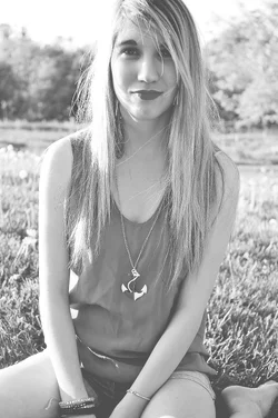
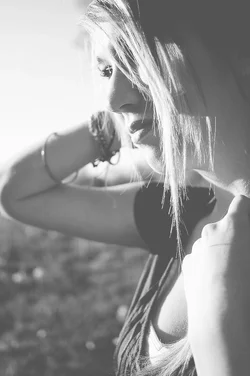
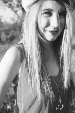
Here are a few recent photographs, and thank-you for your time!
$aDSC_0378.webp$aDSC_0221.webp$aDSC_0087.webp
 
Harsh shadows aren't attractive, I agree with more contrast but only after fill lighting.

You're also choppin' heads. :)
 
The contrast maybe. But with the way I crop heads, there is reason to my madness. I take them that way, because I don't like the space above the tops of peoples heads, I'm not sure why, it just always looks out of place to me.
 
The contrast needs improvement, also your cropping (or framing) should be improved. Also, shooting in direct sunlight means you should have used fill flash at the minimum, or off camera flash, or a reflector. Reflectors are cheap, remote flash will take some practice, but even easier is to find diffused light, such as an area of light shade.

Loosen up a little on your framing, you can be more precise in cropping on the computer later. Besides the model's entire head being in the photograph, if the model is wearing a cap, then the entire cap should be in the frame.

The sitting pose can be cropped just below the bustline for a nice "head and shoulders" shot. Or include her legs if that is what you want.

The profile shot needs a deeper field of focus to include her right arm.
 
I really don't have a complaint with the crop, I find the low contrast gives these a 70's feel. The model looks natural and the poses are cute. I think you did just fine for this style of portrait, keep studying, you're on the right track ;)
 
The contrast needs improvement, also your cropping (or framing) should be improved. Also, shooting in direct sunlight means you should have used fill flash at the minimum, or off camera flash, or a reflector. Reflectors are cheap, remote flash will take some practice, but even easier is to find diffused light, such as an area of light shade.

Loosen up a little on your framing, you can be more precise in cropping on the computer later. Besides the model's entire head being in the photograph, if the model is wearing a cap, then the entire cap should be in the frame.

The sitting pose can be cropped just below the bustline for a nice "head and shoulders" shot. Or include her legs if that is what you want.

The profile shot needs a deeper field of focus to include her right arm.
I disagree with every bit of this, unless the OP is interested in adopting the commentator's style instead of pursuing her own vision.

On the head chopping, I'm not one to do it personally, but plenty of accomplished photographers do. It's a personal preference/style thing, and if that's your style, run with it.
 
I agree with the contrast - for the 3rd one I like it a lot.
 
The stray hairs in front of her face are distracting, and look accidental. If you want that sort of thing going on, get a bit more hair out there and make sure it's obviously deliberate. A little distraction makes you look incompetent, and big distraction makes you look like an artist!

The contrast thing is a matter of taste, but if you look closer you'll see that there's a ton of lost detail. The lips in the 2nd one seem flat to me (which is just weird -- I expect "lost" dark areas to be black) and there are blown out highlights all over the place. Again, these look accidental -- the low contrast suggests that all the detail should be there, but it's not, so the viewer is confused. We expect blown highlights and lost shadows when there's a full contrast range and more in the image, and find them confusing when the image is this flat. If you're going for this, again, I would simply push on it harder. Render the image almost two-tone, pale grey and white, damn it, so the viewer knows you meant it. If you didn't mean it, well, knock it off and do it the way you meant!
 
These have kind of a cool look to them...I am giving you the benefit of the doubt that you did it on purpose :).
Post more.
 
My favorite is the third, but i also think (like stated above) that it needs some contrast. but then again the whole vibe of the picture works just the way it is.
Good job :)
 
You have gone a long way towards making what is probably an attractive female into one that isn't with the harsh shadows, the lens focal length that emphasizes/elongates her facial features and the lost mid-tones.

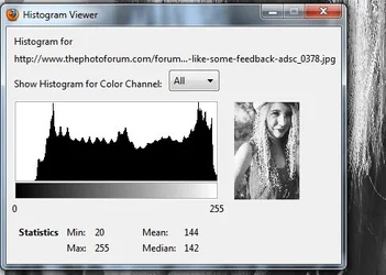
It's not that these pictures have low contrast, there's lots of contrast.
It's that you have placed the tones in the wrong place on the histogram.$5-26-2012 1-15-21 PM.webp

And you need to allow others to show you how to edit your pictures.
 

Create an account or login to comment

You must be a member in order to leave a comment

Create account

Create an account on our community. It's easy!

Log in

Already have an account? Log in here.

Back
Top Bottom