Thanks everyone. I greatly appreciate the critique.
This was a very dark and thick grove of old bamboo. Lots of colors but very muted. I'll play with it some more when I get home. Still learning this technique.
Here is a reworked version with your critiques in mind. Lots pushed saturation and vibrance. I figured that was OK for an impressionistic photo, as it already looks somewhat unreal. Only slight boost in exposure.
Yes, I like your edit as well. I was hesitant to brighten the image as the original captures the sense of claustrophobic shadow in which it was shot. Your edit does a nice job of keeping that. I am honored that you took the time to work with my shot. I am enjoying the extra color, now that time has given me some distance from that bamboo grove.
Oh....and thanks for my 100th "like"....'tis a silly thing, but it makes me smile.
Thanks again. Mully, Kenc, Mishele, Frequency, Charlie, Invisible....you've all given me inspiration and helped me look at this image in many different ways.
Invisible, I tried out your edit....here's something similar, though, not quite your crop. Maybe the darks at the bottom left are too much.....
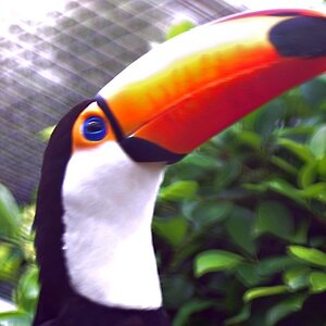
So, I played with some of the other bamboo shots and pushed them further past reality. Here's one that I like. I'll have to rework it later.....I'm not wedded to the 2:1 aspect ratio, but I don't want to lose the transition from yellow to blue on the top "feather"
Desi, that some good experimentation. "Reality" is just a starting point. Love the images you've shared with us. It's not all about the DOF and sharpness and the perfect exposure.
I was under the impression that I was looking at some sort of fabric curtains, all this time. Desi, thumbs up on creativity, thumbs down on killing the illusion


![[No title]](/data/xfmg/thumbnail/33/33447-c3f5563c9b8b1f19498a3062f60f92b1.jpg?1619735973)
![[No title]](/data/xfmg/thumbnail/36/36399-041c9ebc3a39e89ec8e39243c0d43528.jpg?1619737551)
![[No title]](/data/xfmg/thumbnail/36/36398-33d875428a7eefdf5b31188ec0f555a5.jpg?1619737551)
![[No title]](/data/xfmg/thumbnail/33/33421-38d09827e584b8381c5e3a468cdf0159.jpg?1619735961)
![[No title]](/data/xfmg/thumbnail/36/36601-26ec0a53712c5470af53be9652811a6e.jpg?1619737641)
![[No title]](/data/xfmg/thumbnail/36/36600-689bc868e20f53581a083c9054ee0e47.jpg?1619737641)
![[No title]](/data/xfmg/thumbnail/36/36400-97a007ae878e1032155c7a7d47eeba73.jpg?1619737552)