What's new

in the studio with andrea(updated, now with more!)

christopher

TPF Noob!
Joined
Sep 24, 2003
Messages
90
Reaction score
0
Location
canada
ok, so they are ready again:
(I'm going to show them all because people can't go to links and only comment on the ones they see)

behindthescenes.jpg


close-up.jpg


contemplation.jpg


dash-2.jpg


dash.jpg


distance-stare.jpg


distance-stare2.jpg


focus.jpg


front-slash.jpg


glasses-shine.jpg


goofy.jpg


look-away-pose.jpg


look-away-sword-2.jpg


look-away-sword.jpg


look-away.jpg


point.jpg


row.jpg


runaway.jpg


sword-back.jpg


sword-side-small.jpg


sword-stare.jpg


sword-upclose.jpg
 
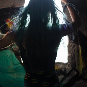
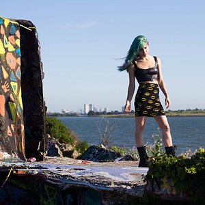
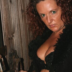
Out of all of them, I would go with what you have as #3 on this page. It has an engaging graphic element, and I find it to be much stronger than any of the others.
 
thanks, don't mind the horrible fading. my PC's monitor is horribly dark and I didn't 'notice until I checked 'em on the laptop(the laptop that doesn feature photohsop).
 
I dont know why but I prefer the last one. I like the lit blue against the darker areas at the top.
 
I like number 3's composition but I do like the background in number 4. Maybe combine the two? The black background is nice but it does her head disappoint. That's actually a nice effect too. It just depends on what you are going for.
 
I like the one of her laughing, and also the last one. You've got a nice collection of images here.
 

Create an account or login to comment

You must be a member in order to leave a comment

Create account

Create an account on our community. It's easy!

Log in

Already have an account? Log in here.

Back
Top Bottom