What's new

Info Here - color or black/white?

Black & White hands down, my reason why is... It just looks better as the white bit of sky looks better rather than the colour image and also nice and moody punchy looking too.
 
Tough call. I think color can really add to a scene in some cases. However, in this case the man with BRIGHT green shirt and RED arrow pointing at his butt, just creates a tremendous distraction. In the color version, I keep trying to look at the scene, but the eye keeps going back to the arrow. :aiwebs_016: As this is a really busy scene, I think the B&W is a good choice, as the other dimension created by the color, just makes it to much to take in. Even so, I would seriously consider cloning out the arrow in the B&W, and cropping closer to the man on the left. Not sure the shop scene adds much anyhow. Cropping closer to the man creates a line of people into the crowd, that matches with the line on the right. Think I also might take a little of the top, that would eliminate the sky problem, as well as the top of the light pole.
 
I almost never prefer b&w to color but in this case, based on what you named it, then b&w is the winner since it highlights him better. However, for some reason, my eye keeps going to that M sign. Not sure why but it pulls my attention away from the rest of the scene. I think I would clone that out.
 
It just looks better as the white bit of sky looks better

Good point. The sky was not optimal at dusk. Thanks

However, for some reason, my eye keeps going to that M sign. Not sure why but it pulls my attention away from the rest of the scene. I think I would clone that out.

The M sign bothered me on the color version. Thanks

Tough call. I think color can really add to a scene in some cases. However, in this case the man with BRIGHT green shirt and RED arrow pointing at his butt, just creates a tremendous distraction. In the color version, I keep trying to look at the scene, but the eye keeps going back to the arrow. :aiwebs_016: As this is a really busy scene, I think the B&W is a good choice, as the other dimension created by the color, just makes it to much to take in. Even so, I would seriously consider cloning out the arrow in the B&W, and cropping closer to the man on the left. Not sure the shop scene adds much anyhow. Cropping closer to the man creates a line of people into the crowd, that matches with the line on the right. Think I also might take a little of the top, that would eliminate the sky problem, as well as the top of the light pole.

The arrow is what wanted me to take the photo. Interesting take that it is distracting. I did crop the photo slightly and will try your crop. Thanks

I appreciate everyone's input. It is interesting to see what you see that I may have overlooked.
 
Cloned out the arrow and the M. The cropped power pole looks better.

110318_S_065v3BWsmall.webp
 
The arrow is what wanted me to take the photo. Interesting take that it is distracting

Now maybe if the young lady in shorts in the center were sporting the arrow, it might not be as distracting, then again. LOL IMO, I think part of the problem is "where" he's at in relation to the other elements of the composition. Having such a strong visual located on one edge, makes it hard to see the rest of the image, because it keeps pulling the eye back out of the frame rather then leading in.

Again just my opinion, but I believe the revised crop, minus the arrow, lets the lines in the street and the lines created by the people work in unison to pull you into the image. Now the "INFO HERE" provides an interesting distraction, but is not so powerful as to hold the eye out of the frame.

Of course if you reaallllyyy want the arrow pointed at the butt, you could use a square crop with him in the center, and leave the McDonald's sign, which would likely create an interesting image all on it's own.
33176102288_6cfecf4594_c a.webp
 
The arrow is what wanted me to take the photo. Interesting take that it is distracting

Now maybe if the young lady in shorts in the center were sporting the arrow, it might not be as distracting, then again. LOL IMO, I think part of the problem is "where" he's at in relation to the other elements of the composition. Having such a strong visual located on one edge, makes it hard to see the rest of the image, because it keeps pulling the eye back out of the frame rather then leading in.

Again just my opinion, but I believe the revised crop, minus the arrow, lets the lines in the street and the lines created by the people work in unison to pull you into the image. Now the "INFO HERE" provides an interesting distraction, but is not so powerful as to hold the eye out of the frame.

Of course if you reaallllyyy want the arrow pointed at the butt, you could use a square crop with him in the center, and leave the McDonald's sign, which would likely create an interesting image all on it's own.
View attachment 169091

Now that I see you crop the arrow is not realllllyyyy that important. :icon_eek: Thanks for walking me through your thoughts on how to read a scene. Normally I take the little Sony and just shoot video in town, but next trip I think I will take the Fuji and focus on photos. Last time I was switching from video to photo every other moment on the Sony and too much multi-tasking. So you want more women with arrow photos? ;)
 
Oh no, put them back in! lol The guy in that yellow shirt is the most interesting part of the picture! that's who/what I would've taken a picture of! Put the arrow back, and the M which shows what iconic MickeyD's is like in another place. I think the open air restaurant to the left is interesting, and if that's the Mickey D's the picture needs to show that to tell the story.

I think it's a really wide area to cover in one photo with so much going on. I see really two pictures here. If possible in this type situation I'd probably have taken another shot or two taking a step or two to the left to 'move' the sign a little to separate it more from the guy's head and maybe get more of the scene to the left. To the right there are parts of people entering the scene and in the frame that aren't really adding to the composition. To me those tables w/umbrellas down the way would make for another picture so I probably would've moseyed closer to photograph there.
 
Oh no, put them back in! lol The guy in that yellow shirt is the most interesting part of the picture! that's who/what I would've taken a picture of! Put the arrow back, and the M which shows what iconic MickeyD's is like in another place. I think the open air restaurant to the left is interesting, and if that's the Mickey D's the picture needs to show that to tell the story.

I think it's a really wide area to cover in one photo with so much going on. I see really two pictures here. If possible in this type situation I'd probably have taken another shot or two taking a step or two to the left to 'move' the sign a little to separate it more from the guy's head and maybe get more of the scene to the left. To the right there are parts of people entering the scene and in the frame that aren't really adding to the composition. To me those tables w/umbrellas down the way would make for another picture so I probably would've moseyed closer to photograph there.

The open air restaurant on the left is the McD's. The sign is too close to his head and I have to remember to take steps left or right. The tourist street is over 10 blocks long and lots to take in. If a vendor thinks you are taking their photo then they rush you to buy something. If the buskers spot you then they want $ for their photo. Thanks
 
Trust your instincts; if the arrow and the back of the shirt is what prompted you to take the picture, that should tell you something.

I usually use a short telephoto so I can get in closer without actually having to get in close. With the conditions you described, you might need a rather longish lens! lol I'm not dealing with those circumstances, but it can help to eliminate or minimize some backgrounds and distractions, etc.
 
The tourist street is over 10 blocks long and lots to take in

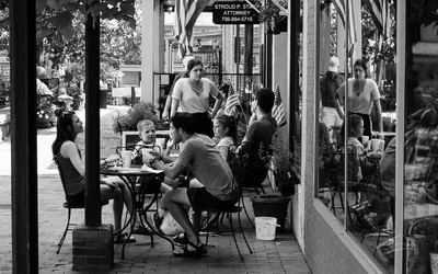
Robert Capa is credited with the quote "If your photographs aren’t good enough, you’re not close enough". In street photography however, I think it's since been amended some to put the emphasis on "empathy" vs "proximity". People as a whole IMO are not very interesting without being able to see their faces well enough to register something about them, unless your only using them somehow as a pattern or other creative element. Like Vintage Snaps, I use a short telephoto, (my carry around is a 28-135), that will get me close enough without being in their face. I'm also fortunate that my live view screen will flip up/out/around, so that I can sit with the camera on my lap and focus on people without being to obvious. I prefer real human emotion that hasn't been altered because they think someone is looking. IE: one of my favorite streets scenes was the "Conversation". This was on a busy street, but everything was focused on the table next to us. The guy in the back was hitting on the waitress who was bored at his attempt, he wasn't paying attention to his kids. His little boy was trying to converse with guy in the foreground who was trying to ignore him, while the little sister was trying to get her brother to turn around and the woman in the foreground was laughing at how uncomfortable the little boy was making her boyfriend/husband. I watched it unfold for a bit before finally moving around to get the reflection which I thought worked well to keep the viewer in the middle of the conversation, while the posts created frames within frames.
Dahlonega07222017_722-Edit-2.webp

"over 10 blocks long and lots to take in" And that is why the man with the arrow caught your attention. With a street full of people, buildings, traffic, etc. the mind looks for a rock, something to stabilize on. IMO street photos are the same way, include to much and the eye gets lost. Another of my favorite pieces of advice is by John Hedgecoe, when discussing composition he says "simplify". Once you have your focal point, eliminate the distractions, and use only those things that enhance what you want the viewer to see. Also like Vintage Snaps comment you really had more then one scene, any one of which could have stood on their own.
 

Create an account or login to comment

You must be a member in order to leave a comment

Create account

Create an account on our community. It's easy!

Log in

Already have an account? Log in here.

Back
Top Bottom