What's new

Interested in opinions on these

Brunot

TPF Noob!
Joined
Dec 28, 2010
Messages
29
Reaction score
2
Location
Slovakia
Can others edit my Photos
Photos OK to edit
Hey there, after a decent hiatus I puffed off the dust from my camera because of a trip to Italy and went on shooting some again. So, I would appreciate your opinion on these picks, discuss, criticize, I will be grateful for your responses :o)

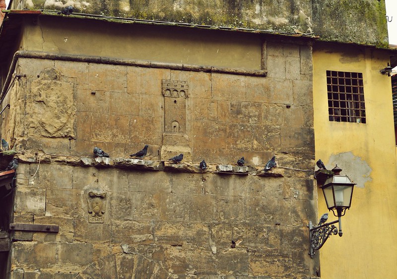
1

Untitled by Tallbrun, on Flickr

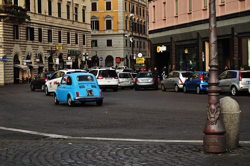
2

Untitled by Tallbrun, on Flickr

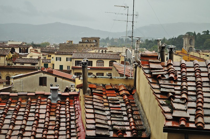
3

Untitled by Tallbrun, on Flickr

photostream
photostream
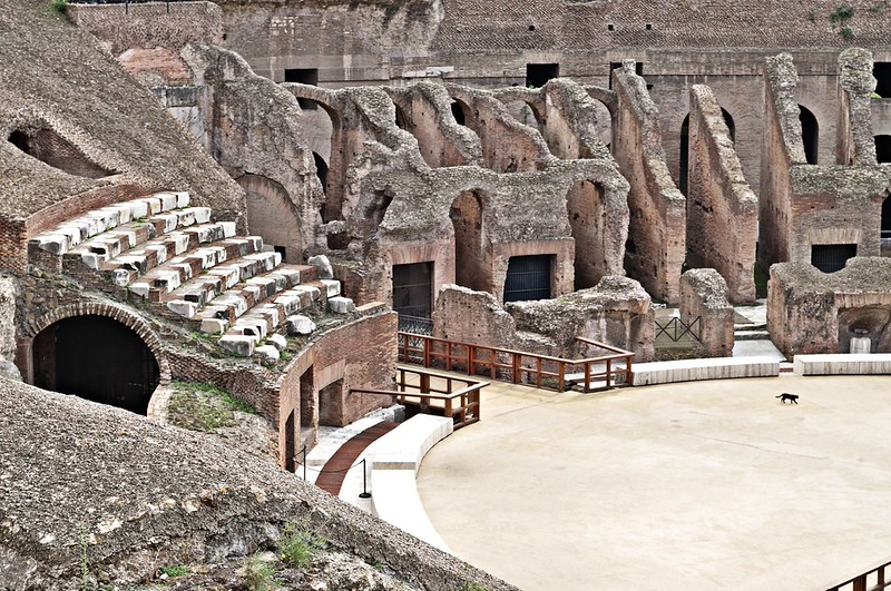
4

Colloseum wanderer by Tallbrun, on Flickr

5

Untitled by Tallbrun, on Flickr

6

Untitled by Tallbrun, on Flickr
 
Last edited:
1. Not bad. Makes me want to tilt my head. The birds are the story... but they're getting a little lost in the image. Exposure and color look good.
2, 3 and 4 seem to have no subject. 4 doesn't even balance. Color and exposure look good on them.
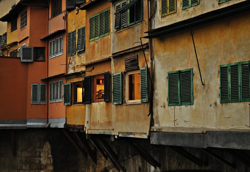
5. I am not sure on. It seems to have a subject-the illuminated windows. But it's the leading lines I want to mean something. I think cropped to an 8x10 would make the lines work for me.
 
Hi Brunot, it's great you got out and about with your camera. Here are some general guidelines about composition to consider. Before taking the picture ask, "What is the subject?" or "Why am I taking this photo?" The answer should be very specific and brief. Let's look at two of your examples. What is the subject of #3? I really like the look of those foreground roof tiles. But, if those are your main subject, what is all the other details about? What do the mountains and sky add? What about the antennas? IMO you have tried to include too much in this image. #4 What is the subject here? I see a lot less choices, I see interesting shapes, texture, and an animal that gives scale. What I see all fits together nicely. I see a nice contrast of color, too. The subject is easier for me to figure out. The frame does not have clutter (distractions). That small piece of railing in the lower left is one small distraction. For me a distraction is something that our eyes are drawn to, but for no important reason, so they "distract" the viewer away from what you really want us to look at.

That brings me to another composition strategy. Check the edges...top, bottom and especially the sides. Look carefully at #1. Look at the upper right edge. What is that sliver of grey doing there? Our eyes are drawn to the lightest areas of images. Do you want us looking there at that empty space? No. Look at the entire left edge. I think you should crop inwards so that we only see the front wall. That is a neat looking wall, but what about the top edge? I do not think that dark section is very interesting. It is hard to crop it all out, because the angle you used might chop off the top of the window which I think is important. I think you just tried to include a little bit too much. How about if you had just included two pigeons on either side of that neat castle relief in the wall, or maybe just a closer view of that barred window? Which leads me back to another point of composition. Do not try to include "it all" in one image. Remember, "less is more" or "if you think you are close enough, get closer".

That is why I like # 4 and #6 best. In #6 I would consider cropping out the lower dark section. We just cannot see clearly enough what is in that space. Do not distract us away from the interesting color of the walls!

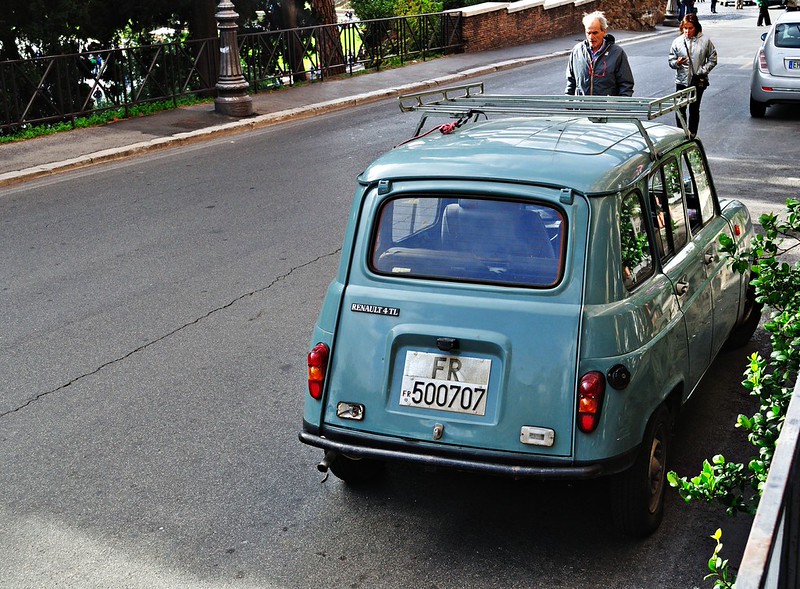
#5 Cool car, but what are those people doing there> You even cut that man in half! If you were taking a picture of that car, then let us see the car. Do not let our eyes wander away to other objects that are not important.

In conclusion, I think you have a nice eye for interesting subjects, but just work a scene a little more before you shoot. What do you really want us to see. Make it as obvious as possible to have what you reacted to or what drew you to take the shot. Make the parts fit into the whole or leave them out. Look for a scene within a scene. Remember, we were not there to share the same emotions you had when you clicked the shutter, but we have all seen those images that make us say, "Wow!" That should be your goal, too! I know I could look at an old wall and go, "Wow". Can you make me do that with one of your images? Yup, but I just would have needed a little closer look.

Keep shooting and have fun!

 
Hey, I'm back. I forgot #2. Lots of elements to like here. Lots of color variety and look how the lines of th two side buildings and the cars lead us right down the street toward the back center. In wide angle shots like this one, it is effective strategy to have something large, close by, and in focus, in the foreground. (the lamp post) It helps give depth. You can have object like that only three feet away from you and still have the distance in focus. When you include signs in a photo, it is nice to be able to read them (eg. "ORO")

Also, going back to what I said about #6, I noticed when I stood up at my desk and tilted the screen, the image lightened up, and I could see much more clearly the supporting beams underneath. Do not crop as I suggested. They add a lot to the scene and character to the buildings. Very nice image!
 
These are nicely exposed holiday snapshots.

There's not much really interesting or compelling about them photographically, though the birds is at least getting close and the buildings in 6 have SOME potential from a subject matter perspective.

Beyond that they're probably fine memories and not much more. Keep trying.
 
Thanks for the responses guys, clear and exact. And special thanks to you rambler, much to go on from there. I somehow knew there is a lot going on in these photos, mainly because they were shot as close as possible with my set 18-55 lens, therefore I could not make the things I wanted closer THAT much closer as I wanted. However, kinda crappy excuse, excuses do not get us farther in what we want! Glad to at least get the exposure down as I have been learning to shoot on A,S and M for the second year and, wow, it is challenging to get into it. Thanks for the encouragement, I know what to move on now.
 
Here is a timely quote from a professional photographer, Vounas Bouhner, which I just read this morning in Photogrphy Magazine (digital) from Craft and Vision:

"The less clutter you have, the more attention your viewers will pay to your subject, and the stronger your photographs will be. Instead of trying to include everything under the sun in front of it, minimize the complexity for maximum impact."
 
I agree for the most part with the other comments. #3 and #6 are pretty good studies in texture and color if cropped tighter as suggested by others. These strike me as being better than vacation photos. I might even include #4 with some cropping and darker mid-tones.
 
Theres too many for me to want to go into detail, overall I would say you have a couple of good shots here, good work! Makes me want to go there! :)
 
I like these photos for the quality exposure. The last one is colorful and warm with the peek of interior light.
 
Interesting scenes/views. I like 1/3/6..4's ok also...the cat! :)
All the pictures look to ok for 5:4 (8x10) crops too.
 

Create an account or login to comment

You must be a member in order to leave a comment

Create account

Create an account on our community. It's easy!

Log in

Already have an account? Log in here.

Back
Top Bottom