So, I have one of the previous merged to HDR on CR and the blown out lights reduced a little. I also shot at 3:00pm, HDR it and the result was way more textured and shaded. I think the interior lightning lost its meaning this way. I couldn't photograph later, but I think I'm on the way.
If you're shooting interior lighting then I personally wouldn't worry about the blown highlights in the bulbs. You don't want them dark so you can see the filaments in the bulbs, you want the impression of light, you want them to look bright, almost radiating light.
Now if you'll excuse me I'm going a bit left field here. Being a student of architecture and design also excuse me for covering ground you're already familiar with.
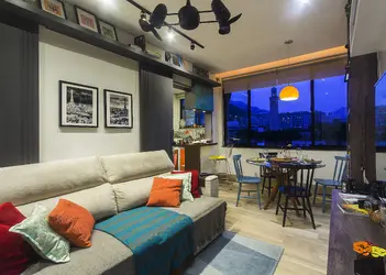
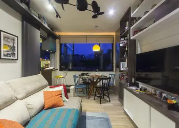
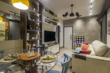
Colour is not absolute but relative, we see things as relative and we see them in comparison to everything else. So here's a comparison between your two similar shots on your two posts:
View attachment 118496
The lower image is your first one and contains more vibrancy in the colour, but the upper one (slightly tweaked) contains more variety in colour and texture. It is more muted colour when placed directly against the first shot, but then the yellow seat chair is pretty much 100% saturation and brightness in the lower shot.
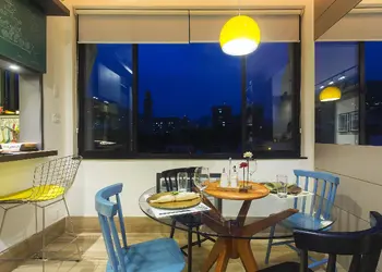
Now if we look at it but include the window detail from one of the first images (the one I edited). The contrast in colour here is a bold statement. It is two near complementary colours at equal and maximum brightness. This is the bold statement by which all the other colours are compared to, and will always be found lacking to. By including it in your first shot you show this inferiority in the colour of the (your?) interior design and are forced to match it when doing the pp on the shot. By not including it in the second you seem to edit with a far more subtle hand. Look at the original shots and see how this works, how colour is judged in context and how you set that context.
View attachment 118497
Maybe not absolutely correct, but hopefully though provoking.
")


")


![[No title]](/data/xfmg/thumbnail/37/37628-b854997825aadb4eedaa3247baf8069f.jpg?1734170752)


![[No title]](/data/xfmg/thumbnail/37/37627-c3d3ca879cdfbdb9e35acdcc7fcd4b3e.jpg?1734170751)