Interior design

Angela Lourenço

TPF Noob!
Joined
Jan 13, 2016
Messages
46
Reaction score
48
Location
Rio de Janeiro
Can others edit my Photos
Photos OK to edit
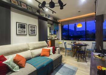
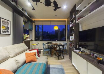
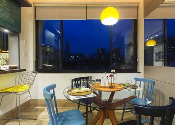
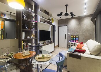
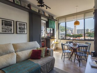
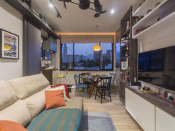
I am an architect and I've been studying about architectural photography in order to valorize my designs. In these pictures, I wanted to show the room's integration with the outside, taking vantage of the late afternoon. I explored the light of the end of the day to get less exposure out and value the internal lights. I also wanted to show the room's integration with the kitchen and the young design concept of this apartment. Is the message clear and the thechnical fairly good?
 

Attachments

  • _MG_5773.jpg
    _MG_5773.jpg
    3.9 MB · Views: 129
  • 25451566974_339af5c2d2_k.jpg
    25451566974_339af5c2d2_k.jpg
    620.7 KB · Views: 104
  • 25963829122_9d16362dd7_k.jpg
    25963829122_9d16362dd7_k.jpg
    729.7 KB · Views: 108
  • 26056345095_3d021094de_k.jpg
    26056345095_3d021094de_k.jpg
    647.5 KB · Views: 107
  • 25451614504_f78bf63652_k.jpg
    25451614504_f78bf63652_k.jpg
    765.4 KB · Views: 122
I mostly like these quite a bit. I very much like the color of the exterior though the windows and the way the orange of the lamp plays against it. If I were to pick one thing to complain about it would be the blown out lighting. It really detracts significantly for me. Otherwise, you did a nice job presenting what appears to be a small, but tasteful and comfortable looking living space.
 
I mostly like these quite a bit. I very much like the color of the exterior though the windows and the way the orange of the lamp plays against it. If I were to pick one thing to complain about it would be the blown out lighting. It really detracts significantly for me. Otherwise, you did a nice job presenting what appears to be a small, but tasteful and comfortable looking living space.
I agree about the blown out lighting. I reduced the highlights on camera raw, but it wasn't enough. Is there a way, or equipment, to deal with it while shooting without depending on a HDR or post production?
 
Not that I know of. HDR or some other blending of bracketed exposures in Photoshop seems to best way to achieve the results you are hoping for. Perhaps the dynamic range of some high end cameras may get you there, but I think post processing is the most economical approach. You will need some PP regardless so you may as well learn the technique.
 
A tad bright given the apparent time of day.
Fisheye correction couldn't hurt.
Nice shots.
 
Very nice and technically very well done.

My opinion, and just a different viewpoint not a correct one, is that the exterior is far too blue. If the subject is the room and the design then why make the boldest colour contrast within the window, the outside? Windows in pictures are much like pictures hanging on a wall. I find this one a little too cool and that coolness seems to seep into the room.

I would shoot this a little earlier in the day when it's not quite so dark outside so there's a more even balance of light, though I would be careful to keep some separation between the interior and exterior brightness. Excuse the crude edit, it's only to illustrate. :)

mod-1.jpg
 
I would 2d Tim Tuckers comments. I would also add that the slight blueness conflicts with the many warm colored objects in these photos. I would also note that all are over contrasty. Such high contrast does not lend itself well to busy pictures which all of these are. Just a slight reduction will make a big difference overall.
 
Agree with Didereaux and TT on this.....earlier in the day, less blue outside (which creates a colder feel), different tone to the lighting, warmer feel overall.

And you really need to look at HDR to help you deal with extremes (and extremes are what we're talking about when you have blownout highlights in order to get ready of really dark spots. That's the reason HRD software is so popular for people shooting interiors....the high dynamic range inherent in most interiors.
The good news is that I live here and I can try again. Altough I have to can clean the house, I will try some HDR and color contrast adjustments.
 
Agree with Didereaux and TT on this.....earlier in the day, less blue outside (which creates a colder feel), different tone to the lighting, warmer feel overall.

And you really need to look at HDR to help you deal with extremes (and extremes are what we're talking about when you have blownout highlights in order to get ready of really dark spots. That's the reason HRD software is so popular for people shooting interiors....the high dynamic range inherent in most interiors.
So, I have one of the previous merged to HDR on CR and the blown out lights reduced a little. I also shot at 3:00pm, HDR it and the result was way more textured and shaded. I think the interior lightning lost its meaning this way. I couldn't photograph later, but I think I'm on the way.
 

Attachments

  • 2016-03-28_07-34-01.jpg
    2016-03-28_07-34-01.jpg
    896.5 KB · Views: 94
  • 2016-03-28_07-33-41.jpg
    2016-03-28_07-33-41.jpg
    915.6 KB · Views: 107
  • 2016-03-27_10-51-04.jpg
    2016-03-27_10-51-04.jpg
    721.9 KB · Views: 96
  • _MG_5771_reduzida.jpg
    _MG_5771_reduzida.jpg
    2.5 MB · Views: 93
So, I have one of the previous merged to HDR on CR and the blown out lights reduced a little. I also shot at 3:00pm, HDR it and the result was way more textured and shaded. I think the interior lightning lost its meaning this way. I couldn't photograph later, but I think I'm on the way.

If you're shooting interior lighting then I personally wouldn't worry about the blown highlights in the bulbs. You don't want them dark so you can see the filaments in the bulbs, you want the impression of light, you want them to look bright, almost radiating light.

Now if you'll excuse me I'm going a bit left field here. Being a student of architecture and design also excuse me for covering ground you're already familiar with.

Colour is not absolute but relative, we see things as relative and we see them in comparison to everything else. So here's a comparison between your two similar shots on your two posts:

compare-1.jpg


The lower image is your first one and contains more vibrancy in the colour, but the upper one (slightly tweaked) contains more variety in colour and texture. It is more muted colour when placed directly against the first shot, but then the yellow seat chair is pretty much 100% saturation and brightness in the lower shot.

Now if we look at it but include the window detail from one of the first images (the one I edited). The contrast in colour here is a bold statement. It is two near complementary colours at equal and maximum brightness. This is the bold statement by which all the other colours are compared to, and will always be found lacking to. By including it in your first shot you show this inferiority in the colour of the (your?) interior design and are forced to match it when doing the pp on the shot. By not including it in the second you seem to edit with a far more subtle hand. Look at the original shots and see how this works, how colour is judged in context and how you set that context.

compare-2.jpg


Maybe not absolutely correct, but hopefully though provoking. ;)
 
...and thought provoking too. :)
 
So, I have one of the previous merged to HDR on CR and the blown out lights reduced a little. I also shot at 3:00pm, HDR it and the result was way more textured and shaded. I think the interior lightning lost its meaning this way. I couldn't photograph later, but I think I'm on the way.

If you're shooting interior lighting then I personally wouldn't worry about the blown highlights in the bulbs. You don't want them dark so you can see the filaments in the bulbs, you want the impression of light, you want them to look bright, almost radiating light.

Now if you'll excuse me I'm going a bit left field here. Being a student of architecture and design also excuse me for covering ground you're already familiar with.

Colour is not absolute but relative, we see things as relative and we see them in comparison to everything else. So here's a comparison between your two similar shots on your two posts:

View attachment 118496

The lower image is your first one and contains more vibrancy in the colour, but the upper one (slightly tweaked) contains more variety in colour and texture. It is more muted colour when placed directly against the first shot, but then the yellow seat chair is pretty much 100% saturation and brightness in the lower shot.

Now if we look at it but include the window detail from one of the first images (the one I edited). The contrast in colour here is a bold statement. It is two near complementary colours at equal and maximum brightness. This is the bold statement by which all the other colours are compared to, and will always be found lacking to. By including it in your first shot you show this inferiority in the colour of the (your?) interior design and are forced to match it when doing the pp on the shot. By not including it in the second you seem to edit with a far more subtle hand. Look at the original shots and see how this works, how colour is judged in context and how you set that context.

View attachment 118497

Maybe not absolutely correct, but hopefully though provoking. ;)

Part of the concept of this design (my design and living) is the contrast and balance between furniture colors and sobriety of the finishings (wood, black windows, white panting, etc.), so my concern here is to show it. However, I know that the color in photography is a composition issue, and the blue of the sky is an option that's not part of the design, but have to reinforce it. My doubt here and what I'm reflecting about is the excess of information by color, if it's helping to show the concept of it's distracting. To be honest, I like it with the high color contrast of the firts photos, but I tend to overdue when it comes to colors in PP, so I'm asking if what you see is what I see.
 
Have you tried with a sunset sky? (more orange hues)
What direction does the window face?
 

Most reactions

New Topics

Back
Top