Here's a quick edit I did. Since you're taking a 2 dimensional picture of a curved three dimensional staircase, some of the lines are going to be tilted no matter what. However, I felt that the horizontal lines on the staircase should be flat, and the central line underneath the lone person on the staircase should be vertical. So I straightened it for that (ended up being -2.2 degrees). Then I added a couple of different curves adjustments to the marble staircase to bring out some of the textures in the marble. In the original, the stone was sort of flat. Then I added some contrast to the roof, to really make the geometry pop a little more (and it had the side effect of really making the blue on the right more prominent, which I had mixed feelings about, and actually ended up dialing back a touch with a color adjustment).
I think the single person's head in the middle of the staircase totally made the image.
quality isn't everything it could be, because curves adjustments on jpegs aren't always so awesome, but I think you get the idea of what I meant with the scene needing more contrast, and getting the central vertical straight:
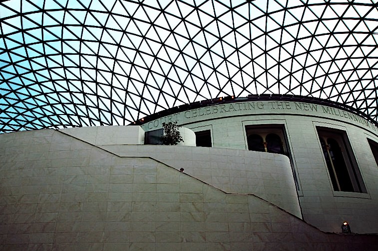 NationalGallery
 by
franklinrabon, on Flickr
edit: after looking at it, it's still probably about .3 degree tilted to the right. I think -2.5 degrees about nails it. And I'd probably desaturate the blue in the upper left even a bit more as well. I'd probably also try to perfectly center the person horizontally, and then put him on the bottom 1/3 line vertically to strengthen the composition a bit more.





![[No title]](/data/xfmg/thumbnail/34/34139-e52deba745f42ba091907fcc460cd6db.jpg?1734164696)
![[No title]](/data/xfmg/thumbnail/42/42065-b846d670a79653fe9a60fc2ba4bc683f.jpg?1734176465)

![[No title]](/data/xfmg/thumbnail/42/42067-88a229e814afcfc8848b3e293d8113d9.jpg?1734176466)