What's new

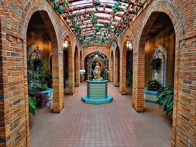
Is this over the top? I can never tell...

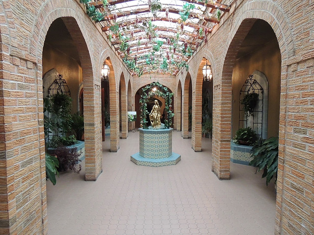
In comparison to the original, the first edit is obviously a little over.... but I like it. It is warm, the colors are probably pretty accurate. It is nowhere near as blah as the original.... and I feel like the 2nd edit is a compromise....
 
I like the first edit. You said you wanted it to pop, and boooooooy does it!
 
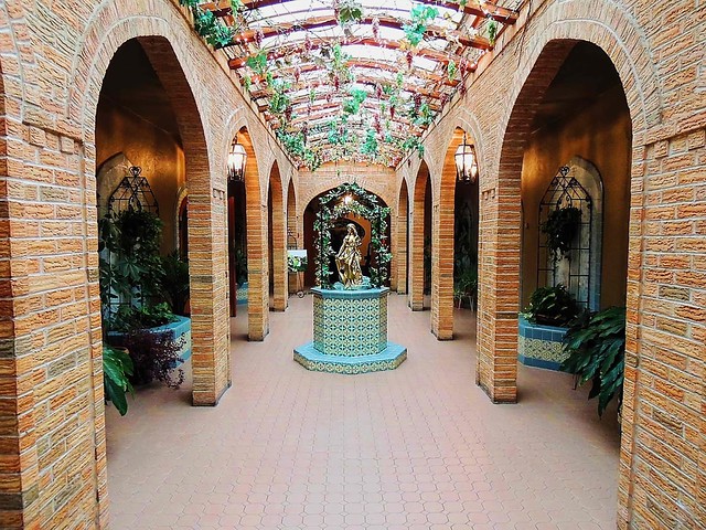
The re-edit is still better than the original, but I like it a little more saturated. Somewhere between the first edit and the second edit. But that is just personal preference.
 
ok cool. Thanks guys. I am leaning more towards what cwcaesar said, which is somewhere in between my first edit and my second edit. That winery is a pretty cool place to take photos at.
 
I read too fast and thought your original WAS the edit and I thought to myself... It's not over the top. Maybe needs a hair more contrast, but nah, it's good.

And then I saw your edit.

Yeah... THAT is over the top.

There's already enough detail showing through. Maybe it's just the magic Flickr sharpening at that size, but it looks plenty sharp to me. If it's not actually that sharp, just sharpen it a hair, maybe add a hair contrast, and be done with it. :lol:
 
^haha...nope it wasnt flickr, it was me. I posted a re-edit I think you would like.

Your re-edit is *better* than your first edit... but out of all of them I still prefer the original... original. :lol: Keep the sharpening you have on the original (since you said it was you and not Flickr magic), and just pop the contrast a bit and *then* you'd have an edit I'd *really* like.

But again, that's just *my* opinion. I'm just one person. And if you like the re-edit, then that's the way it should be. Like I said, it's not bad, it's just my personal preference to want to stick with the first :sillysmi:
 
My feelings from the beginning were you never got your color set correctly. In addition to setting black and white points, there are images which also require a good gray point set to set either a warm or cool tone. No matter where I set the gray point (and I generally shoot for a nice 18%) in this image, it always was of want to go toward the cool side; so I did.

I also didn't see this as having a problem in detail acquisition as much as how you went about getting the detail, which in either the original or the compromise was much akin to a bull in a China shop; there's not much on the side of finesse - sorry, but I am in a call it as you see it mood.

$parker.webp
 
I like the photo, and the edit... I don't like the non-symmetrical framing. I wish the dark area on the left wasn't there.
 
The edits are a bit much with regard to sharpening and saturation, although this is pretty subjective, but that's my take. However, what I think this needs more than either one is darker mid-tones. I'd play around with curves before I did anything else. Then if you still feel it needs more saturation and/or sharpness, you can always add them.
 
^ KenC, can you do a quick edit on the original photo so I can see what you are talking about? In my 2nd edit I thought I did adjust the mid tones. Any way I would love to see what you come up with as it sounds like you are on to something.
 

Create an account or login to comment

You must be a member in order to leave a comment

Create account

Create an account on our community. It's easy!

Log in

Already have an account? Log in here.

Back
Top Bottom