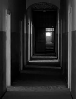
I like #2 better than #1. #1 for me gets weak toward the bottom and in the doorways. I would like to see *some* detail there. I also agree with Freq that if you had someone (or yourself) walking across the doorway at the end of #2, partially motion blurred, this would add a degree of interest that might bump the photo up a notch.
#3 is boring to me. There just isn't anything there that is grabbing my attention. No interesting patterns or light, or organization. It's possible it works at a larger size, but I doubt it.