For my own photo pp, I only and exclusively use my computer, that screen is the one I take for "my 100% screen". They never look right on any other screen. (Whether they then look the way I feel they ought to you on your all's screens is a thing I don't know, of course).
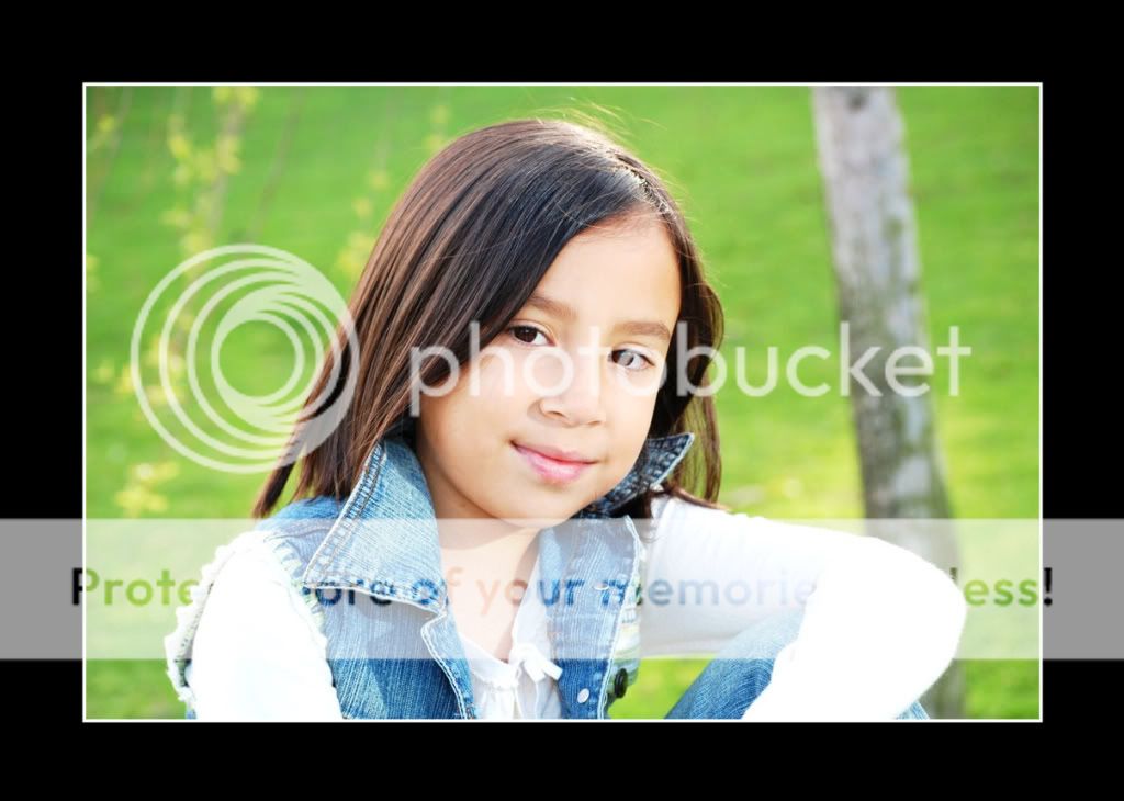
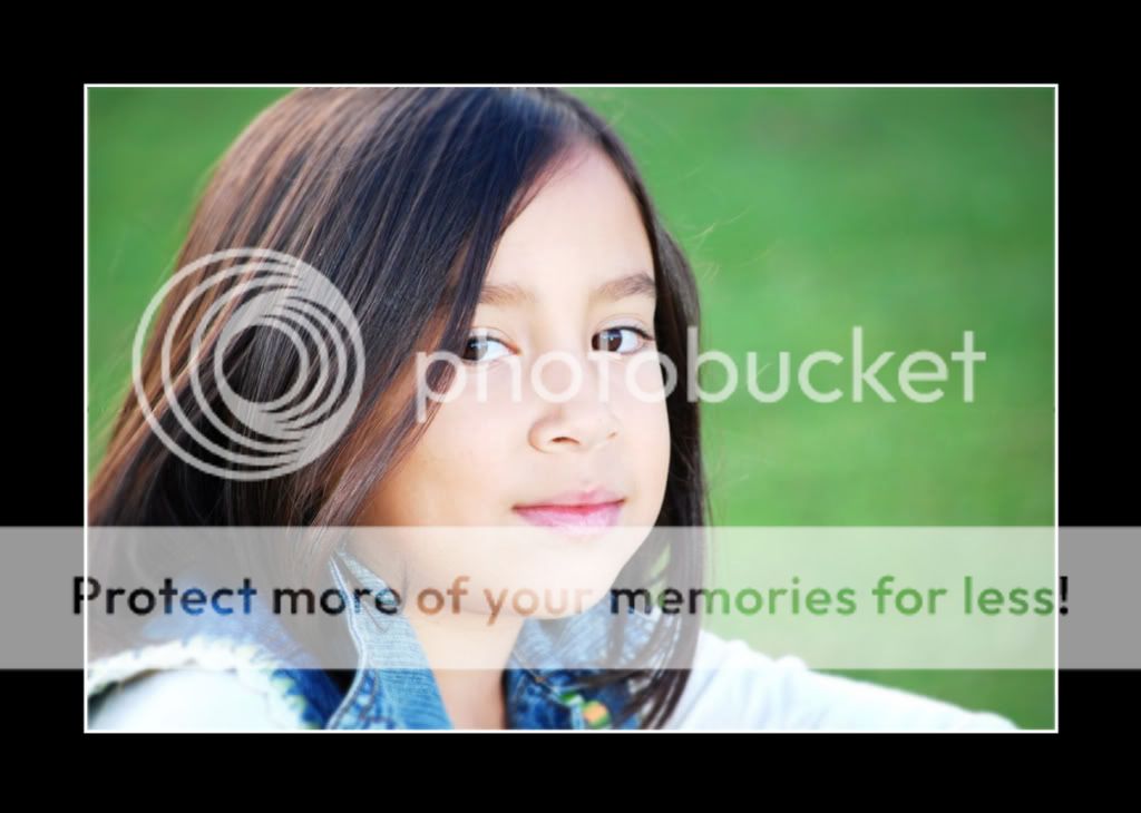
Now, to your photos: the first, I feel, is overexposed. Don't know if you tried to go for something like "high key", but ... it doesn't feel like THAT, either. Just "not quite right".
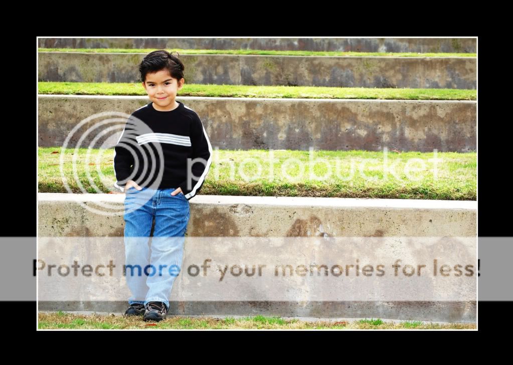
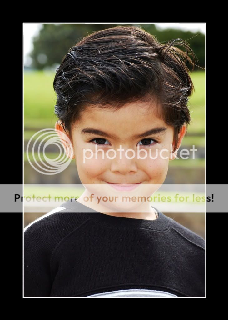
I do love (and best by far of all these!) the second. The lines in the background, his position inside the frame, cool demeanour, slightly mischievous smile, light and exposure ... it all works here.
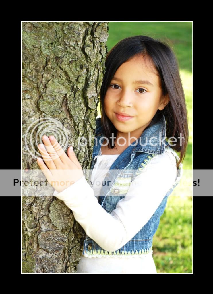
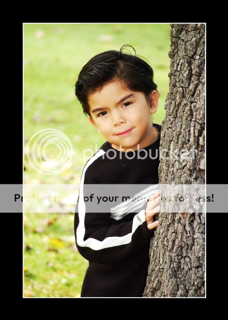
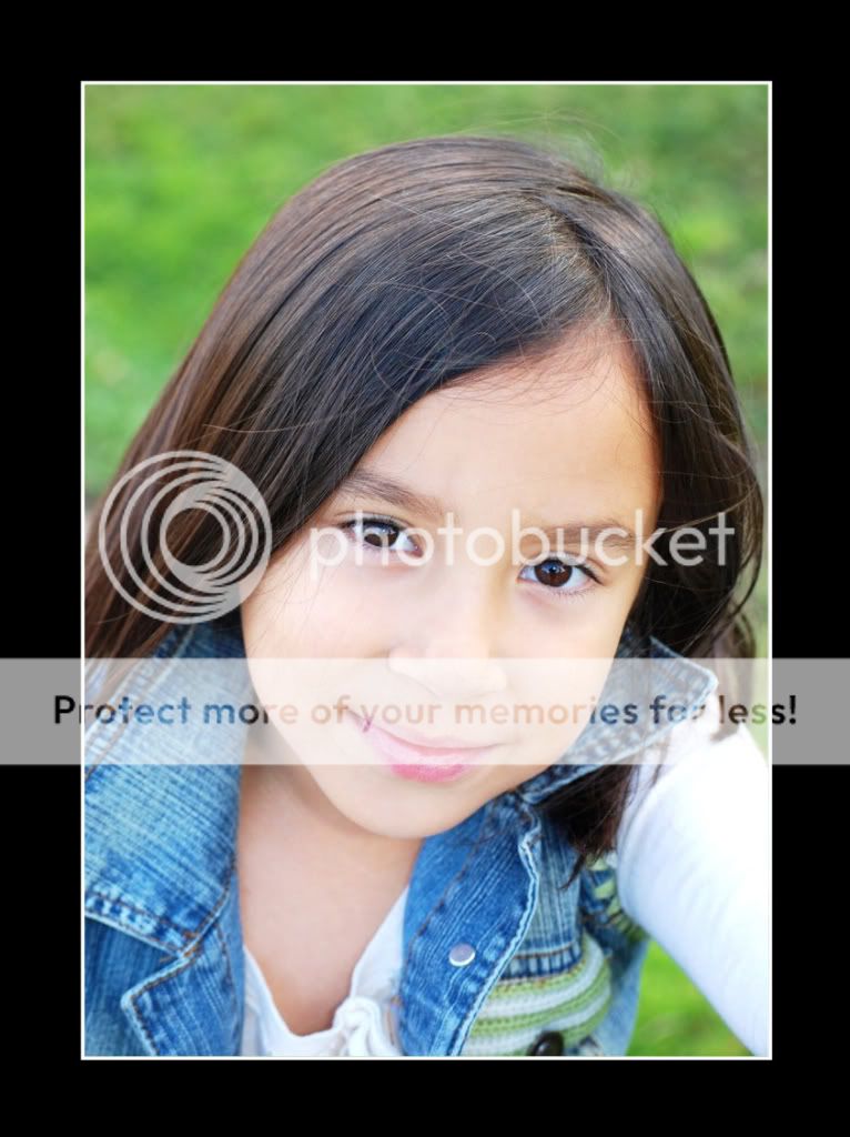
I feel that the "look around that tree trunk" compositions have been done so often ... I do feel the use of the steps and lines in two is refreshingly different from those that follow. Your focus is not always right in those that follow, though. Which shows MOST in your daughter's eyes in the penultimate. The last is better, but still not quite "there", what focus and sharpness are concerned. But exposure looks good in all but the first.
And have I told you already that I love the second?
")
")


![[No title]](/data/xfmg/thumbnail/36/36672-6e6efd07ece42d211057279229ffe34c.jpg?1734169173)

![[No title]](/data/xfmg/thumbnail/37/37413-e579e9da185db973d8cb34300b9f0eb9.jpg?1734170438)

![[No title]](/data/xfmg/thumbnail/36/36670-546c6128f51bbe69923c2eb6fd4fa438.jpg?1734169173)

![[No title]](/data/xfmg/thumbnail/37/37105-0f1ebcc8381303893e9a7ce0764e86fe.jpg?1734169829)