What's new

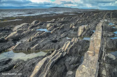
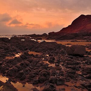
It's not the grand canyon, it's the St-Lawrence river!

xaviersaintcyr

TPF Noob!
Joined
Mar 24, 2012
Messages
87
Reaction score
31
Location
Whistler, BC
Can others edit my Photos
Photos OK to edit
Kamouraska, QC,
Taken a low tide, 3 days ago...


$quebec2013-54.webp
 
Thanks woodsman, for me it's the foreground, you can let yourself going loose in your imagination avout what it could be.

I often see it as a other planet rough landscape, but with hope as there is some lakes in it, hehe
 
Every morning I experiment with someone's image to practice my own PP processes. Using someone else's image takes the ownership factor out of the equation and allows me to go as far as I want since it's just for me...selfish of me, yes, but I learn a lot.

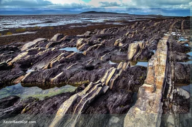
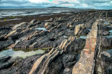
I've never been to the St. Lawrence River so I have no idea of the coloration in the petrified mud but if its anything like the southwestern desert, I would think there was more color richness for the asking. Thus...(and I left the overlay so you can see how far I went past your initial presentation). As always, it is just another opinion and another viewpoint. It is not necessarily better, just a different interpretation.

$9739747605_5f8862801a_o.webp
 
Thank ceeboy, it makes me realize that the color were too tame in my original picture, I was curious, wich software did you use to retouch it?

Thanks again!

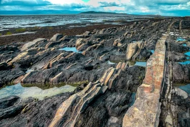
Here a lil transformation I did

$quebec2013-54.webp
 
I like the pattern of the land, very unusual and interesting. I think the edits blue it up a little too much, gets away from looking real. I might like this with a little more sky in the frame instead of the color being bumped up.

Or I'd like a picture of Quebec with some hockey in it...
 
The problem with your last edit is hitting the saturation sliders too hard. Also, while you are picking up some of your detail in the formations, you're losing detail in the little pools of water. Go back to your raw file, do a white balance set, do a control e to make a layer set copy, dupe that layer then make an adjustment to the shadows and highlights in the top adjustments panel (because this dialogue works on the image pixels and you don't want to go there). Lastly, do a color balance adjustment layer moving more toward the red than the blues. This is a great starting place for the rest of your adjustments.

 

Create an account or login to comment

You must be a member in order to leave a comment

Create account

Create an account on our community. It's easy!

Log in

Already have an account? Log in here.

Back
Top Bottom