
willis_927
No longer a newbie, moving up!
- Joined
- Dec 19, 2010
- Messages
- 624
- Reaction score
- 82
- Location
- Winnipeg
- Can others edit my Photos
- Photos OK to edit
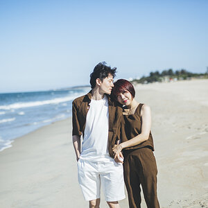
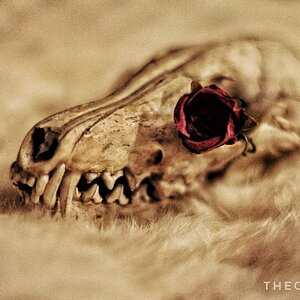
I wasn't overly happy with the lighting conditions for this shoot (very flat lighting etc), so I tried something a bit different than I have normally done.. Does it work for you guys? Or a total miss? Just curious on your thoughts on these...
1)

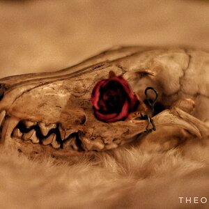
2) Similar to #1

3)

1)
2) Similar to #1
3)
![[No title]](/data/xfmg/thumbnail/40/40308-f92e28f094216c151f3ad1fd7453c99b.jpg?1619739413)
![[No title]](/data/xfmg/thumbnail/38/38444-6063bb59cb410c520a1ccccbe58db9c7.jpg?1619738614)
![[No title]](/data/xfmg/thumbnail/30/30989-2ed4e52fa80fcd0ba553c515ffc589cd.jpg?1619734553)
![[No title]](/data/xfmg/thumbnail/39/39292-4169a355b794ae9735845c4ad45d06ff.jpg?1619738958)
![[No title]](/data/xfmg/thumbnail/34/34148-864c8cb333c478b2dfb9e369908dc329.jpg?1619736320)