Jill - senior

thebeginning

TPF Noob!
Joined
Jan 10, 2005
Messages
3,795
Reaction score
30
Location
Texas
Website
www.danielcolvinphotography.com
Can others edit my Photos
Photos NOT OK to edit
yet another...

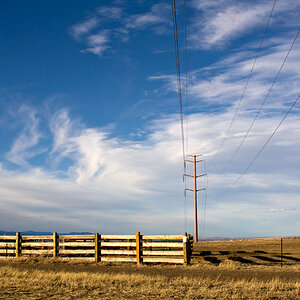
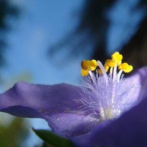
just one for now, many many more to come i'm sure.

Jill-horizheadshot-WEB.jpg


c/c welcome!
 
It feels a little too wide angle/too close...too much distortion. It's great for her eyes and lips, they look nice and big...but so does her nose and head. It also looks like she is slumped forward, making her back look hunched.
I suppose you were going for the 'in your face', kind of edgy look...and it certainly has that.

All that said, it's a very nice image. The lighting is great and I love the background with the folds but just enough O.O.F.

yep, pretty much. she asked for that specifically, strangely enough.


also strange is the distortion that you're seeing (?)...this was shot at 70mm.
 
I think Mike thinks it looks wide angle because of the lighting. You lit the broad side of her face instead of the short, making her face seem bigger.
 
This is different and I like it all around. The only issues see is with the composition it works well in the 5x7 format but maybe too tight in an 8x10 format
 
From all the comments, seems there is not much right with this portrait, however - I find the whole combination very engaging, certainly not a canned portrait. Works for me.
 
Nice! I can see why she is pleased with the results. I agree with whoever mentioned the background being a tad distracting - but for what you seemed to have been going for, it works. The retouching fits very well.

It might just be my screen, I haven't calibrated this month, but one very minor detail nit-pick, is the strand of hair that is curling near her left shoulder, it looks like it wasn't given the same treatment (dodging?) as the rest of her hair. But that is about the most picky one can get while critiquing.

Wonderful job! Your images are always worth looking at.
 
It feels a little too wide angle...

I see it too, but with a longer focal length, we wouldn't see that wonderful background treatment. I'm not certain that it's the best color choice with her clothing, but wow.... gotta love it.

My only nit-pick is the necklace. When I see this, I pull on the chain from behind the neck to bring the pendant up into view so that the converging lines have a chance to converge.

Nice stuff. I too am sure there will be lots more.

Pete
 
Yeah, me too, not too impressed with her top though, another colour would have suited her more, something white with sequins perhaps just to mess your lights up big time:lol:
 

Most reactions

New Topics

Back
Top