Just Playing Around, Getting Grungy

sm4him

In memoriam
Supporting Member
Joined
Oct 4, 2011
Messages
10,726
Reaction score
5,467
Location
The Beautiful Hills of East Tennessee
Website
sm4him.500px.com
Can others edit my Photos
Photos OK to edit
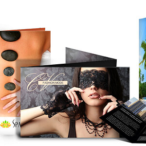
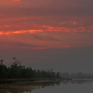
This may well end up in the "Pics No One Else Likes" thread...lately, since certain life priorities have kept me from getting out and taking photos much, I've been working on improving my Photoshop skills, something that's been on my "must do" list for a while, but I could never find the time.

I've also been wanting to do more "artistic" stuff with my photos, not just straight, "take the picture, do a little processing and there you go." I foresee the bulk of my work still being straight photography, either portraiture, fine art or nature/birds, but sometimes I sense more of a need to create more than just an image of what I see in the world.

This is definitely NOT going to be everyone's cup of tea. Grunge isn't really even my "thing"--I love some of it, and hate quite a bit more of it. But I came across this deal on textures and stuff and it came with a bunch of videos. The videos (so far; I'm not even halfway through) have proved to have some decent information in them, although they are more geared to beginners than I expected--but what the heck, I bit on the deal for the texture files, not for the videos.
Anyway, the techniques are good to know whether you use them for grunge effect work or not--but I also thought that perhaps doing something so completely out of my standard, traditional work might be helpful to get the creative mojo dancing in my brain.

So here it is. This is my first ever attempt at anything like this, so if it's truly awful, tell me, but try not to be too insensitive about it, eh? :D
It was fun anyway, and something I'll definitely do some more of. This one kind of developed as I went--basically grabbed elements that appealed to me and start seeing how they looked together. I'd like to come up with a vision for one next, and then find the pieces to create the vision.
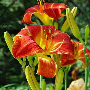
Osprey_grungeweb.jpg
 
No way,this is to darn cool.I am not sure Sharon, It seems a lot of good stuff has either been going unnoticed or people running out of things to say. If anything,this should be in a unique thread as one of a kind.Nicely done is right..
 
Thanks, guys. I knew I liked it, but sometimes, when you're doing something new (new to you anyway), it's good to know that you're on the right track!
I'm kinda envisioning a set of these for different birds, not to mention some florals. And maybe birds AND florals. And who knows what else?
 
I like the textured background. I'm not so sure about the lettering, not the style so much but maybe it could say something more? (I don't know, toss some haiku in there?? lol jk I'm not a poet to know what would be interesting, maybe a saying of some sort?

It is beautifully done.


edit - Or maybe now that I look again, I think it might be more the size, arrangement, and different colors of the text that I might play around with. The lighter text seems to get just a little lost (it wasn't that noticeable to me at first look) and the black might be a little too strong against the background. Maybe a chocolate brown and I don't know, another golden or sepia tone or even ivory?
 
Last edited:
I like your vision and your skills.

Actually jealous of the skills ;) .

The skills are definitely improving. It's funny--even though I've used PS for years, I bogged down at the barely-past-beginner stage and pretty much got stuck there for, oh about a decade. I could do the very basics but that was it, because I learned what I absolutely had to, and ignored the rest. I took a PS class a couple of years ago that really opened my eyes to all the things I actually NEEDED to know how to do, but didn't! Since then, I've just tried to work on those skills as I had time, which never happens. So I'm trying to really commit to doing it. Using KelbyOne, phlearn, and these videos I just attained mostly. I'd say in a month, my skills have improved a good bit.

No way,this is to darn cool.I am not sure Sharon, It seems a lot of good stuff has either been going unnoticed or people running out of things to say. If anything,this should be in a unique thread as one of a kind.Nicely done is right..

I appreciate that. It's early yet for this thread, so who knows? But I do think we are in a bit of a lull as far as good stuff getting good attention. I think it's just that there are some many incredible TPFers producing such great stuff that it's overwhelmed us to the point of not even knowing what to say. :biglaugh: Okay, maybe not.
I'm guilty of sometimes not giving attention to threads that deserve it. I've even found myself looking at yet more awesome photos from Kris or others, and thinking, "oh, they know I love their stuff; I don't need to actually comment." But threads live and die on whether people choose to take a few seconds and leave their comment. So I appreciate when someone does it for me, and need to get back to doing it more for others!
 
I like the textured background. I'm not so sure about the lettering, not the style so much but maybe it could say something more? (I don't know what, toss some haiku in there?? jk I'm not a poet to know what would be interesting, maybe a saying of some sort?

It is beautifully done.

Thanks, other Sharon!
Originally, my plan was to also add the Greek letters for "Fishery Eagle," which is where the "haliaetus part of the scientific name comes from," and then also add a short description ("a large fish-eating hawk with long wings that is dark brown above and mostly white below...") and/or the Order and Family information. But when I added that stuff, I couldn't find a balance to the overall image that I liked as well--plus I felt like the description needed to be in a different font and couldn't find one I liked that worked with the current font.
However, some sort of quote is a good option too. Funny, I'd thought of some quotes for some future pieces like this with other birds, but simply hadn't even thought of finding something for this one. A quote might work better than the description--it was boring, lol.

The good thing is, I can keep playing with it and add more if I ever find other elements that I like with it.
 
I think for me what's written to the left is a little hard to read since of course I have no clue what a pindo whatever is or what that says. That's what made me think for me it's rather subtle while the pronunciation in black stands out a lot (more than the name of the bird, osprey). I don't think now that it's the info. so much as how readable the various words are and how much the various lettering stands out.
 
I think for me what's written to the left is a little hard to read since of course I have no clue what a pindo whatever is or what that says. That's what made me think for me it's rather subtle while the pronunciation in black stands out a lot (more than the name of the bird, osprey). I don't think now that it's the info. so much as how readable the various words are and how much the various lettering stands out.

You're right about the pronunciation text being too black; that's one of the little things I've seen since posting that I'll change at some point. The scientific name and "nicknames" are intentionally lighter, as they are more "elements" of the design than anything. But I did want the word "Osprey" to stand out more than the other text.
 
By the way this is too beautiful to be called grungy!
 

Most reactions

Back
Top