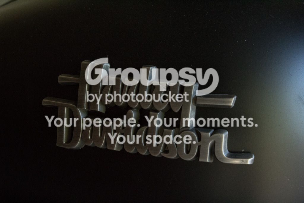
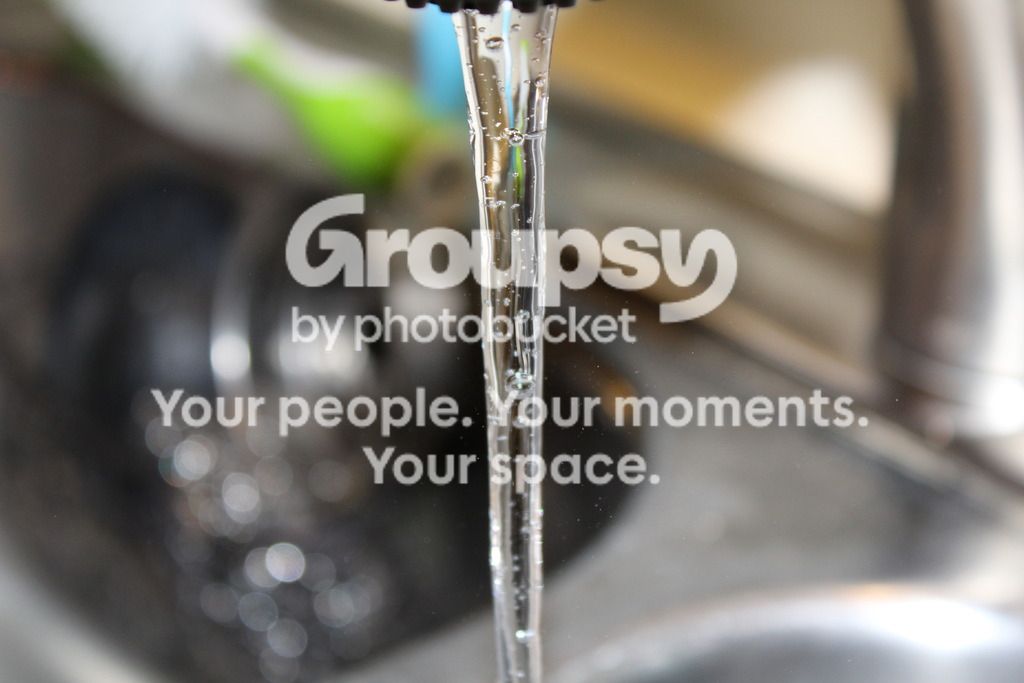
I agree that the exposure could all around be a bit brighter, and as a macro photographer I too am super bothered by the dust on the HD and keyboard images. At this point, you might be able to edit it out, but in future you should give everything a wipe down. The keyboard composition is a little tilted, so I would level it out too. The water faucet is great, but compositionally I would either crop out the little bit of the faucet we see or include more of it- right now it's clear that you weren't paying that much attention to it and its purpose in the image. But nice job on the water clarity! With the Harley image, I would have brought the light source a little more around to the front so that it cast across the raised fronts of the lettering and brightened the image up a bit that way.


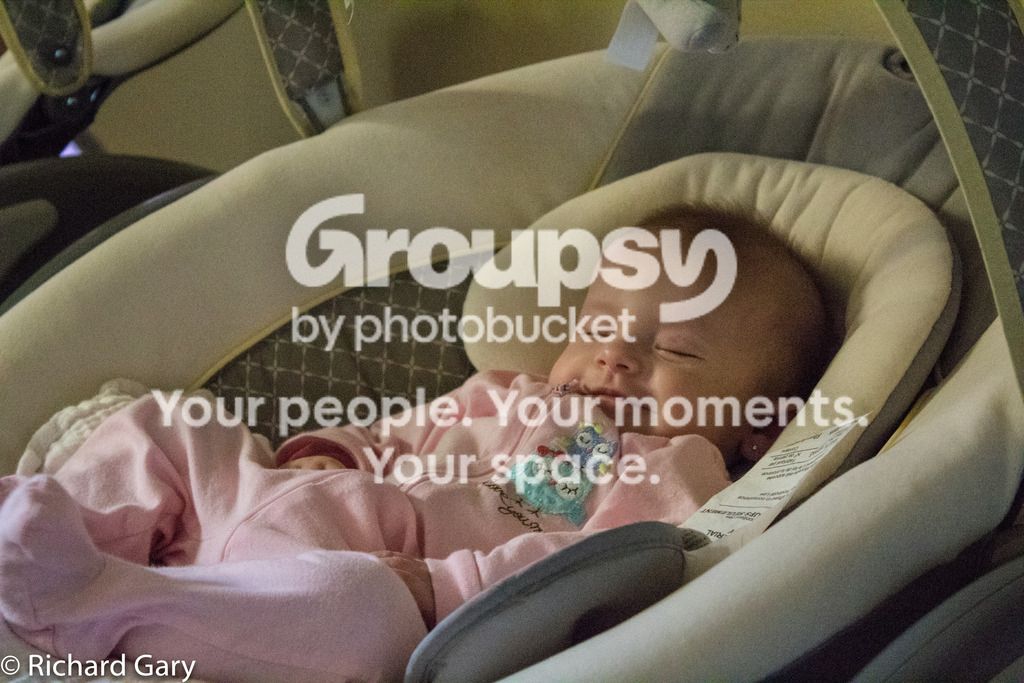



 The baby appears to be dust free.






![[No title]](/data/xfmg/thumbnail/40/40300-583eaa43665714005823e12314084a4d.jpg?1734174710)
![[No title]](/data/xfmg/thumbnail/33/33449-978bff23ad40c63da778b7e59d54f546.jpg?1734163488)