C & C per request:
I like the vintage processing in the first shot except for the heavy vignette (you might be able to get away with a very slight vignette).
I'll agree with you there. I love the processing on this one, but the vignette is too heavy.
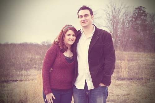
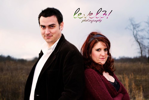
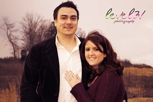
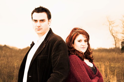
I kind of like the treatments of 3 and 4 but only for the background...I think if the couple weren't in the shot these would make for very nice landscapes. As it is, I don't think this processing treats them all that well (I really don't like what it does to their skin in #4). I'm not at all a fan of the processing in 2 and 5 which, as you already hinted in your request, blows out way too much of the image, particularly on their faces.
I like 3 & 5, they seem to be the common favorites. I don't mind the skin so much in 4, but I am still playing around with some editing. So I will see if I can get a better result out of it. And I completely agree about 2 and 5... 5 seems even more blown than it did before I uploaded it. ;/ Re-edit I go.
I don't know if you've sent these to the couple or if you've posted here first to get a feel for how to process the entire set. One thing that I've found important when presenting a package is a unified feel. Pick your favorite vintage treatment and apply it to all the shots on which you're going vintage. Don't get me wrong, when I work with models I generally process each image individually on how it speaks to me, but in those cases I'm looking for one keeper for my portfolio (and one for the model's), not a comprehensive set.
This was actually a couple of friends of ours that offered to pose for me as practice. They wanted a few different looks to them. I should have said in the description that it was somewhere around 18 degrees outside when we did this, and they were freezing and so was I. (It's East Tennessee.. we're big ninnies about the cold.) So we were literally only out for about 4 minutes before we went running for the warm house. This was an empty field across the street from their house, and I would have like to do more with them and posing.. but time didn't allow. Maybe next go-around.
And a few general comments:
-Think a bit more about your compositions. All of these shots have the couple centered which generally creates a less interesting image than having them off center. The exception is the third shot (with them back to back), in which I feel the symmetry adds to the shot.
-You generally did a good job of not letting the horizon cut through their heads, but it is still more centered than I would recommend. With almost equal portions of the background devoted to sky and ground you have some conflict happening in the background which draws some of the attention away from the couple. Just as if these were strictly landscape shots, I'd suggest committing to either the sky or the ground as the majority of the background. Then you would have created more of a unified backdrop than an interesting background, further bringing attention to the couple.
-You avoided having a tree trunk growing straight out of their heads, but in three of the five that copse of trees is too centered behind them for my liking. I'm more a fan of it just infringing on the side of the frame as in the back to back shots but, even though it's nicely out of focus, it does tend to pull the eye to the edge of the frame. This goes back to centering the couple - because they're so balanced, that tree unbalances the image and pulls you that way. I know I said earlier that I liked the centration for the back to backs...my ideal would have been to have the back to backs centered with no trees in the background and for the other shots have the couple off center to one side and a little bit of the trees to the opposite side.