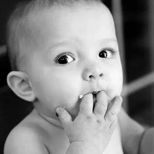
I actually like the last one better! I like the light, the shadows, the sharpness of it and the expression!
I would crop it differently to cut the bottom of the pictures a little bit higher (current crop is too close to the elbow) and that would reduice the death space she have at her back and will balance the shoot a bit.



 I did as much as I could though.

 I think her one eye was a little lazy too!