keep or chuck

sarallyn

TPF Noob!
Joined
Feb 21, 2008
Messages
552
Reaction score
4
Location
New England
Can others edit my Photos
Photos OK to edit
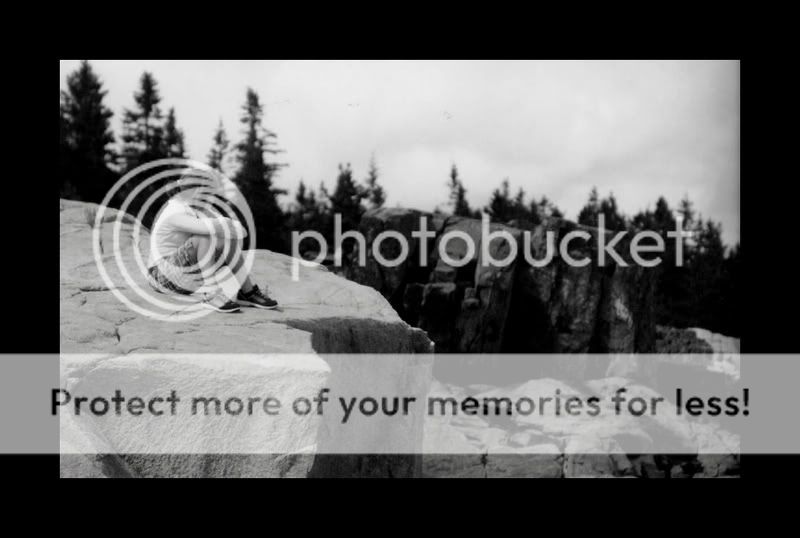
i'm not really sure if I like this or not... her head really gets lost in the trees. it would've been a lot better if she were sitting lower on thw rock...
maineer083.jpg
 
Last edited:
i'm not really sure if I like this or not... her head really gets lost in the trees. it would've been a lot better if she were sitting lower on thw rock...

I agree with your assessment. I also think that the depth of field could have been expanded a bit (light permitting). I don't know if you were intentionally choking down on the depth of field, but I don't think it was necessary here. The darkness of the rocks and trees in the background would have created enough of a separation between your subject and the background that blurring them out isn't necessary.

Then again, blurring out the background is what is keeping her head from getting lost in trees entirely. The in-focus detail of her hair causes her head to stand out from the blurry trees.

My two-bits, but I'm not much more than a beginner so a salt grain or two should be taken with my C&C.
 
by adding al little bit more sharpness in the picture you see her a little bit clearer. But I do agree with hat you said yourself. it would be better if she would be sitting lower on the rock. :thumbup:
 
id say itd be good if the girl and the rock were sharper, they seem to just blend in with the background
 
I don't think it is a bad shot at all. I think the trees are sufficiently blurred to make her head stand out in contrast. My initial reaction didn't even pick that up until I read where you mentioned it. I like it.
 
There are definitely a few things you could've done (or still can do) to improve the image but I don't think that means it's bad or worth throwing out. It's still a very good image.
 
thanks for the feedback, all

There are definitely a few things you could've done (or still can do) to improve the image but I don't think that means it's bad or worth throwing out. It's still a very good image.

thanks -- what would you suggest I do (in terms of processing) to improve the image? just sharpening?
 
I'd say sharpening the girl might help, cropping it a little closer to her (though the image has some awesome depth that you wouldn't want to lose) and maybe darkening the sky. Seems like the girl and the sky are very bright so darkening the sky might pull more attention her way (if you need help with how to darken the sky shoot me a PM and I'll type up a quick Photoshop process).
 
alright, I'll get working in a little bit. thanks!
 
I kind of like the way she blends in. Personally, I don't always enjoy being punched in the face with the subject.
 

Most reactions

Back
Top